为什么高度100%的身体计算高度与实际高度不匹配?
这是一个简单的html页面。我设置了html,身高100%,但内容很长。
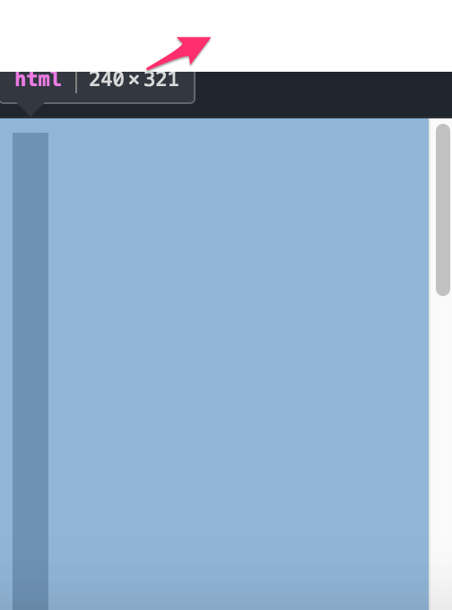
现在我将浏览器缩放到一个小尺寸,滚动条将显示。我打开Chrome Dev工具,body的计算高度似乎是视口的大小,比如321px。
通常情况下,321px计算高度的主体容器将在页面顶部结束,但实际上主体看起来与整个页面的高度相同,此处为1000px。
这是我的谜题,为什么计算出的高度与实际高度不匹配?


html,body{
	width:100%;
	height:100%;
  background: #ccc;
}

.content {
  width: 20px;
  height: 1000px;
  background: #666;
}
<html>
<head></head>
<body>
<div class="content"> </div>
</body>
</html>
2 个答案:
答案 0 :(得分:1)
此处您有溢出,因此body和html的高度与1000px不同,因为100%而等于屏幕高度。< / p>
让您认为body有1000px的内容可能是涵盖整个内容的背景,但在这里您面临special behavior of the background called background propagation.
您可以更改html元素的背景,您将清楚地看到问题:
&#13;
&#13;
&#13;
&#13;
html,
body {
  height: 100%;
  background: #ccc;
  margin:0;
}

html {
  background: red;
  border:5px solid green;
}

.content {
  width: 20px;
  height: 1000px;
  background: #666;
}
<div class="content"> </div>
正如您所注意到的,body高度不等于内容高度,但仅限于屏幕高度,而您的内容只是溢出了body元素。我还为html元素添加了一个边框,以显示其高度也仅限于屏幕大小,并更好地突出显示背景传播行为。
答案 1 :(得分:0)
当您将height:100%设置为元素时,您基本上会告诉它将父母的身高视为自己的身高。
示例:
&#13;
&#13;
&#13;
&#13;
* {
  text-align: right;
}

#parent {
  height: 100px;
  background: red;
}

#kid {
  height: 100%;
  width: 200px;
  background: lime;
}

#grandkid {
  height: 1000px;
  width: 100px;
  background: orange;
}
<div id="parent">
<div id="kid">
<div id="grandkid">
</div>
</div>
</div>
如果您希望家长接受孩子的计算身高,请不要为其定义身高。
示例:
&#13;
&#13;
&#13;
&#13;
#parent {
  /* Parent without height takes all of it's children's heights*/
  background: red;
}

.kids {
  height: 1000px;
  width: 40px;
  background: lime;
  margin-top: 10px;
}
<div id="parent">
<div class="kids"></div>
<div class="kids"></div>
</div>
相关问题
最新问题
- 我写了这段代码,但我无法理解我的错误
- 我无法从一个代码实例的列表中删除 None 值,但我可以在另一个实例中。为什么它适用于一个细分市场而不适用于另一个细分市场?
- 是否有可能使 loadstring 不可能等于打印?卢阿
- java中的random.expovariate()
- Appscript 通过会议在 Google 日历中发送电子邮件和创建活动
- 为什么我的 Onclick 箭头功能在 React 中不起作用?
- 在此代码中是否有使用“this”的替代方法?
- 在 SQL Server 和 PostgreSQL 上查询,我如何从第一个表获得第二个表的可视化
- 每千个数字得到
- 更新了城市边界 KML 文件的来源?