中心组件如何在React Native中使用Flex?
我很难使用CSS将我的组件集中在屏幕上。
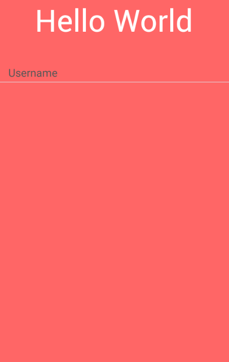
查看我的App.js:
import { Container } from 'native-base';
import React from 'react';
import { StyleSheet } from 'react-native';

import Screen from './ScreenContainer';

const styles = StyleSheet.create({
  container: {
    backgroundColor: '#FF6666',
    flex: 1
  }
});

const App = () => (
  <Provider store={store}>
    <Container style={styles.container}>
      <Screen />
    </Container>
  </Provider>
);

export default App;
现在,请参阅我的ScreenContainer.js
import { Container, Content, Form, Input, Label, Item } from 'native-base';
import React from 'react';

import AppLogo from '../components/AppLogo';

const Screen = () => (
  <Container>
    <Content>
      <AppLogo />
      <Form>
        <Item floatingLabel last>
          <Label>Username</Label>
          <Input />
        </Item>
      </Form>
    </Content>
  </Container>
);

export default Screen;
此代码生成此屏幕:
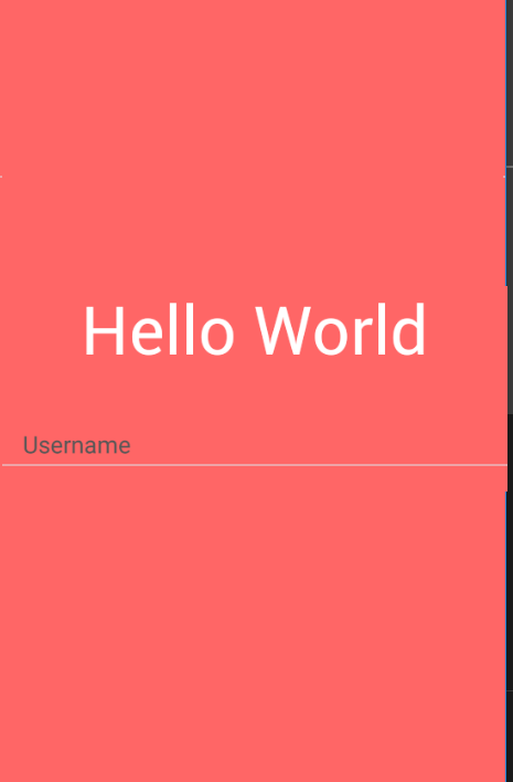
但是,我希望屏幕保持这种格式:
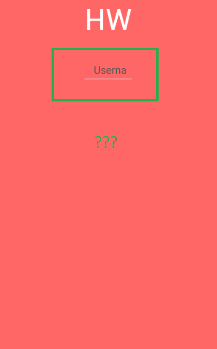
当我更改代码时:
const styles = StyleSheet.create({
  container: {
    alignItems: 'center',
    backgroundColor: '#FF6666',
    flex: 1
  }
});
我的应用程序返回此屏幕:
5 个答案:
答案 0 :(得分:2)
您可能需要花一些时间阅读React Native文档中的使用Flexbox进行布局页面;因为这会让你更好地了解如何实现你正在寻找的东西。
您可以访问我在上面提到的React Native Flexbox文档: https://facebook.github.io/react-native/docs/flexbox.html
在React Native中,组件可以使用flexbox算法指定其子项的布局。 Flexbox旨在为不同的屏幕尺寸提供一致的布局。
您已经使用了CSS样式flex: 1;和alignItems: 'center';使用了一些Flexbox,无论您是否知道。
解决方案
在React Native中,Flexbox的工作方式与在Web上的工作方式相同,但默认值不同,flexDirection默认为列而不是行。
出于这个原因,我们可以将alignItems规则用于组件的样式,以确定子轴沿辅助轴(垂直)的对齐方式。
将以下规则添加到子元素将导致它们采用全屏宽度;但是,请考虑为横向布局和更大的屏幕(例如平板电脑)添加max-width:
childSelector {
    alignItems: stretch;
}
要水平和垂直居中容器内容,请应用以下样式规则:
alignItems: 'center'
justifyContent: 'center'
答案 1 :(得分:2)
它完成了:
import { Container, Content, Form, Input, Label, Item } from 'native-base';
import React from 'react';
import { StyleSheet } from 'react-native';

import AppLogo from '../components/AppLogo';

const styles = StyleSheet.create({
  container: {},
  content: {
    alignItems: 'center',
    flex: 1,
    justifyContent: 'center'
  },
  form: {
    width: '100%'
  },
  item: {}
});

const Screen = () => (
  <Container style={styles.container}>
    <Content contentContainerStyle={styles.content}>
      <AppLogo />
      <Form style={styles.form}>
        <Item floatingLabel last>
          <Label>Username</Label>
          <Input />
        </Item>
      </Form>
    </Content>
  </Container>
);

export default Screen;
答案 2 :(得分:1)
最简单的方法:
    <View style={{jusifyContent: "center", alignItems: "center"}}>
      <Text>I'm an element</Text>
      <Text>I'm another element</Text>
    </View>
答案 3 :(得分:1)
css属性flex对我们来说将使所有对齐工作变得非常容易。您可以使用class="row"或style={{ display: 'flex, justContent: 'center', alignItems: 'center'这样的内联样式来完美对齐父div中心的所有内容。
<div style={{ display: 'flex', justifyContent: 'center'}}>
    <div>Child1</div>
    <div>Child2</div>
</div>
答案 4 :(得分:0)
如果你想在没有 flex 的情况下做到这一点,你可以这样做:
library(tidyverse)
library(ggpubr)
df %>%
  filter(p == "A") %>%
  ggplot(aes(x, y, color = p)) +
   geom_point() +
   geom_smooth(method = "lm") +
   ggpubr::stat_regline_equation(show.legend = F)
   geom_abline(slope = 0.0269, intercept = 38.3)
library(broom)
df %>%
  split(.$p) %>%
  map(~lm(y~x, data = .) %>% broom::tidy(.))
$A
# A tibble: 2 x 5
  term        estimate std.error statistic p.value
  <chr>          <dbl>     <dbl>     <dbl>   <dbl>
1 (Intercept)  21.2       10.1       2.11   0.0420
2 x             0.0517     0.228     0.227  0.822

$B
# A tibble: 2 x 5
  term        estimate std.error statistic p.value
  <chr>          <dbl>     <dbl>     <dbl>   <dbl>
1 (Intercept)   15.5       5.67       2.74 0.00821
2 x              0.153     0.125      1.22 0.229
这将是输出:
- 我写了这段代码,但我无法理解我的错误
- 我无法从一个代码实例的列表中删除 None 值,但我可以在另一个实例中。为什么它适用于一个细分市场而不适用于另一个细分市场?
- 是否有可能使 loadstring 不可能等于打印?卢阿
- java中的random.expovariate()
- Appscript 通过会议在 Google 日历中发送电子邮件和创建活动
- 为什么我的 Onclick 箭头功能在 React 中不起作用?
- 在此代码中是否有使用“this”的替代方法?
- 在 SQL Server 和 PostgreSQL 上查询,我如何从第一个表获得第二个表的可视化
- 每千个数字得到
- 更新了城市边界 KML 文件的来源?