Bootstrap Row不会使列居中
我正在尝试使用3列布局,在较小的屏幕上变为2或1列。我正在使用React来填充行中的许多列,但所有组合都是这样的:
    <Grid className="property-grid">
       <Row className="property-row">
          <Col xs={12} md={4} className="property-thumbnail" key={this.props.key}>
              <div className="thumbnail">
                <Image src={this.props.img} responsive className="property-pic" />
              </div>
              <div className="property-padded">
                <p>some description</p>
              </div>
          </Col>
          .
          .
          /* other columns */
          .
          .
       </Row>
    </Grid>
以下是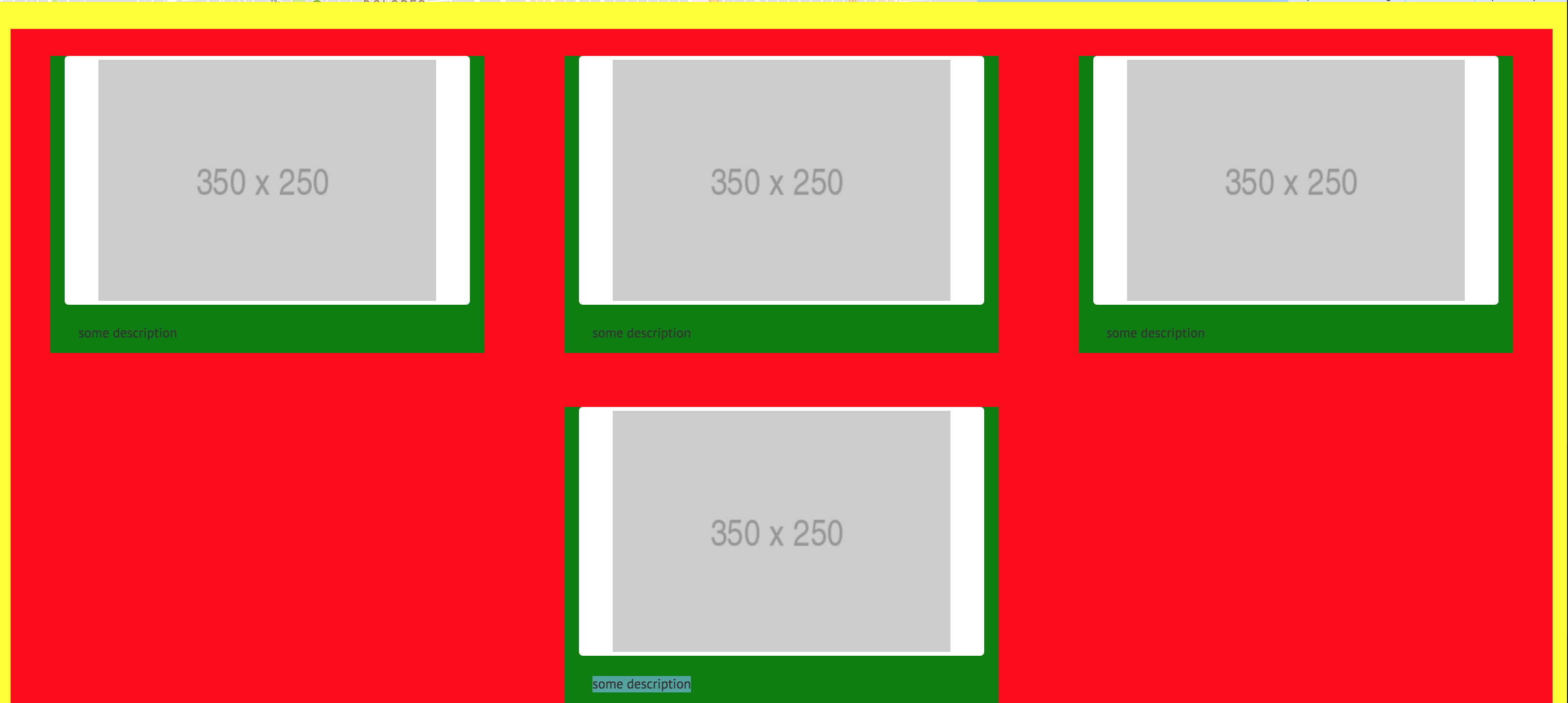
.properties-grid {
  width: 100%;
  margin: 0 auto;
  background-color: yellow;
}
.properties-row {
  flex-wrap: wrap;
  display: inline-flex;
  background-color: red;
  margin: 2em auto;
  width: 100%;
}

.property-thumbnail {
  margin: 2em auto;
  background-color: green;
  display: table-cell;
  max-width: 450px;
}
我希望最后一个奇数列行位于左侧,所以我尝试使用display: inline-block。但是这发生了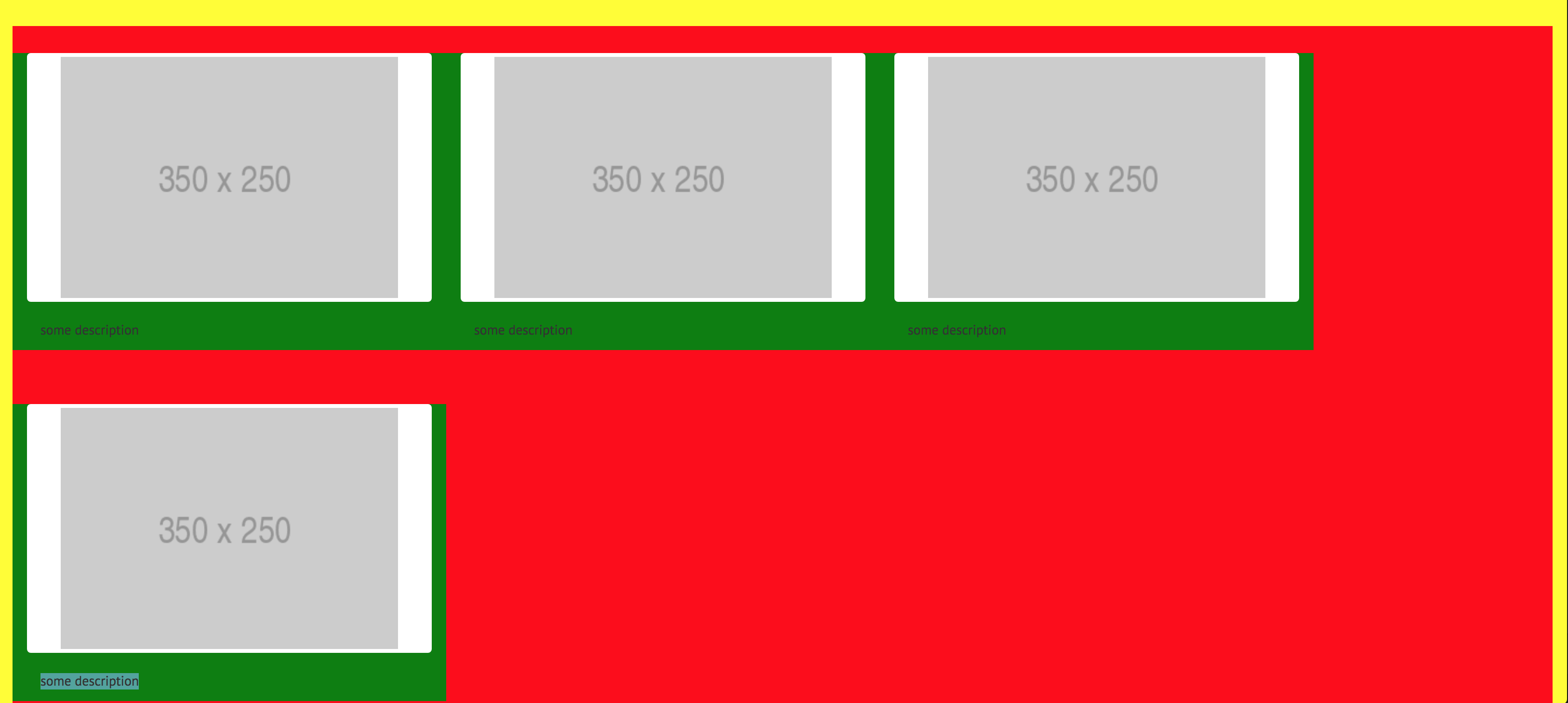
如何确保第一行看起来像第一张图片(居中的列和它们之间的间隙),同时确保最后一行留在左边?
2 个答案:
答案 0 :(得分:1)
如果你按照它应该使用的方式使用Bootstrap网格,它会按照你想要的方式进行布局。
https://www.codeply.com/go/0pJfjcpGgK
<div class="container properties-grid">
    <div class="row properties-row">
        <div class="col-xs-6 col-md-4 property-thumbnail">
            <img src="//placehold.it/300x200" class="thumbnail center-block">
        </div>
        <div class="col-xs-6 col-md-4 property-thumbnail">
            <img src="//placehold.it/300x200" class="thumbnail center-block">
        </div>
        <div class="col-xs-6 col-md-4 property-thumbnail">
            <img src="//placehold.it/300x200" class="thumbnail center-block">
        </div>
        <div class="col-xs-6 col-md-4 property-thumbnail">
            <img src="//placehold.it/300x200" class="thumbnail center-block">
        </div>
    </div>
</div>
答案 1 :(得分:1)
只需从您的班级margin:2em auto;
.property-thumbnail即可
如果
中的 3个元素少于 3个元素,它会推动您的班级.property-thumbnailproperty-row中的内容进入中心位置
&#13;
&#13;
&#13;
&#13;
const Grid = ReactBootstrap.Grid;
const Row = ReactBootstrap.Row;
const Col = ReactBootstrap.Col;
const Panel = ReactBootstrap.Panel;
const ButtonToolbar = ReactBootstrap.ButtonToolbar;
const Button = ReactBootstrap.Button;
const Form = ReactBootstrap.Form;
const Image = ReactBootstrap.Image;
const Test = React.createClass({
  render() {
    return ( <
      Grid className = "property-grid" >
      <
      Row className = "property-row" >
      <
      Col xs = {
        12
      }
      md = {
        4
      }
      className = "property-thumbnail"
      key = {
        this.props.key
      } >
      <
      div className = "thumbnail" >
      <
      Image src = "https://cdn.pixabay.com/photo/2016/06/18/17/42/image-1465348_1280.jpg"
      responsive className = "property-pic" / >
      <
      /div> <
      div className = "property-padded" >
      <
      p > some description < /p> <
      /div> <
      /Col> <
      /Row> <
      /Grid>
    );
  }
});

ReactDOM.render( < Test / > , document.getElementById('app'));
.property-grid {
width: 100%;
background-color: yellow;
}
.property-row {
display: flex;
flex-wrap: wrap;
background-color: red;
margin: 2em auto;
width: 100%;
}
.property-thumbnail {
background-color: green;
display: table-cell;
max-width: 450px;
padding: 20px;
}
@media (max-width: 991px) {
.property-thumbnail {
margin: 2em auto;
}
}<link href="https://maxcdn.bootstrapcdn.com/bootstrap/3.3.5/css/bootstrap.min.css" rel="stylesheet" />
<script src="https://cdnjs.cloudflare.com/ajax/libs/react/0.14.8/react.min.js"></script>
<script src="https://cdnjs.cloudflare.com/ajax/libs/react/0.14.8/react-dom.min.js"></script>
<script src="https://cdnjs.cloudflare.com/ajax/libs/react-bootstrap/0.29.4/react-bootstrap.min.js"></script>
<div id='app'></div>
添加了对您的案例有用的媒体查询。
请在查询中调整
max-width。 (虽然我很快就会这样做,但将会旅行24小时)
相关问题
最新问题
- 我写了这段代码,但我无法理解我的错误
- 我无法从一个代码实例的列表中删除 None 值,但我可以在另一个实例中。为什么它适用于一个细分市场而不适用于另一个细分市场?
- 是否有可能使 loadstring 不可能等于打印?卢阿
- java中的random.expovariate()
- Appscript 通过会议在 Google 日历中发送电子邮件和创建活动
- 为什么我的 Onclick 箭头功能在 React 中不起作用?
- 在此代码中是否有使用“this”的替代方法?
- 在 SQL Server 和 PostgreSQL 上查询,我如何从第一个表获得第二个表的可视化
- 每千个数字得到
- 更新了城市边界 KML 文件的来源?