磨砂玻璃外观
CSS中是否有alt-filter的替代方案? 要使此示例正常工作,我必须启用chrome://flags/#enable-experimental-web-platform-features


body {
  background: url('http://verdewall.com/wp-content/uploads/2016/08/Background-Images-4H9.jpg') no-repeat center;
}

.glass {
  width: 100%;
  height: 500px;
  background: rgba(0,0,0,0.8);

  -webkit-backdrop-filter: contrast(4) blur(30px);
  backdrop-filter: contrast(4) blur(30px);
}
<!DOCTYPE html>
<html>
<head>
<meta charset="utf-8">
<meta name="viewport" content="width=device-width">
<title>Blur</title>
</head>
<body>
<div class="glass">
</div>
</body>
</html>
以下是启用实验性功能的情况:
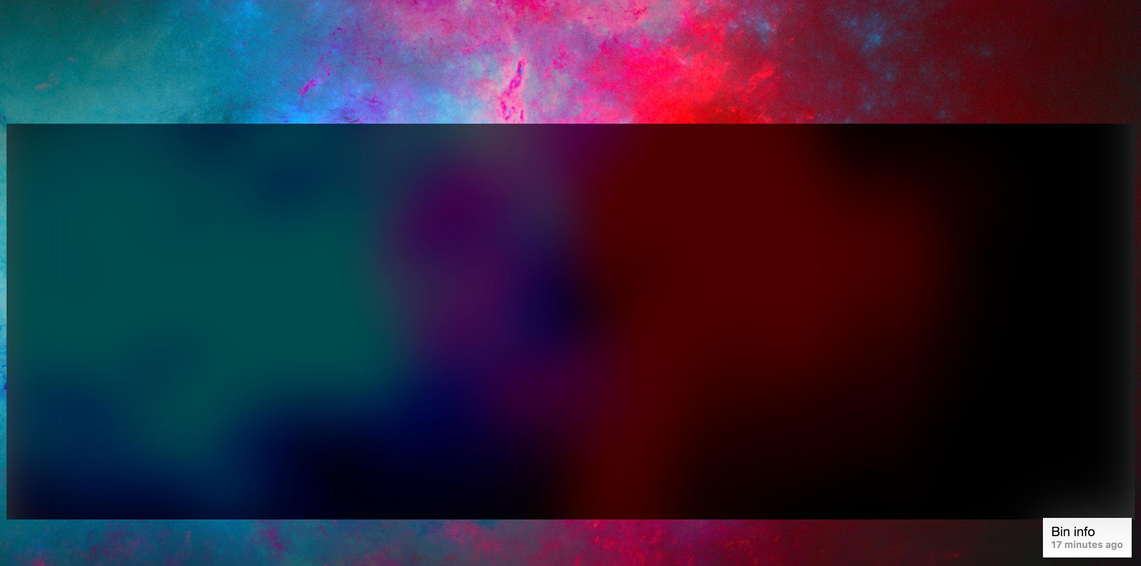
问题是它下面的内容是动态的。因此,并非所有这些都是图像和我发现只能使用图像的替代方案。就像这里显示模糊的半透明一样:

3 个答案:
答案 0 :(得分:3)
解决方法是使用剪辑路径,过滤器和相同内容两次,然后您将获得与backdrop-filter相同的结果
.container {
  width: 200px;
  height: 200px;
  position: relative;
  padding:1px;
}
.container .glass, .container .filter {
  background: url('https://lorempixel.com/400/200/') center/cover;
  text-align:center;
  color:#fff;
  height:100%;
}

.filter {
  position: absolute;
  top: 0;
  bottom: 0;
  right: 0;
  left: 0;
  filter: contrast(4) blur(3px);
  z-index: 2;
  clip-path: polygon(5% 15%, 82% 30%, 83% 71%, 17% 73%);
}
<div class="container">
<div class="glass">
<h1>A title</h1>
<p>Some content Some content</p>
</div>
<div class="filter">
<h1>A title</h1>
<p>Some content Some content</p>
</div>
</div>
你可以创建一个jQuery脚本,当它出现很多内容时会为你复制内容。您还可以考虑使用更复杂的脚本来调整所有需要的值和参数。
$('.backdrop').each(function() {
  var e = $(this).html();
  $(this).append('<div class="filter">'+e+'</div>');
})
.container {
width: 200px;
height: 200px;
position: relative;
padding:1px;
display:inline-block;
}
.container .glass, .container .filter {
background: url('https://lorempixel.com/400/200/') center/cover;
text-align:center;
color:#fff;
height:100%;
}
.filter {
position: absolute;
top: 0;
bottom: 0;
right: 0;
left: 0;
filter: contrast(4) blur(3px);
z-index: 2;
clip-path: polygon(5% 15%, 82% 30%, 83% 71%, 17% 73%);
}<script src="https://ajax.googleapis.com/ajax/libs/jquery/2.1.1/jquery.min.js"></script>
<div class="container backdrop">
<div class="glass">
<h1>A title</h1>
<p>Some content Some content</p>
</div>
</div>
<div class="container">
<div class="glass">
<h1>A title</h1>
<p>Some content Some content</p>
</div>
</div>
答案 1 :(得分:0)
简单地说:过滤器
filter: blur(10px);
但是你必须稍微改变你的结构。这是一个例子:
&#13;
&#13;
&#13;
&#13;
*{
  margin: 0;
  padding: 0;
  font-family: sans-serif;
}
main{
  height: 100vh;
  background: url('https://images.unsplash.com/photo-1477346611705-65d1883cee1e?dpr=0.800000011920929&auto=format&fit=crop&w=1199&h=800&q=80&cs=tinysrgb&crop=') fixed no-repeat;
  background-size: cover;
}
#container{
  width: 350px;
  height: 500px;
  background: inherit;
  position: absolute;
  overflow: hidden;
  top: 50%;
  left: 50%;
  margin-left: -175px;
  margin-top: -250px;
  border-radius: 8px;
}
#container:before{
  width: 400px;
  height: 550px;
  content: "";
  position: absolute;
  top: -25px;
  left: -25px;
  bottom: 0;
  right: 0;
  background: inherit;
  box-shadow: inset 0 0 0 200px rgba(255,255,255,0.2);
  filter: blur(10px);
}
form img{
  width: 120px;
  height: 120px;
  border-radius: 100%;
}
form{
  text-align: center;
  position: absolute;
  left: 50%;
  top: 50%;
  transform: translate(-50%,-50%);
}
input{
  background: 0;
  width: 200px;
  outline: 0;
  border: 0;
  border-bottom: 2px solid rgba(255,255,255, 0.3);
  margin: 20px 0;
  padding-bottom: 10px;
  font-size: 18px;
  font-weight: bold;
  color: rgba(255,255,255, 0.8);
}
input[type="submit"]{
  border: 0;
  border-radius: 8px;
  padding-bottom: 0;
  height: 60px;
  background: #df2359;
  color: white;
  cursor: pointer;
  transition: all 600ms ease-in-out;
}
input[type="submit"]:hover{
  background: #C0392B;
}
span a{
  color: rgba(255,255,255, 0.8);
}
<main>
<div id="container">
<form action="">
<input type="text" value=""><br>
<input type="password"><br>
<input type="submit" value="SIGN IN"><br>
<span><a href="#">Forgot Password?</a></span>
</form>
</div>
</main>
答案 2 :(得分:0)
试试这个:
.glass:before {
  content: "";
  position: fixed;
  left: 0;
  right: 0;
  z-index: 1;
  background: rgba(0,0,0,0.8);

  display: block;
  width:100%;
  height: 100%;

  -webkit-filter: blur(30px);
  -moz-filter: blur(30px);
  -o-filter: blur(30px);
  -ms-filter: blur(30px);
  filter: blur(30px);
}
相关问题
最新问题
- 我写了这段代码,但我无法理解我的错误
- 我无法从一个代码实例的列表中删除 None 值,但我可以在另一个实例中。为什么它适用于一个细分市场而不适用于另一个细分市场?
- 是否有可能使 loadstring 不可能等于打印?卢阿
- java中的random.expovariate()
- Appscript 通过会议在 Google 日历中发送电子邮件和创建活动
- 为什么我的 Onclick 箭头功能在 React 中不起作用?
- 在此代码中是否有使用“this”的替代方法?
- 在 SQL Server 和 PostgreSQL 上查询,我如何从第一个表获得第二个表的可视化
- 每千个数字得到
- 更新了城市边界 KML 文件的来源?