在CSS过渡期间绘制边框颜色
button {
  background: none;
  border: 0;
  box-sizing: border-box;
  margin: 1em;
  padding: 1em 2em;
  box-shadow: inset 0 0 0 2px #f45e61;
  color: #f45e61;
  font-size: inherit;
  font-weight: 700;
  position: relative;
  vertical-align: middle;
}
button::before, button::after {
  box-sizing: inherit;
  content: " ";
  position: absolute;
  width: 100%;
  height: 100%;
}
.draw {
  transition: color 0.25s;
}
.draw::before, .draw::after {
  border: 2px solid transparent;
  width: 0;
  height: 0;
  transition: width 1.25s ease-out 1.25s, height 1.25s ease-out 1.25s;

}
.draw::before {
  top: 0;
  left: 0;
}
.draw::after {
  bottom: 0;
  right: 0;
}
.draw:hover {
  color: #60daaa;
}
.draw:hover::before, .draw:hover::after {
  width: 100%;
  height: 100%;
}
.draw:hover::before {
  border-top-color: #60daaa;
  border-right-color: #60daaa;
  transition: width 0.25s ease-out, height 0.25s ease-out 0.25s;
}
.draw:hover::after {
  border-bottom-color: #60daaa;
  border-left-color: #60daaa;
  transition: border-color 0s ease-out 0.5s, width 0.25s ease-out 0.5s, height 0.25s ease-out 0.75s;
}
<section class="buttons">
<button class="draw">Draw</button>
</section>
我有一支工作笔(https://codepen.io/anon/pen/vdgdxO)可以在悬停时(右上角左下角)更改元素的边框颜色,并进行一些过渡以使其平滑。
我希望能够&#34;反向&#34;几秒钟后边框颜色会发生变化。基本上,当相反的颜色改变颜色时,我想改变边框颜色:
- border-top change color
- border-right change color
- border-bottom更改颜色&amp; border-top恢复原来的颜色
- border-left改变颜色&amp; border-right恢复原来的颜色
- border-top change color&amp; border-bottom恢复原来的颜色
- border-right change color&amp; border-left恢复原来的颜色 等
现在我只有颜色变化,但我不知道如何反转&#34;它。我也希望这种过渡永远循环,但我对从何处开始毫无头绪。有什么建议吗?
1 个答案:
答案 0 :(得分:8)
我会使用多个linear-gradient和一个复杂动画(通过设置每个动画的大小/位置动画)来获得最终结果。如果你得到了技巧,你可以轻松调整不同的值,以获得你想要的任何动画。
.draw {
  padding: 20px 50px;
  outline:none;
  border: none;
  box-shadow: none;
  background-image:
  linear-gradient(#f45e61, #f45e61),
  linear-gradient(#f45e61, #f45e61),
  linear-gradient(#f45e61, #f45e61),
  linear-gradient(#f45e61, #f45e61),

  linear-gradient(#60daaa, #60daaa),
  linear-gradient(#60daaa, #60daaa),
  linear-gradient(#60daaa, #60daaa),
  linear-gradient(#60daaa, #60daaa);

  background-position: 0 0, 0 0, 0 100%, 0 100%,
                       0 0, 0 0, 0 100%, 100% 0;
  background-size: 3px 0%, 0% 3px, 0% 3px, 3px 0%,
                   3px 100%, 100% 3px, 100% 3px,3px 100%;
  background-color:transparent;
  background-repeat:no-repeat;
  transition:0.2s linear;
}

.draw:hover {
  background-position: 0 100%, 0 0, 0 100%, 100% 0,
                       0 0, 0 0, 0 100%, 100% 0;
  background-size: 3px 0%, 100% 3px, 0% 3px,3px 0%,
                   3px 100%, 100% 3px, 100% 3px,3px 100%;
  animation: animate 1.4s linear infinite 0.2s;
}

@keyframes animate {
  0% {
  background-position: 0 100%, 0 0, 0 100%, 100% 0,
                       0 0, 0 0, 0 100%, 100% 0;
  background-size: 3px 0%, 100% 3px, 0% 3px,3px 0%,
                   3px 100%, 100% 3px, 100% 3px,3px 100%;
  }
  40% {
  background-position: 0 100%, 100% 0, 100% 100%, 100% 0,
                       0 0, 0 0, 0 100%, 100% 0;
  background-size: 3px 0%, 100% 3px, 0% 3px,3px 100%,
                   3px 100%, 100% 3px, 100% 3px,3px 100%;
  }
  60% {
  background-position: 0 100%, 100% 0, 100% 100%, 100% 100%,
                       0 0, 0 0, 0 100%, 100% 0;
  background-size: 3px 0%, 0% 3px, 100% 3px,3px 100%,
                   3px 100%, 100% 3px, 100% 3px,3px 100%;
  }
  70% {
  background-position: 0 100%, 100% 0, 0% 100%, 100% 100%,
                       0 0, 0 0, 0 100%, 100% 0;
  background-size: 3px 100%, 0% 3px, 100% 3px,3px 0%,
                   3px 100%, 100% 3px, 100% 3px,3px 100%;
  }
  80% {
  background-position: 0% 0%, 0% 0, 0% 100%, 100% 100%,
                       0 0, 0 0, 0 100%, 100% 0;
  background-size: 3px 100%, 0% 3px, 0% 3px,3px 0%,
                   3px 100%, 100% 3px, 100% 3px,3px 100%;
  }
  100% {
  background-position: 0% 0%, 0 0, 0 100%, 100% 100%,
                       0 0, 0 0, 0 100%, 100% 0;
  background-size: 3px 0%, 100% 3px, 0% 3px,3px 0%,
                   3px 100%, 100% 3px, 100% 3px,3px 100%;
  }
}
<button class="draw">Draw</button>
如何运作?
结构:我们有8个linear-gradient。 4将简单地创建初始边框并且不会移动(它们被放置在底层)并且将使用4来绘制将在初始边界上方创建动画的线(它们被放置在顶层) 。
顺序很重要,因为在背景属性中,每个渐变每个都有8个值。您会注意到3px值只会指定每个渐变的宽度或高度(类似于border-width),并且在动画期间不会发生变化。
动画:我会调整每个渐变的位置/大小来创建动画。它分为两部分:一个小过渡和一个大动画。转换仅用于创建动画的初始状态,这就是为什么用于转换的持续时间与动画的延迟相同的原因。
-
第一步是从左到右为顶部边框设置动画。要执行此操作,渐变应位于
(0,0) [top,left],大小为0% 3px [width height]。然后我只需将大小更改为100% 3px,我就会获得所需的动画(之前描述的3px并且不会改变)。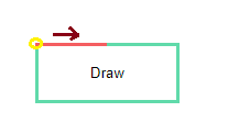
-
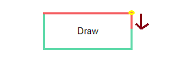
现在为第二个边框设置动画,我们也会这样做。我们需要一个位于
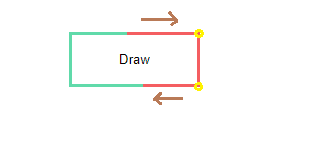
(100%,0) [top,right]且大小为3px 0% [width height]的渐变,我们将其设为3px 100%: - 现在我们有两个边框,我们需要为第三个边框设置动画并隐藏第一个边框。我不会详细说明第三个边框,因为它与上面的相似,所以让我们看看如何隐藏顶部边框。第一个直观的想法是简单地将其大小设置回
0% 3px,但这只会创建逆动画,因此我们将有一个从右到左动画,这是不好的。这里的诀窍是调整渐变的位置,使其成为(100%,0) [top,right]而不是(0,0),因为当渐变为100%大小时,两个位置都是等效的(所以我们在上一步操作动画时这样做)第二个)。现在,我们可以将尺寸缩回0% 3px,我们将有一个从左到右动画: - 我们继续使用相同的逻辑,直到我们回到初始状态,并通过在动画属性中指定
infinite,我们将获得所需的效果。
所以主要的想法是让一个大小等于0%的渐变,我们在给定的方向上动画到全尺寸(100%)然后我们改变它的位置(这对完全没有任何影响)然后将其大小设置为0.将它与我们拥有的4个渐变混合。
的更新
为了避免与所有这些渐变混淆,这里是一个更新,其中我使用静态边框的伪元素,因此我们只为动画保留4个渐变:
.draw {
  position:relative;
  padding: 20px 50px;
  outline:none;
  border: none;
  box-shadow: none;
  background-image:
  linear-gradient(#f45e61, #f45e61),
  linear-gradient(#f45e61, #f45e61),
  linear-gradient(#f45e61, #f45e61),
  linear-gradient(#f45e61, #f45e61);

  background-position: 0 0, 0 0, 0 100%, 0 100%;
  background-size: 3px 0%, 0% 3px, 0% 3px, 3px 0%;
  background-color:transparent;
  background-repeat:no-repeat;
  transition:0.2s linear;
}
.draw:before {
  content:"";
  position:absolute;
  z-index:-1;
  top:0;
  right:0;
  left:0;
  bottom:0;
  border:3px solid #60daaa;
}

.draw:hover {
  background-position: 0 100%, 0 0, 0 100%, 100% 0;
  background-size: 3px 0%, 100% 3px, 0% 3px,3px 0%;
  animation: animate 1.4s linear infinite 0.2s;
}

@keyframes animate {
  0% {
  background-position: 0 100%, 0 0, 0 100%, 100% 0;
  background-size: 3px 0%, 100% 3px, 0% 3px,3px 0%;
  }
  40% {
  background-position: 0 100%, 100% 0, 100% 100%, 100% 0;
  background-size: 3px 0%, 100% 3px, 0% 3px,3px 100%;
  }
  60% {
  background-position: 0 100%, 100% 0, 100% 100%, 100% 100%;
  background-size: 3px 0%, 0% 3px, 100% 3px,3px 100%
  }
  70% {
  background-position: 0 100%, 100% 0, 0% 100%, 100% 100%;
  background-size: 3px 100%, 0% 3px, 100% 3px,3px 0%;
  }
  80% {
  background-position: 0% 0%, 0% 0, 0% 100%, 100% 100%;
  background-size: 3px 100%, 0% 3px, 0% 3px,3px 0%;
  }
  100% {
  background-position: 0% 0%, 0 0, 0 100%, 100% 100%;
  background-size: 3px 0%, 100% 3px, 0% 3px,3px 0%
  }
}
<button class="draw">Draw</button>
- 我写了这段代码,但我无法理解我的错误
- 我无法从一个代码实例的列表中删除 None 值,但我可以在另一个实例中。为什么它适用于一个细分市场而不适用于另一个细分市场?
- 是否有可能使 loadstring 不可能等于打印?卢阿
- java中的random.expovariate()
- Appscript 通过会议在 Google 日历中发送电子邮件和创建活动
- 为什么我的 Onclick 箭头功能在 React 中不起作用?
- 在此代码中是否有使用“this”的替代方法?
- 在 SQL Server 和 PostgreSQL 上查询,我如何从第一个表获得第二个表的可视化
- 每千个数字得到
- 更新了城市边界 KML 文件的来源?