如何像google表单一样向右和向左设置背景颜色中心的动画?
我真的缺乏css动画。我尝试在像谷歌形式的div上创建动画效果。
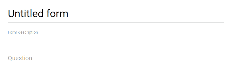
如果以上链接不起作用(就像我现在的电脑一样),你可以在这里看到它https://ibb.co/cYsYKb
我尝试transition: all 1s ease; background: linear-gradient(to right, #673ab7);但不行。
这是我的小提琴:https://jsfiddle.net/hL8mncqa/
我试图在谷歌中找到它,但仍然无法解决我的问题,因为我不知道找到它的关键字。
怎么做?欢迎任何建议。
4 个答案:
答案 0 :(得分:5)
您可以使用 CSS3动画执行此操作:
$(function(){
  $('body').on('focus', 'textarea', function(){
    $(this).next().addClass('active');
  });

  $('body').on('focusout', 'textarea', function(){
    $(this).next().removeClass('active');
  });
});
body {
background: #fff;
}
.container {
position: relative; /* needs to be set since the child has position absolute */
}
textarea {
width: 100%;
border: 0;
outline: 0;
}
.txt-underline {
background: rgba(0,0,0,0.12);
height: 1px;
/* to grow from center: */
position: absolute;
left: 50%;
transform: translateX(-50%);
}
.txt-underline.active {
background: #673ab7;
height: 2px;
animation-name: underline; /* "calling" the animation */
animation-duration: .3s; /* adjust to your needs */
animation-timing-function: ease; /* also experiment with other values */
animation-fill-mode: forwards; /* retains 100% width when it gets there */
}
@keyframes underline { /* lets call it the "underline" */
0% {width:0} /* start width */
100% {width:100%} /* end width */
}<script src="https://ajax.googleapis.com/ajax/libs/jquery/2.1.1/jquery.min.js"></script>
<div class="container">
<textarea>asddas dasdasdas asdas</textarea>
<div class="txt-underline"></div>
</div>
答案 1 :(得分:3)
您可以在父div上使用:before和:after伪元素来创建此类边框,并通过切换活动类来更改其状态。
&#13;
&#13;
&#13;
&#13;
$('.element textarea').on('focus blur', function() {
  $(this).parent('.element').toggleClass('active')
})
body {
background-color: #ffffff;
}
.element {
display: inline-block;
position: relative;
}
textarea {
width: 100%;
border: 0;
outline: 0;
}
.element:before,
.element:after {
content: '';
bottom: 0;
position: absolute;
left: 0;
width: 100%;
height: 1px;
background: rgba(0, 0, 0, 0.12);
}
.element:after {
background: #673ab7;
width: 0;
left: 50%;
transform: translateX(-50%);
transition: all 0.3s ease-in;
}
.element.active:after {
width: 100%;
}<script src="https://ajax.googleapis.com/ajax/libs/jquery/2.1.1/jquery.min.js"></script>
<div class="element">
<textarea>Text</textarea>
</div>
答案 2 :(得分:2)
这就是你想要的......
&#13;
&#13;
&#13;
&#13;
* { box-sizing:border-box; }

/* basic stylings ------------------------------------------ */
body 				 { background:url(https://scotch.io/wp-content/uploads/2014/07/61.jpg); }
.container 		{
  font-family:'Roboto';
  width:600px;
  margin:30px auto 0;
  display:block;
  background:#FFF;
  padding:10px 50px 50px;
}
h2 		 {
  text-align:center;
  margin-bottom:50px;
}
h2 small {
  font-weight:normal;
  color:#888;
  display:block;
}
.footer 	{ text-align:center; }
.footer a  { color:#53B2C8; }

/* form starting stylings ------------------------------- */
.group 			  {
  position:relative;
  margin-bottom:45px;
}
input 				{
  font-size:18px;
  padding:10px 10px 10px 5px;
  display:block;
  width:300px;
  border:none;
  border-bottom:1px solid #757575;
}
input:focus 		{ outline:none; }

/* LABEL ======================================= */
label 				 {
  color:#999;
  font-size:18px;
  font-weight:normal;
  position:absolute;
  pointer-events:none;
  left:5px;
  top:10px;
  transition:0.2s ease all;
  -moz-transition:0.2s ease all;
  -webkit-transition:0.2s ease all;
}

/* active state */
input:focus ~ label, input:valid ~ label 		{
  top:-20px;
  font-size:14px;
  color:#5264AE;
}

/* BOTTOM BARS ================================= */
.bar 	{ position:relative; display:block; width:300px; }
.bar:before, .bar:after 	{
  content:'';
  height:4px;
  width:0;
  bottom:0px;
  position:absolute;
  background:#5264AE;
  transition:0.2s ease all;
  -moz-transition:0.2s ease all;
  -webkit-transition:0.2s ease all;
}
.bar:before {
  left:50%;
}
.bar:after {
  right:50%;
}

/* active state */
input:focus ~ .bar:before, input:focus ~ .bar:after {
  width:50%;
}

/* HIGHLIGHTER ================================== */
.highlight {
  position:absolute;
  height:60%;
  width:100px;
  top:25%;
  left:0;
  pointer-events:none;
  opacity:0.5;
}

/* active state */
input:focus ~ .highlight {
  -webkit-animation:inputHighlighter 0.3s ease;
  -moz-animation:inputHighlighter 0.3s ease;
  animation:inputHighlighter 0.3s ease;
}

/* ANIMATIONS ================ */
@-webkit-keyframes inputHighlighter {
	from { background:#5264AE; }
  to 	{ width:0; background:transparent; }
}
@-moz-keyframes inputHighlighter {
	from { background:#5264AE; }
  to 	{ width:0; background:transparent; }
}
@keyframes inputHighlighter {
	from { background:#5264AE; }
  to 	{ width:0; background:transparent; }
}
<div class="container">
<h2>Material Design in CSS3<small>Inputs</small></h2>
<form>
<div class="group">
<input type="text" required>
<span class="highlight"></span>
<span class="bar"></span>
<label>Name</label>
</div>
<div class="group">
<input type="text" required>
<span class="bar"></span>
<label>Email</label>
</div>
<div class="group">
<input type="text" required>
<span class="highlight"></span>
<span class="bar"></span>
<label>Email</label>
</div>
</form>
</div>
快乐编码:)
答案 3 :(得分:1)
以下是使用CSS3动画制作的快速解决方案以及容器的伪元素:https://jsfiddle.net/nv92uoo4/
$(document).ready(function() {
  $("div").on("click", function() {
  	$(this).addClass("hover")
  });
});
input {
position: relative;
border: 0;
background-color: transparent;
border-bottom: 1px solid #a0a0a0;
padding-bottom: 2px;
outline: 0;
}
div {
position: relative;
display: inline-block;
}
div.hover:after {
content: '';
display: block;
height: 2px;
width: 0;
background-color: purple;
animation-duration: 1s;
animation-name: hover;
animation-fill-mode: forwards;
position: absolute;
bottom: -2px;
left: 50%;
transform: translate(-50%, 0);
}
@keyframes hover {
from {
width: 0;
}
to {
width: 100%;
}
}<script src="https://ajax.googleapis.com/ajax/libs/jquery/2.1.1/jquery.min.js"></script>
<div>
<input type="text" value="My value">
</div>
相关问题
最新问题
- 我写了这段代码,但我无法理解我的错误
- 我无法从一个代码实例的列表中删除 None 值,但我可以在另一个实例中。为什么它适用于一个细分市场而不适用于另一个细分市场?
- 是否有可能使 loadstring 不可能等于打印?卢阿
- java中的random.expovariate()
- Appscript 通过会议在 Google 日历中发送电子邮件和创建活动
- 为什么我的 Onclick 箭头功能在 React 中不起作用?
- 在此代码中是否有使用“this”的替代方法?
- 在 SQL Server 和 PostgreSQL 上查询,我如何从第一个表获得第二个表的可视化
- 每千个数字得到
- 更新了城市边界 KML 文件的来源?