为什么div与"显示:flex"和"位置:固定"不占用全部可用宽度?
我注意到,当div有position: fixed和display: flex时,它并没有像普通div那样占据整个可用宽度。


.container {
  display: flex;
  background-color: #ddd;
  margin-top: 50px;
}

.fixed {
  position: fixed;
}

.content {
  background-color: #bbb;
  flex-grow: 1;
}
<div class="container">
<div>Title</div>
<div class="content">Content</div>
</div>
<div class="container fixed">
<div>Title</div>
<div class="content">Content</div>
</div>
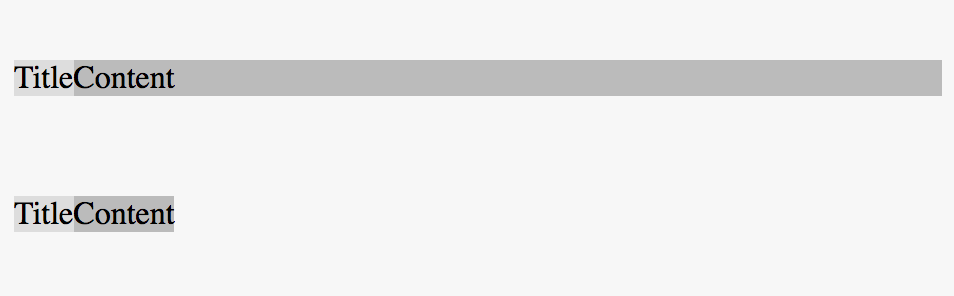
我怎样才能更改我的CSS,以便第二个容器像第一个容器一样占据整个可用宽度?
3 个答案:
答案 0 :(得分:2)
第一个容器表示流内块级元素。这些元件设计成垂直堆叠。这意味着它们占据了其父容器的整个宽度。
第二个容器代表绝对定位的元素(固定定位是绝对定位的一种形式)。这意味着元素不流动,不占用任何空间。
与流内块级元素不同,绝对定位元素不是设计为垂直堆叠。所以没有自动全宽。绝对定位元素的默认宽度和高度取决于其内容。要覆盖默认大小,请设置自己的长度。
&#13;
&#13;
&#13;
&#13;
.container {
  display: flex;
  background-color: #ddd;
  margin-top: 50px;
}

.fixed {
  position: fixed;
  width: 100%; /* new */
  /* alternatively, you can use left: 0 and right: 0 */
}

.content {
  background-color: #bbb;
  flex-grow: 1;
}
<div class="container">
<div>Title</div>
<div class="content">Content</div>
</div>
<div class="container fixed">
<div>Title</div>
<div class="content">Content</div>
</div>
答案 1 :(得分:2)
为什么?已由Michael_B
回答......它已经不合时宜了......
您还可以执行的操作是调整左右坐标中fixed元素的大小而不是width:100%;,这通常是一个麻烦制造者而不是有用的。
如果它是身体的直接孩子,它也可以继承边缘。
.container {
  display: flex;
  background-color: #ddd;
  margin-top: 50px;
}

.fixed {
  position: fixed;
  left:0;
  right:0;
  margin-left:inherit;
  margin-right:inherit;
}

.content {
  background-color: #bbb;
  flex-grow: 1;
}
<div class="container">
<div>Title</div>
<div class="content">Content</div>
</div>
<div class="container fixed">
<div>Title</div>
<div class="content">Content</div>
</div>
答案 2 :(得分:0)
您必须添加width: 100%;,否则宽度将与元素的内容一样宽。
此外,您应添加html, body { margin: 0; }以避免默认边距。
顺便说一句:这与display: flex无关,只与position: fixed有关...
html, body {
margin: 0;
}
.container {
  display: flex;
  background-color: #ddd;
  margin-top: 50px;
}

.fixed {
  position: fixed;
  width: 100%;
}

.content {
  background-color: #bbb;
  flex-grow: 1;
}
<div class="container">
<div>Title</div>
<div class="content">Content</div>
</div>
<div class="container fixed">
<div>Title</div>
<div class="content">Content</div>
</div>
相关问题
最新问题
- 我写了这段代码,但我无法理解我的错误
- 我无法从一个代码实例的列表中删除 None 值,但我可以在另一个实例中。为什么它适用于一个细分市场而不适用于另一个细分市场?
- 是否有可能使 loadstring 不可能等于打印?卢阿
- java中的random.expovariate()
- Appscript 通过会议在 Google 日历中发送电子邮件和创建活动
- 为什么我的 Onclick 箭头功能在 React 中不起作用?
- 在此代码中是否有使用“this”的替代方法?
- 在 SQL Server 和 PostgreSQL 上查询,我如何从第一个表获得第二个表的可视化
- 每千个数字得到
- 更新了城市边界 KML 文件的来源?