将所有HTML元素与同一行对齐
我有一张图片(我的平板电脑版输出):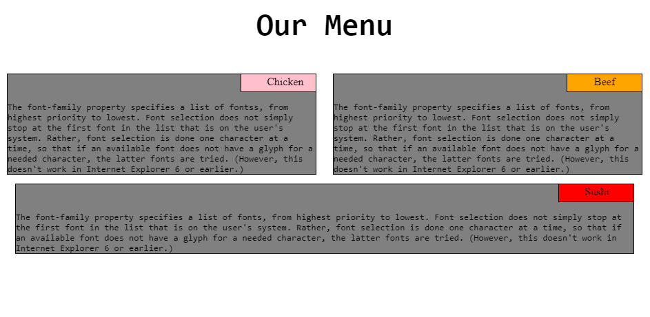
我想在同一行中对齐HTML的第三个元素。
当浮动到下一行时,第三个框在下一行中没有正确对齐,如上图所示
请告诉我代码中的错误。


* {
  box-sizing: border-box;
}

h1 {
  text-align: center;
  font-family: monospace;
  font-size: 45px;
  margin-bottom: 45px;
}

p {
  font-family: monospace;
  border: 1px solid black;
  width: 95%;
  margin-left: auto;
  margin-right: auto;
  background-color: gray;
  padding-top: 40px;
  margin-top: 0px;
}

div.Chicken {
  background-color: pink;
  padding: 2px 37px 5px 37px;
  position: absolute;
  right: 2.5%;
  border: 1px solid black;
  top: 0px;
  text-align: center;
  width: 110px;
}

div.Beef {
  background-color: orange;
  padding: 2px 37px 5px 37px;
  position: absolute;
  right: 2.5%;
  border: 1px solid black;
  top: 0px;
  text-align: center;
  width: 110px;
}

div.Sushi {
  background-color: red;
  padding: 2px 37px 5px 37px;
  text-align: center;
  position: absolute;
  right: 2.5%;
  border: 1px solid black;
  top: 0px;
  width: 110px;
}

footer {
  position: absolute;
  background-color: gray;
  width: 100%;
  bottom: 0px;
  text-align: center;
}


/*Desktop Version*/

@media(min-width: 992px) {
  .col-lg-1,
  .col-lg-2,
  .col-lg-3,
  .col-lg-4,
  .col-lg-5,
  .col-lg-6,
  .col-lg-7,
  .col-lg-8,
  .col-lg-9,
  .col-lg-10,
  .col-lg-11,
  .col-lg-12 {
    float: left;
    position: relative;
  }
  .col-lg-1 {
    width: 8.33%;
  }
  .col-lg-2 {
    width: 16.66%;
  }
  .col-lg-3 {
    width: 25%;
  }
  .col-lg-4 {
    width: 33.33%;
  }
  .col-lg-5 {
    width: 41.66%;
  }
  .col-lg-6 {
    width: 50%;
  }
  .col-lg-7 {
    width: 58.33%;
  }
  .col-lg-8 {
    width: 66.67%;
  }
  .col-lg-9 {
    width: 75%;
  }
  .col-lg-10 {
    width: 83.33%;
  }
  .col-lg-11 {
    width: 91.66%;
  }
  .col-lg-12 {
    width: 90%;
  }
}


/*Tablet Version*/

@media(min-width: 768px) and (max-width: 991px) {
  .col-md-1,
  .col-md-2,
  .col-md-3,
  .col-md-4,
  .col-md-5,
  .col-md-6,
  .col-md-7,
  .col-md-8,
  .col-md-9,
  .col-md-10,
  .col-md-11,
  .col-md-12 {
    float: left;
    position: relative;
  }
  .col-md-1 {
    width: 8.33%;
  }
  .col-md-2 {
    width: 16.66%;
  }
  .col-md-3 {
    width: 25%;
  }
  .col-md-4 {
    width: 33.33%;
  }
  .col-md-5 {
    width: 41.66%;
  }
  .col-md-6 {
    width: 50%;
  }
  .col-md-7 {
    width: 58.33%;
  }
  .col-md-8 {
    width: 66.67%;
  }
  .col-md-9 {
    width: 75%;
  }
  .col-md-10 {
    width: 83.33%;
  }
  .col-md-11 {
    width: 91.66%;
  }
  .col-md-12 {
    width: 100%;
    position: relative;
  }
}


/*Mobile Version*/

@media(max-width: 767px) {
  .col-sm-1,
  .col-sm-2,
  .col-sm-3,
  .col-sm-4,
  .col-sm-5,
  .col-sm-6,
  .col-sm-7,
  .col-sm-8,
  .col-sm-9,
  .col-sm-10,
  .col-sm-11,
  .col-sm-12 {
    float: left;
    position: relative;
  }
  .col-sm-1 {
    width: 8.33%;
  }
  .col-sm-2 {
    width: 16.66%;
  }
  .col-sm-3 {
    width: 25%;
  }
  .col-sm-4 {
    width: 33.33%;
  }
  .col-sm-5 {
    width: 41.66%;
  }
  .col-sm-6 {
    width: 50%;
  }
  .col-sm-7 {
    width: 58.33%;
  }
  .col-sm-8 {
    width: 66.67%;
  }
  .col-sm-9 {
    width: 75%;
  }
  .col-sm-10 {
    width: 83.33%;
  }
  .col-sm-11 {
    width: 91.66%;
  }
  .col-sm-12 {
    width: 100%;
  }
}
<!DOCTYPE html>
<html>
<head>
<meta charset="utf-8">
<meta http-equiv="X-UA-Compatible" content="IE=edge">
<meta name="viewport" content="width=device-width,initial-scale=1">
<title>Module 2 Assignment Coursera</title>
<link rel="stylesheet" type="text/css" href="css/styles.css">
</head>
<body>
<h1>Our Menu</h1>
<div class="col-lg-4 col-md-6 col-sm-12">
<div class="Chicken">Chicken</div>
<p>
The font-family property specifies a list of fontss, from highest priority to lowest. Font selection does not simply stop at the first font in the list that is on the user's system. Rather, font selection is done one character at a time, so that if an
available font does not have a glyph for a needed character, the latter fonts are tried. (However, this doesn't work in Internet Explorer 6 or earlier.)
</p>
</div>
<div class="col-lg-4 col-md-6 col-sm-12">
<div class="Beef">Beef</div>
<p>
The font-family property specifies a list of fonts, from highest priority to lowest. Font selection does not simply stop at the first font in the list that is on the user's system. Rather, font selection is done one character at a time, so that if an
available font does not have a glyph for a needed character, the latter fonts are tried. (However, this doesn't work in Internet Explorer 6 or earlier.)
</p>
</div>
<div class="col-lg-4 col-md-12 col-sm-12">
<div class="Sushi">Sushi</div>
<p>
The font-family property specifies a list of fonts, from highest priority to lowest. Font selection does not simply stop at the first font in the list that is on the user's system. Rather, font selection is done one character at a time, so that if an
available font does not have a glyph for a needed character, the latter fonts are tried. (However, this doesn't work in Internet Explorer 6 or earlier.)
</p>
</div>
</body>
</html>
我希望输出类似如下所示,其中所有元素都完美对齐。
平板电脑版的预期图片: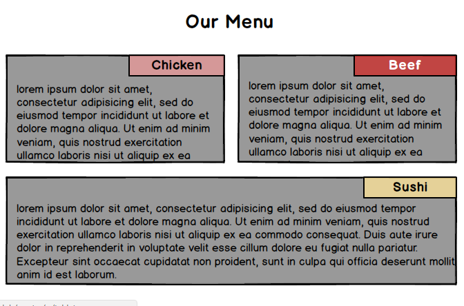
提前感谢您的关注。:)
1 个答案:
答案 0 :(得分:0)
而不是使用宽度使用margin-left和margin-right。将p更改为:
p {
    font-family: monospace;
    border: 1px solid black;
    background-color: gray;
    padding-top: 40px;
    margin-top: 0px;
    margin-left: 10px;
    margin-right: 10px;
}
然后你还需要更改div.sushi,div.Beef和div.Chicken中的右边,将标签放在右上角:
div.Sushi, div.Chicken, div.Beef {
    padding: 2px 37px 5px 37px;
    text-align: center;
    position: absolute;
    right: 10px;
    border: 1px solid black;
    top: 0px;
    width: 110px;
}
相关问题
最新问题
- 我写了这段代码,但我无法理解我的错误
- 我无法从一个代码实例的列表中删除 None 值,但我可以在另一个实例中。为什么它适用于一个细分市场而不适用于另一个细分市场?
- 是否有可能使 loadstring 不可能等于打印?卢阿
- java中的random.expovariate()
- Appscript 通过会议在 Google 日历中发送电子邮件和创建活动
- 为什么我的 Onclick 箭头功能在 React 中不起作用?
- 在此代码中是否有使用“this”的替代方法?
- 在 SQL Server 和 PostgreSQL 上查询,我如何从第一个表获得第二个表的可视化
- 每千个数字得到
- 更新了城市边界 KML 文件的来源?