填充改变布局两个div并排
我想并排制作div,我可以实现这个但是当我添加som margin或padding它们可以打扰布局时,我只想要两个div并排显示padding和margin属性。
#center{

    	width:100%;
    	border:1px solid gray;
    	overflow:hidden;
    	display:inline-block;
    	}
    #leftdiv{
    height:200px;
    width:50%;
    background-color:gray;
    float:left;
    margin:2px;
    }

    #rightdiv{
    height:200px;
    width:50%;
    background-color:yellow;
    float:left;
    margin:2px;
    }
<div id="center">
<div id="leftdiv"></div>
<div id="rightdiv"></div>
</div>
6 个答案:
答案 0 :(得分:1)
只需添加
 #rightdiv,#leftdiv{
 box-sizing:border-box;
}
答案 1 :(得分:1)
要在padding上使用<div>,您可以将box-sizing属性设置为border-box,以便padding中包含width <div>的。{但是margin更难以包含在width中,因为它位于框外。因此,您必须计算margin上的width(请参阅#leftdiv上的示例):
#center{
  width:100%;
  border:1px solid gray;
  overflow:hidden;
  display:inline-block;
}
#leftdiv{
  height:200px;
  width:calc(50% - 20px); /** 20px = sum of margin left and right */
  background-color:gray;
  float:left;
  padding:10px;
  margin-right:20px;
  box-sizing:border-box;
}
#rightdiv{
  height:200px;
  width:50%;
  background-color:yellow;
  float:left;
  padding:10px;
  box-sizing:border-box;
}
<div id="center">
<div id="leftdiv"></div>
<div id="rightdiv"></div>
</div>
border-box :
width和height属性包含内容,填充和边框,,但不包括margin即可。content-box :这是CSS标准指定的初始值和默认值。测量宽度和高度属性仅包括内容,但不包括填充,边框或边距。
来源: https://developer.mozilla.org/en-US/docs/Web/CSS/box-sizing#Values
您可以在Chrome开发者工具上看到该框模型:
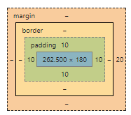
在那里,您可以看到margin周围的border。 width和height的计算结算时间为border,不包括margin。
答案 2 :(得分:0)
您将不得不从块
更改其显示类型和css是:
  #center{
   width:100%;
   border:1px solid gray;
   overflow:hidden;
   display:inline-block;
  }
  #leftdiv{
  height:200px;
  width:50%;
  background-color:gray;
  float:left;
  margin:2px;
  display: inline-block;
  }

  #rightdiv{
   height:200px;
   width:50%;
   background-color:yellow;
   float:left;
   display: inline-block;
   margin:2px;
  }
这应该允许他们并排回应并对齐。
答案 3 :(得分:0)
margin将(空格)应用于boxmodel的外部。
padding将(空格)应用于boxmodel的内部 - 与box-sizing: border-box;结合使用以抵消影响元素继承高度和宽度的额外填充。
在对齐的情况下,在这种情况下,您可以选择一些选项:
#center {
  width: 100%;
  border: 1px solid gray;
  overflow: hidden;
}

.inline-div {
  height: 200px;
  width: 48%;
  display: inline-block;
  margin: 2px;
}

.float-left {
  float: left;
}

.float-right {
  float: right;
}

.flex-wrapper {
    display: flex;
    justify-content: space-between;
}

.flex-wrapper .inline-div {
    flex: 1;
}

#leftdiv {
  background-color: gray;
}

#rightdiv {
  background-color: yellow;
}
<h1>Inline</h1>
<div id="center">
<div id="leftdiv" class="inline-div"></div>
<div id="rightdiv" class="inline-div"></div>
</div>
<h1>Float</h1>
<div id="center">
<div id="leftdiv" class="inline-div float-left"></div>
<div id="rightdiv" class="inline-div float-right"></div>
</div>
<h1>Flex</h1>
<div id="center" class="flex-wrapper">
<div id="leftdiv" class="inline-div"></div>
<div id="rightdiv" class="inline-div"></div>
</div>
答案 4 :(得分:0)
让我们先来看看#center的css。您将宽度设置为100%,边框设置为1px(左侧为1px,右侧为1px),这意味着实际宽度将为100%+ 2px,这可能不是您想要的。要解决此问题,您可以使用box-sizing:border-box;或宽度:计算(100% - 2px)。你也可能不需要&#34;溢出:隐藏&#34;和&#34;显示:内联块&#34;
盒子大小是非常有用的属性。您可以在此处阅读更多内容:https://www.w3schools.com/cssref/css3_pr_box-sizing.asp
#center {                                   #center {
    width:100%;                                 width:calc(100% - 2px);
    box-sizing:border-box;       or             border:1px solid gray;
    border:1px solid gray;                  }
}
然后,为了让2个孩子并排,你可以像你一样使用flex布局或浮动布局,但你再次假设&#34;宽度:50%&#34;实际上没有边距,所以实际宽度将是50%+ 4px(2px左+ 2px右)边距。为了解决这个问题,你可以再次使用calc();
#leftdiv {                              #rightdiv {
    height:200px;                           height:200px;
    width:calc(50% - 4px);                  width:calc(50% - 4px);
    background-color:gray;                  background-color:gray;
    float:left;                             float:right;
    margin:2px;                             margin:2px;
}
还要记住,因为子元素是浮动的,所以父元素的高度为0.为了使父元素包装其子元素,你必须设置一些#center元素的高度(在你的情况下是204px) ,200px为儿童和4px为其边际)或使用以下css这样做。 css将在两个子节点之后添加空块元素(因为它具有propeerty&#34; clear&#34;)并且因为它是块元素,所以父节点将扩展。
#center:after {
    content:"";
    display:block;
    clear:both;
}
答案 5 :(得分:0)
首先,你必须在100%宽度范围内将其除以我所做的保证金!
#center{

    	width:100%;
    	border:1px solid gray;
    	overflow:hidden;
    	display:inline-block;
    	}
    #leftdiv{
    height:200px;
    width:48.5%;
    background-color:gray;
    float:left;
    margin:1%;
	margin-right:0px;
    }

    #rightdiv{
    height:200px;
    width:48.5%;
    background-color:yellow;
    float:left;
    margin:1%;
    }
<div id="center">
<div id="leftdiv"></div>
<div id="rightdiv"></div>
</div>
- 我写了这段代码,但我无法理解我的错误
- 我无法从一个代码实例的列表中删除 None 值,但我可以在另一个实例中。为什么它适用于一个细分市场而不适用于另一个细分市场?
- 是否有可能使 loadstring 不可能等于打印?卢阿
- java中的random.expovariate()
- Appscript 通过会议在 Google 日历中发送电子邮件和创建活动
- 为什么我的 Onclick 箭头功能在 React 中不起作用?
- 在此代码中是否有使用“this”的替代方法?
- 在 SQL Server 和 PostgreSQL 上查询,我如何从第一个表获得第二个表的可视化
- 每千个数字得到
- 更新了城市边界 KML 文件的来源?