如何修复此弹性框垂直对齐问题?
我正在使用Materialize框架。它工作得很好,但我想让所有的页面都填满窗口(使用最小高度)。这似乎搞砸了元素的垂直对齐。
这是我正在使用的CSS代码:
.valign-wrapper {
  display: -webkit-flex;
  display: -ms-flexbox;
  display: flex;
  -webkit-align-items: center;
      -ms-flex-align: center;
          align-items: center;
}
这就是我用来调整元素大小的方法,以便填充窗口。
function resize() {
    var heights = window.innerHeight;
    $(".fill-container").each(function () {
        $(this).css("min-height", heights + "px");
    });
}
resize();
window.onresize = function () {
    resize();
};
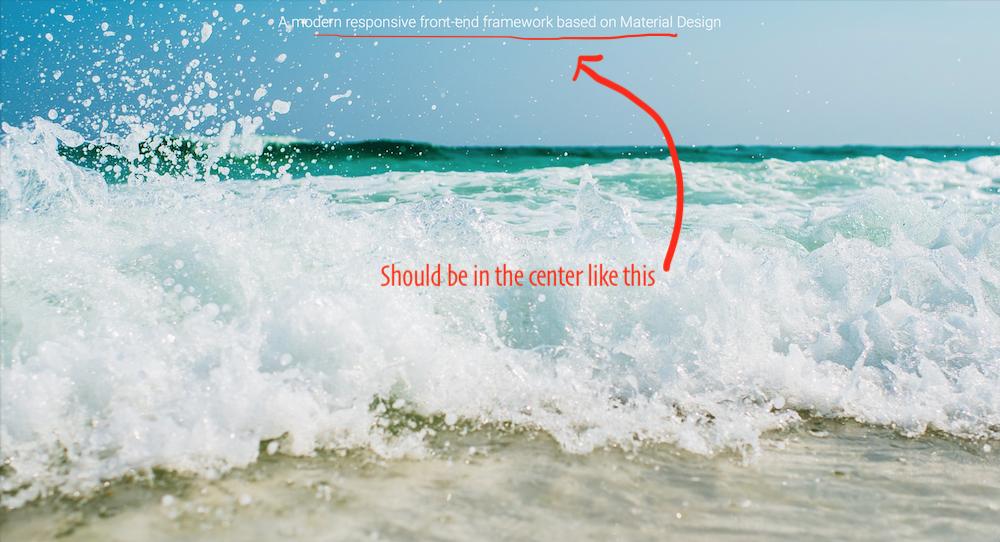
这是一个我希望在保持垂直对齐的同时匹配窗口高度的示例(它处于水平位置):
<div class="parallax-container valign-wrapper">
    <div class="section no-pad-bot">
        <div class="container fill-container">
            <div class="row center">
                <h5 class="header col s12 light">A modern responsive front-end framework based on Material Design</h5>
            </div>
        </div>
    </div>
    <div class="parallax"><img src="img/background3.jpg" alt="Unsplashed background img 3"></div>
</div>
所以问题是是否有一个使用弹性盒子的好方法?如果没有,那么如何在 Flexbox中心文本之前让容器调整的大小?
此外,这是调用resize()时的样子,因此您可以看到问题:
2 个答案:
答案 0 :(得分:1)
我认为有很多方法可以解决这个问题。但您可以使用CSS来应用min-height: 100vh。我只是把它放在.valign-wrapper上,它将使孩子居中,其中包含.fill-container。同时将justify-content: center应用于水平居中(根据您的屏幕截图)
.valign-wrapper {
  display: -webkit-flex;
  display: -ms-flexbox;
  display: flex;
  -webkit-align-items: center;
      -ms-flex-align: center;
          align-items: center;
  justify-content: center;
  min-height: 100vh;
}
<link href="https://cdnjs.cloudflare.com/ajax/libs/materialize/0.98.2/css/materialize.min.css" rel="stylesheet"/>
<div class="parallax-container valign-wrapper">
<div class="section no-pad-bot">
<div class="container fill-container">
<div class="row center">
<h5 class="header col s12 light">A modern responsive front-end framework based on Material Design</h5>
</div>
</div>
</div>
<div class="parallax"><img src="img/background3.jpg" alt="Unsplashed background img 3"></div>
</div>
答案 1 :(得分:0)
如果您知道页面高度,我认为可以添加简单的解决方案:
$("h5").css("line-height", heights + "px");
我认为它会起作用。 :)
相关问题
最新问题
- 我写了这段代码,但我无法理解我的错误
- 我无法从一个代码实例的列表中删除 None 值,但我可以在另一个实例中。为什么它适用于一个细分市场而不适用于另一个细分市场?
- 是否有可能使 loadstring 不可能等于打印?卢阿
- java中的random.expovariate()
- Appscript 通过会议在 Google 日历中发送电子邮件和创建活动
- 为什么我的 Onclick 箭头功能在 React 中不起作用?
- 在此代码中是否有使用“this”的替代方法?
- 在 SQL Server 和 PostgreSQL 上查询,我如何从第一个表获得第二个表的可视化
- 每千个数字得到
- 更新了城市边界 KML 文件的来源?