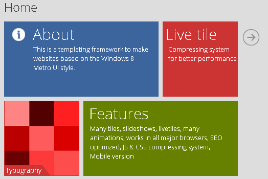
我想创建一个带有平铺布局的网站,类似于新的Windows风格。 https://dab1nmslvvntp.cloudfront.net/wp-content/uploads/jquery4u/2013/03/metro-template.png< - 有点像这样,除了在我的情况下:
我已经完成了这个,但问题是:按钮似乎取决于文本长度。
我已经在css档案中为他们分配了一个绝对的位置,但他们不会留下来。
如果图块中的文字较长,则它们会一直移动到瓷砖边框之外/之外,这是他们不应该超越的。这完全是一团糟。我已经尝试了一切,但我找不到解决方案。我希望你们可以看看,也许看看我错过了什么?这是我的CSS代码:
.box {
    width: 200px;
    height: 200px;
    margin: 2px;
    color: whitesmoke;
    float: left;
    padding: 7px;
}


.center-box-content {
    display: flex;
    align-items: center;
    justify-content: center;
    flex-direction: column;

    position: relative;
    top: 50%;
    left: 50%;
    transform: translate(-50%, -50%);
}


.lower-right-box-content {
    position: absolute;
    float: right;
    padding: 2px;
    bottom: -60px;
    right: -5px;
}

.red-box {
    background-color: indianred;
}

.blue-box {
    background-color: deepskyblue;
}

.green-box {
    background-color: mediumseagreen;

}
这是我的HTML代码:( PHP位只读出数据库中的文本,即事件名称,事件描述和事件日期)
 <!--the entire square tile -->
 <div class="box red-box" height="100%" width="100%">
      <!--this centers the text within the tile -->
      <div class="center-box-content">
      <!--echo the name -->
      <b><?php echo $row["title"]; ?></b>

      <!--echo the description -->
      <?php echo $row["description"]; ?>

      <br> • <!--echo the date -->
      <?php echo $row["date"]; ?> •

          <!--edit and delete button in the lower right corner of the tile -->
          <!--this is the part that keeps moving as the text gets longer -->
          <div class="lower-right-box-content">
               Upcoming Events <span style="display:inline-block; width: 20px;"></span>
               <a href="#">
                <span class="glyphicon glyphicon-pencil glyphicon-pencil" role="button"> </span>
                </a>

                <a href="deleteevent.php?id=<?php echo $row["eventid"];?>">
                <span class="glyphicon glyphicon-trash glyphicon-trash" role="button"></span>
                </span>

                </a>
           </div>


       </div>
</div>
    <?php };
        ?>
答案 0 :(得分:0)
理想的管理方式&#34; box&#34;今天我们使用网格。 6列网格的一个示例css:
body {
  font-family: 'Ariel', sans-serif;
  font-weight: 100;
  font-size: 1em;
  color: #faf3bc;
  background-color: #0976B2;
}

.grid_1 { width: 15.625%; } /* 125px/800px = 15.625% */
.grid_2 { width: 32.5%; } /* 260px/800px = 32.5% */
.grid_3 { width: 49.375%; } /* 395px/800px = 49.375% */
.grid_4 { width: 65.625%; } /* 525px/800px = 65.625% */
.grid_5 { width: 83.125%; } /* 665px/800px = 83.125% */
.grid_6 { width: 100%; } /* 800px/800px = 100% */

.grid_1,
.grid_2,
.grid_3,
.grid_4,
.grid_5,
.grid_6 {
  /* margin-right: 1.25%; */
  float: left;
  display: block;
}
.last {margin-right:0; }

.container{
  clear:both;
  width: 90%;
  max-width: 800px;
  padding: 0% 0;
  margin: auto;
}
img {
  max-width: 100%;
}
h1 {
  color: #ffffff;
}

a:link {color:#b4c34f; text-decoration:none;}      /* unvisited link */
a:visited {color:#b4c34f; text-decoration:none;}  /* visited link */
a:hover {color:#faf3bc; text-decoration:underline;}  /* mouse over link */
a:active {color:#b4c34f; text-decoration:none;}  /* selected link */

a.selected {color:#ffffff;}  /* selected link */

ul {
  list-style-type:none;
}

.form-input {
  height: 30px;
}
   @media screen and (max-width : 705px) {
.grid_1,
.grid_2,
.grid_3,
.grid_4,
.grid_5,
.grid_6 {
  width: 100%;
}}
HTML for 3&#34; box&#34;原始:
<div class='grid_2'>
</div>
<div class='grid_2'>
</div>
<div class='grid_2 last'>
</div>
HTML for 2&#34; box&#34;原始:
<div class='grid_3'>
</div>
<div class='grid_3 last'>
</div>
也许你需要更多网格列,继续学习响应式网页设计。
答案 1 :(得分:0)
这些绝对定位元素的直接父项是正方形吗?它应该是,并且它需要position: relative才能使绝对位置起作用。
从这些元素中删除float - 对于绝对定位的元素没有意义。
答案 2 :(得分:0)
您需要将.lower-right-box-content设置为position:relative,然后将按钮置于绝对位置。
 <div class="lower-right-box-content">
    <div style="display:inline-block;margin-right:40px;text-align:justify;">  Upcoming Events longggg text does not matter </div>
         <a href="#">
            <span class="glyphicon glyphicon-pencil glyphicon-pencil" role="button" style='position:absolute;bottom:10px;right:5px;'> </span>
         </a>

          <a href="deleteevent.php?id=<?php echo $row["eventid"];?>">
           <span class="glyphicon glyphicon-trash glyphicon-trash" role="button" style="position:absolute;bottom:10px;right:20px;">
           </span>
          </a
       </div>
</div>
为了清晰起见,我使用了内联样式。请使用适当的选择器更新样式表中的样式。
答案 3 :(得分:0)
div。position: relative添加到框中。position: absolute将文字和按钮放在底部。
.box {
  width: 200px;
  height: 200px;
  margin: 2px;
  color: whitesmoke;
  float: left;
  display: flex;
  align-items: center;
  justify-content: center;
  flex-direction: column;
  position: relative;
}

.center-box-content {
  text-align: center;
}

.upcoming {
  position: absolute;
  bottom: 0;
  text-align: center;
  left: 0;
  right: 0;
  padding: 0 30px; /* ensure the text clears the buttons */
}

.buttons {
  position: absolute;
  bottom: 0;
  right: 0;
}

.red-box {
  background-color: indianred;
}

.blue-box {
  background-color: deepskyblue;
}

.green-box {
  background-color: mediumseagreen;
}
<link href="//netdna.bootstrapcdn.com/bootstrap/3.0.0/css/bootstrap.min.css" rel="stylesheet"/>
<div class="box red-box">
<div class="center-box-content">
<b>Name</b>
<br>Description
<br> • Date •
</div>
<div class="lower-right-box-content">
<span class="upcoming">Upcoming events</span>
<div class="buttons">
<a href="#">
<span class="glyphicon glyphicon-pencil glyphicon-pencil" role="button"></span>
</a>
<a href="#">
<span class="glyphicon glyphicon-trash glyphicon-trash" role="button"></span>
</a>
</div>
</div>
</div>
<div class="box red-box">
<div class="center-box-content">
<b>Name</b>
<br>Description
<br> • Date •
</div>
<div class="lower-right-box-content">
<span class="upcoming">Upcoming events events events</span>
<div class="buttons">
<a href="#">
<span class="glyphicon glyphicon-pencil glyphicon-pencil" role="button"></span>
</a>
<a href="#">
<span class="glyphicon glyphicon-trash glyphicon-trash" role="button"></span>
</a>
</div>
</div>
</div>