跨越SVG线的线性渐变
我想知道是否有可能使线性线across (from top to bottom)成为线,而下面的例子中渐变为along (from left to right)线。
<svg xmlns="http://www.w3.org/2000/svg" version="1">
<defs>
    <linearGradient id="e" x1="40" y1="210" x2="460" y2="210" gradientUnits="userSpaceOnUse">
        <stop stop-color="steelblue" offset="0" />
        <stop stop-color="red" offset="1" />
    </linearGradient>
</defs>
 <line x1="40" y1="210" x2="460" y2="210" stroke="url(#e)" stroke-width="30" />
</svg>

更改y坐标可以很好地适应未旋转的线条,linearGradient现在可以穿过(从上到下)线条:
<svg xmlns="http://www.w3.org/2000/svg" version="1">
<defs>
    <linearGradient id="e" x1="40" y1="195" x2="40" y2="225" gradientUnits="userSpaceOnUse">
        <stop stop-color="steelblue" offset="0" />
        <stop stop-color="red" offset="1" />
    </linearGradient>
</defs>
 <line x1="40" y1="210" x2="460" y2="210" stroke="url(#e)" stroke-width="30"/>
</svg>

但不适用于旋转:
<svg xmlns="http://www.w3.org/2000/svg" version="1">
<defs>
    <linearGradient id="e" x1="40" y1="235" x2="40" y2="265" gradientUnits="userSpaceOnUse">
        <stop stop-color="steelblue" offset="0" />
        <stop stop-color="red" offset="1" />
    </linearGradient>
</defs>
 <line x1="40" y1="210" x2="460" y2="290" stroke="url(#e)" stroke-width="30"/>
</svg>
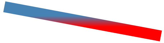
我想要的是旋转的线,其上有层叠渐变。
像这样的Smth:
2 个答案:
答案 0 :(得分:2)
你的意思是旋转渐变?然后使用gradientTransform
<svg xmlns="http://www.w3.org/2000/svg" version="1">
<defs>
    <linearGradient id="e" x1="40" y1="210" x2="460" y2="210" gradientUnits="userSpaceOnUse" gradientTransform="rotate(90)">
        <stop stop-color="steelblue" offset="0" />
        <stop stop-color="red" offset="1" />
    </linearGradient>
</defs>
 <line x1="40" y1="210" x2="460" y2="210" stroke="url(#e)" stroke-width="30" />
</svg>
答案 1 :(得分:2)
<svg width="600" height="200" viewBox="0 190 600 200" xmlns="http://www.w3.org/2000/svg" version="1">
<defs>
    <linearGradient id="e" x1="40" y1="210" x2="460" y2="290" gradientUnits="userSpaceOnUse">
        <stop stop-color="steelblue" offset="0" />
        <stop stop-color="red" offset="1" />
    </linearGradient>
</defs>
 <line x1="40" y1="210" x2="460" y2="290" stroke="url(#e)" stroke-width="30"/>
</svg>
第一种情况的技巧是使直线的x1 y1,x2 y2与线性渐变的x1 y1,x2 y2坐标相匹配。 对于第二种情况,它在数学上涉及更多。 您必须创建一条与第一条垂直的线,并且该线的长度应为所需线的宽度,并且还必须从其中一个点的宽度的一半开始。
所以在您的情况下(用伪代码!):
步骤1:
获取方向
   dx=x2-x1;
   dy=y2-y1;
dx,dy现在是从点1到点2的方向
步骤2:
通过将dx和dy除以线的长度来将方向标准化为长度1。
    len=Math.sqrt(dx*dx+dy*dy);
    dx=dx/len;
    dy=dy/len;
当然,如果len = 0,这是行不通的,但是因为您给了我一些帮助,所以我现在不必担心。
步骤3:
找到垂直方向。这实际上很容易,但是从逻辑上讲可以是两个方向。我只选一个。
    temp=dx;
    dx=-dy;
    dy=temp;
如果您需要其他方向,只需取消dx和dy。经过这个过程。
    dx=-dx;
    dy=-dy;
dx,dy现在保持垂直方向。
步骤4:
将dx和dy乘以所需的线宽(在您的情况下为30)。我将其称为w。
    dx=w*dx;
    dy=w*dy;
步骤5:
要找到渐变的p1和p2,请从直线上取p1,然后将dx加或减一半。
    gradient_x1=x1+dx*0.5;
    gradient_y1=y1+dx*0.5;
    gradient_x2=x1-dx*0.5;
    gradient_y2=y1-dx*0.5;
现在您可以重新建立阵容。
为了向您展示我的意思,我已经插入了您的价值观并做了整件事,我明白了:
    Your case: (x1="40" y1="210" x2="460" y2="290" w=30)

    ## STEP1 ##
    dx: 420 dy:80

    ## STEP2 ##
    dx: 0.9823385664224747 dy:0.1871121078899952

    ## STEP3 ##
    dx: -0.1871121078899952 dy:0.9823385664224747

    ## STEP4 ##
    dx: -5.613363236699856 dy:29.47015699267424

    ## STEP5 ##
    gradient_x1=37.19331838165007
    gradient_y1=224.7350784963371

    gradient_x2=42.80668161834993
    gradient_y2=195.2649215036629
因此请在您的示例中插入该插件:
<svg width="600" height="200" viewBox="0 190 600 200" xmlns="http://www.w3.org/2000/svg" version="1">
<defs>
    <linearGradient id="e" x1="37.19331838165007" y1="224.7350784963371" x2="42.80668161834993" y2="195.2649215036629" gradientUnits="userSpaceOnUse">
        <stop stop-color="steelblue" offset="0" />
        <stop stop-color="red" offset="1" />
    </linearGradient>
</defs>
 <line x1="40" y1="210" x2="460" y2="290" stroke="url(#e)" stroke-width="30"/>
</svg>
总结
幸运的是,由于我们拥有一台计算机,而svg元素可以很容易地用javascript操作,因此我们根本不必进行所有这些计算。 要使用javascript来访问svg中的元素,最方便的是使用ID。 您的渐变有一个id =“ e”,让我们给它加上id =“ l”。
之后就是在页面中插入一个小脚本的问题 取直线(“ l”)中的x1 y1,x2 y2并计算所有内容并将其放入渐变(“ e”)中,您将得到:
<svg width="600" height="200" viewBox="0 190 600 200" xmlns="http://www.w3.org/2000/svg" version="1">
  <defs>
    <linearGradient id="e" x1="0" y1="0" x2="1" y2="1" gradientUnits="userSpaceOnUse">
    <!-- put the coords on 0,0 1,1 it really doesn't matter, they will be calculated-->
      <stop stop-color="steelblue" offset="0" />
      <stop stop-color="red" offset="1" />
  </linearGradient>
  </defs>
  <line id="l" x1="40" y1="270" x2="450" y2="210" stroke="url(#e)" stroke-width="30"/>
</svg>

<script>
  var line=document.getElementById("l");
  var x1=parseFloat(l.getAttribute("x1"));
  var y1=parseFloat(l.getAttribute("y1"));
  var x2=parseFloat(l.getAttribute("x2"));
  var y2=parseFloat(l.getAttribute("y2"));
  var w=parseFloat(l.getAttribute("stroke-width"));

  // step 1
  var dx=x2-x1;
  var dy=y2-y1;

  // step 2
  len=Math.sqrt(dx*dx+dy*dy);
  dx=dx/len;
  dy=dy/len;

  // step 3
  var temp=dx;
  dx=-dy;
  dy=temp;

  //step 4
  dx=w*dx;
  dy=w*dy;

  //step 5
  var gradient_x1=x1+dx*0.5;
  var gradient_y1=y1+dy*0.5;
  var gradient_x2=x1-dx*0.5;
  var gradient_y2=y1-dy*0.5;

  document.getElementById("e");
  e.setAttribute("x1",gradient_x1);
  e.setAttribute("y1",gradient_y1);
  e.setAttribute("x2",gradient_x2);
  e.setAttribute("y2",gradient_y2);
</script>
您可以自由地编辑线条的起点和终点,甚至是笔划宽度,该脚本都可以即时修改渐变。为了向您“证明”这一点,这正是我所做的。 :) 希望这会有所帮助。
- 我写了这段代码,但我无法理解我的错误
- 我无法从一个代码实例的列表中删除 None 值,但我可以在另一个实例中。为什么它适用于一个细分市场而不适用于另一个细分市场?
- 是否有可能使 loadstring 不可能等于打印?卢阿
- java中的random.expovariate()
- Appscript 通过会议在 Google 日历中发送电子邮件和创建活动
- 为什么我的 Onclick 箭头功能在 React 中不起作用?
- 在此代码中是否有使用“this”的替代方法?
- 在 SQL Server 和 PostgreSQL 上查询,我如何从第一个表获得第二个表的可视化
- 每千个数字得到
- 更新了城市边界 KML 文件的来源?