添加任何东西覆盖背景图像与新的白色背景
我正在使用codepen并遇到一个问题,其中任何新元素会覆盖(或更准确地说,“移植到”)我的标题。我仔细检查了一些简单的事情,比如不关闭行div等等但是没有用。此外,新元素将在我的html背景上显示白色背景,当我尝试使用rgba来改变不透明度时,它对任何事情都没有帮助。
所以, 1.如何从标题行中“取消链接”后续元素? 2.如何防止后续元素的背景(明显地)覆盖html背景?
这是codepen
HTML
<link href="css/bootstrap.css" rel="stylesheet"type="text/css"/>

<html>
 <head class="row">
   <div class="col-md-4 top-bar top-bar-left">
     <a href="http://codepen.io/Wolves0fTomorrow/" target="_blank">IH</a>
   </div>
   <div class="col-md-4 top-bar top-bar-mid text-center">
     <p>Isaak Hyde Web Design</p>
   </div>
   <div class="col-md-4 top-bar top-bar-right">
     <a href="#"target="_blank">Bio</a>
     <a href="#"target="_blank">Projects</a>
     <a href="#"target="_blank">Contact</a>
   </div>
   </div>
 </head>
 <body>
   <div class="row bio-info">
   </div>
 </body>
</html>
CSS
html {
  background: url(http://www.pixelstalk.net/wp-
content/uploads/2016/04/Black-     background-wallpapers-pattern-light-
texture.jpg) no-repeat center center fixed;
  -webkit-background-size: cover;
  -moz-background-size: cover;
  -o-background-size: cover;
  background-size: cover;
}
.top-bar{
  font-family: Georgia;
  color: blue;
  background: gold;
  border-radius: 50px;
}
.top-bar-left {
  font-size: 24px;
  padding: 5px 0px 0px 30px;
}
.top-bar-mid {
  font-size: 30px;
  padding: 5px 0px 1px 0px;
}
.top-bar-right {
  font-size: 24px;
  padding: 5px 0px 0px 190px;
  word-spacing: 0.5em;
}
.bio-info {
  margin-top: 50px;
}'
.bio-info的内容只是为了说明我的意思。感谢您的任何帮助。
3 个答案:
答案 0 :(得分:0)
您正在将header与head混合,您在body标记之外有一个标题,其中有一个多余的结束</div>以及其他一些基本错误< / p>
以下是更正后的版本:
答案 1 :(得分:0)
你的基础知识对于html和bootstrap都是错误的。
首先<html>按顺序包含<head>和<body>。你把<header>放在了身体而不是`。
在引导程序中,您始终将.row括在.container中。因为.row具有负边距,如果不将其括在.container中,则会使内容流出用户屏幕并显示水平条。
这是一个有效的fiddle。
&#13;
&#13;
&#13;
&#13;
html,body{
  background: url(http://www.pixelstalk.net/wp-content/uploads/2016/04/Black-background-wallpapers-pattern-light-texture.jpg) no-repeat center center fixed;
  -webkit-background-size: cover;
  -moz-background-size: cover;
  -o-background-size: cover;
  background-size: cover;
}
.top-bar{
  font-family: Georgia;
  color: blue;
  background: gold;
  border-radius: 50px;
}
.top-bar-left {
  font-size: 24px;
  padding: 5px 0px 0px 30px;
}
.top-bar-mid {
  font-size: 30px;
  padding: 5px 0px 1px 0px;
}
.top-bar-right {
  font-size: 24px;
  padding: 5px 0px 0px 190px;
  word-spacing: 0.5em;
}
.bio-info {
  margin-top: 50px;
  color:white;
}
.container,.row{
  background:transparent;
}
.container{
  width:100%;
  margin:0;
}
<link href="https://maxcdn.bootstrapcdn.com/bootstrap/3.3.7/css/bootstrap.min.css" rel="stylesheet"/>
<!DOCTYPE html>
<html>
<head>
</head>
<body>
<div class="container">
<div class="row">
<div class="col-md-4 top-bar top-bar-left">
<a href="http://codepen.io/Wolves0fTomorrow/" target="_blank">IH</a>
</div>
<div class="col-md-4 top-bar top-bar-mid text-center">
<p>Isaak Hyde Web Design</p>
</div>
<div class="col-md-4 top-bar top-bar-right">
<a href="#"target="_blank">Bio</a>
<a href="#"target="_blank">Projects</a>
<a href="#"target="_blank">Contact</a>
</div>
</div>
</div>
<div class="container bio-info">
<h1>See this works</h1>
</div>
</body>
</html>
答案 2 :(得分:0)
许多调整,将所有内容都包含在内,将head切换为header,因为第一个用于元标记,样式表,title等,添加了container-fluid到header row。为您的height组件添加了固定的header,并为垂直居中的文本添加了line-height。
在col-md视口中将是:
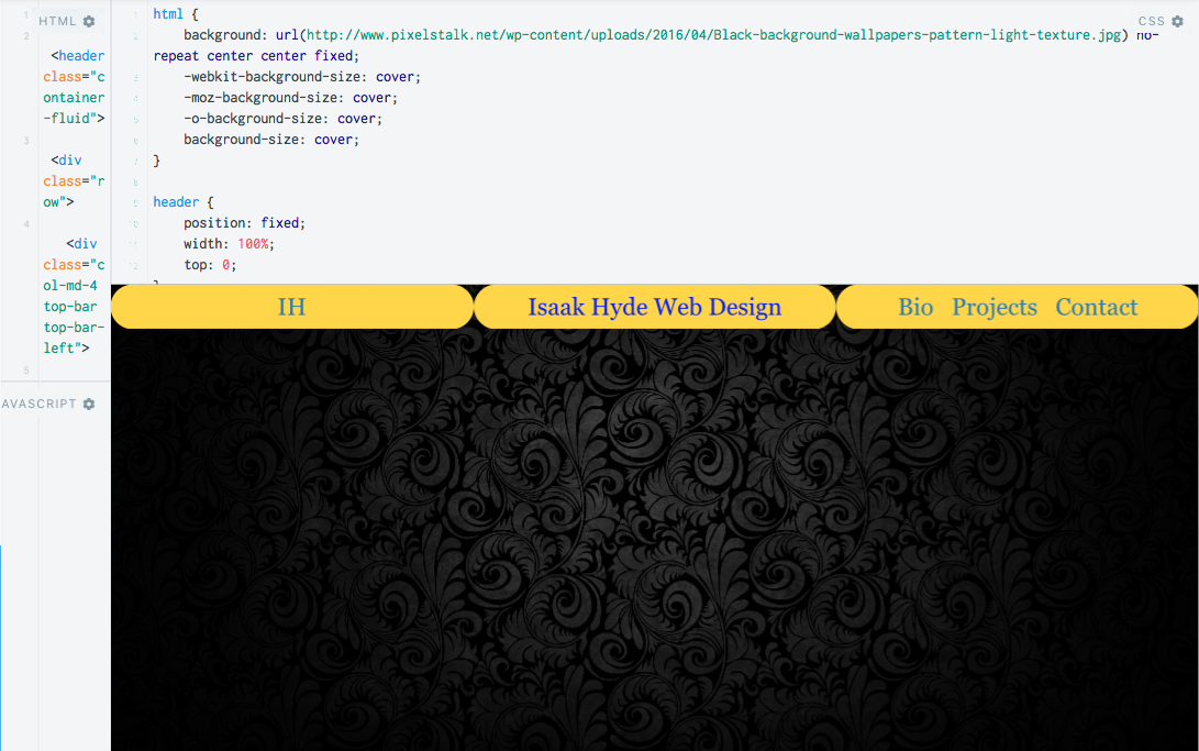
以下片段:(external JSFiddle for resizing here)
&#13;
&#13;
&#13;
&#13;
html {
  background: url(http://www.pixelstalk.net/wp-content/uploads/2016/04/Black-background-wallpapers-pattern-light-texture.jpg) no-repeat center center fixed;
  -webkit-background-size: cover;
  -moz-background-size: cover;
  -o-background-size: cover;
  background-size: cover;
}
header {
  position: fixed;
  width: 100%;
}
.top-bar {
  font-family: Georgia;
  color: blue;
  background: gold;
  border-radius: 50px;
  text-align: center;
}
.top-bar-left {
  font-size: 22px;
  text-align: center;
  height: 41px;
  line-height: 41px;
  /* padding: 5px 0px 0px 30px; */
}
.top-bar-mid {
  font-size: 22px;
  height: 41px;
  line-height: 41px;
  /* padding: 5px 0px 1px 0px; */
}
.top-bar-right {
  font-size: 22px;
  line-height: 41px;
  height: 41px;
  /* padding: 5px 0px 0px 10px; */
  word-spacing: 0.5em;
}
.bio-info {
  /* margin-top: 50px; */
}
<link href="https://maxcdn.bootstrapcdn.com/bootstrap/3.3.7/css/bootstrap.min.css" rel="stylesheet" />
<body>
<header class="container-fluid">
<div class="row">
<div class="col-md-4 top-bar top-bar-left">
<a href="http://codepen.io/Wolves0fTomorrow/" target="_blank">IH</a>
</div>
<div class="col-md-4 top-bar top-bar-mid text-center">
<p>Isaak Hyde Web Design</p>
</div>
<div class="col-md-4 top-bar top-bar-right">
<a href="#" target="_blank">Bio</a>
<a href="#" target="_blank">Projects</a>
<a href="#" target="_blank">Contact</a>
</div>
</div>
</header>
<div class="row bio-info"></div>
</body>
相关问题
最新问题
- 我写了这段代码,但我无法理解我的错误
- 我无法从一个代码实例的列表中删除 None 值,但我可以在另一个实例中。为什么它适用于一个细分市场而不适用于另一个细分市场?
- 是否有可能使 loadstring 不可能等于打印?卢阿
- java中的random.expovariate()
- Appscript 通过会议在 Google 日历中发送电子邮件和创建活动
- 为什么我的 Onclick 箭头功能在 React 中不起作用?
- 在此代码中是否有使用“this”的替代方法?
- 在 SQL Server 和 PostgreSQL 上查询,我如何从第一个表获得第二个表的可视化
- 每千个数字得到
- 更新了城市边界 KML 文件的来源?