两列并排可滚动
我的页面看起来像这样
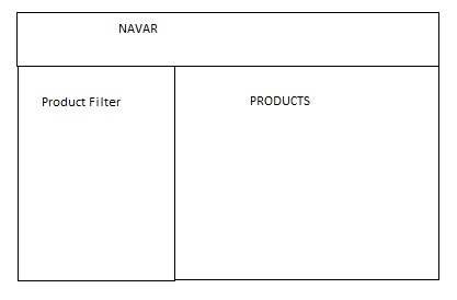
我有两个单独的div,一个是产品过滤器,另一个是产品div。产品内容可以显示40个产品或100个或没有,即内容可以稍后更改。同样,我有过滤器的长度可以我也希望以某种方式使过滤器div可滚动并使其高度取决于产品div的内容。
还有一件事,如果产品div有更多的内容并且过滤器高度小于产品div那么在向下滚动过滤器时应该保持直到滚动到达产品div的末尾。
例如,如果product div的高度为500 Px,则filter div的高度应为500px,任何溢出都应该是可滚动的。
我尝试了什么:
<div class="container">
<div class="row">
<div class="col-md-3"   style="margin-top:30px;overflow-y:scroll;height:100%">
</div>
<div class="col-md-9" >
</div>
</div>
</div>
这并没有为我提供预期的结果。我的方法是什么以及解决方案是什么?
我试图模仿YouTube的基本结构。
5 个答案:
答案 0 :(得分:1)
我从你的问题中看到你正在使用我不太熟悉的Bootstrap类,但是这里是使用CSS Flexbox模块和其他响应式CSS技术的解决方案的方法:
.container {
position: relative;
width: 98%;
}

.navbar {
height: 30px;
background-color:rgb(255,0,0);
}

.product-filter {
display:block;
position:absolute;
top:30px;
left:0;
width:20%;
height: calc(100% - 30px);
overflow-y: auto;
background-color:rgb(127,255,127);
}

.product-filter ul {
margin-left:0;
padding-left:0;
list-style:none;
}

.product-filter li {
display:block;
margin: 0 auto;
width:80%;
margin-bottom:6px;
padding:6px 0;
color:rgb(255,255,255);
font-weight:bold;
text-align:center;
background-color:rgb(0,163,0);
border:2px solid rgb(255,255,255);
}

.products {
display:flex;
flex-wrap: wrap;
justify-content:flex-start;
flex: 1 0 80%;
margin-left:20%;
background-color:rgb(255,255,0);
}

.product {
width:100px;
height:100px;
margin: 12px;
background-color:rgb(255,191,0);
}
<div class="container">
<div class="navbar"></div>
<div class="product-filter">
<ul>
<li>Item 1</li>
<li>Item 2</li>
<li>Item 3</li>
<li>Item 4</li>
<li>Item 5</li>
<li>Item 6</li>
<li>Item 7</li>
<li>Item 8</li>
<li>Item 9</li>
<li>Item 10</li>
<li>Item 11</li>
<li>Item 12</li>
<li>Item 13</li>
<li>Item 14</li>
<li>Item 15</li>
<li>Item 16</li>
<li>Item 17</li>
<li>Item 18</li>
<li>Item 19</li>
<li>Item 20</li>
<li>Item 21</li>
<li>Item 22</li>
<li>Item 23</li>
<li>Item 24</li>
<li>Item 25</li>
<li>Item 26</li>
<li>Item 27</li>
<li>Item 28</li>
<li>Item 29</li>
<li>Item 30</li>
<li>Item 31</li>
<li>Item 32</li>
<li>Item 33</li>
<li>Item 34</li>
<li>Item 35</li>
<li>Item 36</li>
<li>Item 37</li>
<li>Item 38</li>
<li>Item 39</li>
<li>Item 40</li>
</ul>
</div>
<div class="products">
<div class="product"></div>
<div class="product"></div>
<div class="product"></div>
<div class="product"></div>
<div class="product"></div>
<div class="product"></div>
<div class="product"></div>
<div class="product"></div>
<div class="product"></div>
<div class="product"></div>
<div class="product"></div>
<div class="product"></div>
<div class="product"></div>
<div class="product"></div>
<div class="product"></div>
<div class="product"></div>
</div>
答案 1 :(得分:1)
试试这个代码段
检查演示 here
HTML:
<nav class="navbar navbar-default navbar-fixed-top" role="navigation">
  <div class="container-fluid">
    <!-- Brand and toggle get grouped for better mobile display -->
    <div class="navbar-header">
      <button type="button" class="navbar-toggle" data-toggle="collapse" data-target="#bs-example-navbar-collapse-1">
        <span class="sr-only">Toggle navigation</span>
        <span class="icon-bar"></span>
        <span class="icon-bar"></span>
        <span class="icon-bar"></span>
      </button>
      <a class="navbar-brand" href="#">Brand</a>
    </div>

    <!-- Collect the nav links, forms, and other content for toggling -->
    <div class="collapse navbar-collapse" id="bs-example-navbar-collapse-1">
      <ul class="nav navbar-nav">
        <li class="active"><a href="#">Link</a></li>
        <li><a href="#">Link</a></li>
        <li class="dropdown">
          <a href="#" class="dropdown-toggle" data-toggle="dropdown">Dropdown <b class="caret"></b></a>
          <ul class="dropdown-menu">
            <li><a href="#">Action</a></li>
            <li><a href="#">Another action</a></li>
            <li><a href="#">Something else here</a></li>
            <li class="divider"></li>
            <li><a href="#">Separated link</a></li>
            <li class="divider"></li>
            <li><a href="#">One more separated link</a></li>
          </ul>
        </li>
      </ul>
      <form class="navbar-form navbar-left" role="search">
        <div class="form-group">
          <input type="text" class="form-control" placeholder="Search">
        </div>
        <button type="submit" class="btn btn-default">Submit</button>
      </form>
      <ul class="nav navbar-nav navbar-right">
        <li><a href="#">Link</a></li>
        <li class="dropdown">
          <a href="#" class="dropdown-toggle" data-toggle="dropdown">Dropdown <b class="caret"></b></a>
          <ul class="dropdown-menu">
            <li><a href="#">Action</a></li>
            <li><a href="#">Another action</a></li>
            <li><a href="#">Something else here</a></li>
            <li class="divider"></li>
            <li><a href="#">Separated link</a></li>
          </ul>
        </li>
      </ul>
    </div>
    <!-- /.navbar-collapse -->
  </div>
  <!-- /.container-fluid -->
</nav>
<div class="container-fluid">
  <div class="row">
    <div class="col-sm-12">
      <div id="wrapper">

        <!-- Sidebar -->
        <div id="sidebar-wrapper">
          <ul class="sidebar-nav">
            <li class="sidebar-brand">
              <a href="#">
                        Start Bootstrap
                    </a>
            </li>
            <li>
              <a href="#">Dashboard</a>
            </li>
            <li>
              <a href="#">Shortcuts</a>
            </li>
            <li>
              <a href="#">Overview</a>
            </li>
            <li>
              <a href="#">Events</a>
            </li>
            <li>
              <a href="#">About</a>
            </li>
            <li>
              <a href="#">Services</a>
            </li>
            <li>
              <a href="#">Contact</a>
            </li>
          </ul>
        </div>
        <!-- /#sidebar-wrapper -->

        <!-- Page Content -->
        <div id="page-content-wrapper">
          <div class="container-fluid">
            <div class="row">
              <div class="col-lg-12">
                <h1>Simple Sidebar</h1>
                <p>This template has a responsive menu toggling system. The menu will appear collapsed on smaller screens, and will appear non-collapsed on larger screens. When toggled using the button below, the menu will appear/disappear. On small screens,
                  the page content will be pushed off canvas.</p>
                <p>Make sure to keep all page content within the <code>#page-content-wrapper</code>.</p>
                <a href="#menu-toggle" class="btn btn-default" id="menu-toggle">Toggle Menu</a>
              </div>
            </div>
          </div>
        </div>
        <!-- /#page-content-wrapper -->

      </div>
    </div>
  </div>
</div>
CSS:
 body {
   overflow-x: hidden;
 }
 /* Toggle Styles */

 #wrapper {
   padding-left: 0;
   margin-top: 50px;
   -webkit-transition: all 0.5s ease;
   -moz-transition: all 0.5s ease;
   -o-transition: all 0.5s ease;
   transition: all 0.5s ease;
 }

 #wrapper.toggled {
   padding-left: 250px;
 }

 #sidebar-wrapper {
   z-index: 1000;
   position: fixed;
   left: 250px;
   width: 0;
   height: 100%;
   margin-left: -250px;
   overflow-y: auto;
   background: #000;
   -webkit-transition: all 0.5s ease;
   -moz-transition: all 0.5s ease;
   -o-transition: all 0.5s ease;
   transition: all 0.5s ease;
 }

 #wrapper.toggled #sidebar-wrapper {
   width: 250px;
 }

 #page-content-wrapper {
   width: 100%;
   position: absolute;
   padding: 15px;
 }

 #wrapper.toggled #page-content-wrapper {
   position: absolute;
   margin-right: -250px;
 }
 /* Sidebar Styles */

 .sidebar-nav {
   position: absolute;
   top: 0;
   width: 250px;
   margin: 0;
   padding: 0;
   list-style: none;
 }

 .sidebar-nav li {
   text-indent: 20px;
   line-height: 40px;
 }

 .sidebar-nav li a {
   display: block;
   text-decoration: none;
   color: #999999;
 }

 .sidebar-nav li a:hover {
   text-decoration: none;
   color: #fff;
   background: rgba(255, 255, 255, 0.2);
 }

 .sidebar-nav li a:active,
 .sidebar-nav li a:focus {
   text-decoration: none;
 }

 .sidebar-nav > .sidebar-brand {
   height: 65px;
   font-size: 18px;
   line-height: 60px;
 }

 .sidebar-nav > .sidebar-brand a {
   color: #999999;
 }

 .sidebar-nav > .sidebar-brand a:hover {
   color: #fff;
   background: none;
 }

 @media(min-width:768px) {
   #wrapper {
     padding-left: 250px;
   }
   #wrapper.toggled {
     padding-left: 0;
   }
   #sidebar-wrapper {
     width: 250px;
   }
   #wrapper.toggled #sidebar-wrapper {
     width: 0;
   }
   #page-content-wrapper {
     padding: 20px;
     position: relative;
   }
   #wrapper.toggled #page-content-wrapper {
     position: relative;
     margin-right: 0;
   }
 }
JS:
$("#menu-toggle").click(function(e) {
     e.preventDefault();
     $("#wrapper").toggleClass("toggled");
});
答案 2 :(得分:0)
我可以建议一个javascript解决方案吗?
product列的高度
filter列的高度调整为等于product列&#39;高度每半秒
相同,但是如果内容在过滤器列中溢出,则会在过滤器列中添加初始overflow:auto规则
var filter_col = document.getElementById("filter");
var product_col = document.getElementById("product");

function det_size() {
  var height = getComputedStyle(product_col, null).height;
  filter_col.style.height = height;

}
var keep_checking = setInterval(det_size, 500)
  //Use a set timeout function to test results
alert("I am now adding contents to the filter column to determine if it is scrollable")
setTimeout(function() {
  filter_col.innerHTML = product_col.innerHTML + product_col.innerHTML
}, 2000)
.row1,
.row2 {
border: solid red;
position: relative;
display: inline-block;
vertical-align: top;
}
.row1 {
overflow-y: auto;
width: 40%;
}
.row2 {
width: 40%;
}<div class="container">
<div class="row1" id="filter">
</div>
<div class="row2" id="product">
Robert Wertheimer Frucht (later known as Roberto Frucht) (9 August 1906 – 26 June 1997)[1][2] was a German-Chilean mathematician; his research specialty was graph theory and the symmetries of graphs. The Frucht graph. In 1908, Frucht's family moved from
Brünn, Austria-Hungary (now in the Czech Republic), where he was born, to Berlin.[2] Frucht entered the University of Berlin in 1924 with an interest in differential geometry, but switched to group theory under the influence of his doctoral advisor,
Issai Schur; he received his Ph.D. in 1931.[3][4] Unable to find academic employment in Germany due to his Jewish descent, he became an actuary in Trieste, but left Italy in 1938 because of the racial laws that came into effect at that time.[3][5]
He moved to Argentina, where relatives of his wife lived, and attempted to move from there to the United States, but his employment outside academia prevented him from obtaining the necessary visa.[2][5] At the same time Robert Breusch, another German
mathematician who had been working in Chile for three years but was leaving for the U.S., invited Frucht to fill his position at Federico Santa María Technical University in Valparaiso, Chile, where Frucht found an academic home beginning in 1939.[1][2][6]
At Santa María, Frucht became dean of the faculty of mathematics and physics from 1948 to 1968, and retired to become an emeritus professor in 1970.[2] Frucht is known for Frucht's theorem, the result that every group can be realized as the group
of symmetries of an undirected graph,[7][8] and for the Frucht graph, one of the two smallest cubic graphs without any nontrivial symmetries. LCF notation, a method for describing cubic Hamiltonian graphs, was named for the initials of Joshua Lederberg,
H. S. M. Coxeter, and Frucht, its key developers.[9] Frucht was elected to the Chilean Academy of Sciences as a corresponding member in 1979.[2] A special issue of the Journal of Graph Theory was published in Frucht's honor in 1982,[2][10] and another
special issue of the journal Scientia, Series A (the journal of the mathematics department of Federico Santa María Technical University) was published in honor of his 80th birthday in 1986.[2][11]
</div>
</div>
答案 3 :(得分:0)
应该这样做(不需要javascript):
Product Filter只能从它的父块计算高度,因此需要一个容器div,其高度取决于Products。
要将这两个div布局为列,请将margin-left的{{1}}设置为Products的宽度。绝对定位Product Filter,宽度固定。
设置Product Filter以使两列不会折叠为0px。
它可能如下所示
HTML:
min-height的CSS:
<div class='container'>
  <div class='navbar'>...</dev>
  <div class='products-container'>
    <div class='product-filter'>...</div>
    <div class='products'>...<div>
  </div>
</div>
希望你能掌握它。
答案 4 :(得分:0)
可能你想要这样的东西。试试这个: -
$win = $(window);
    $win.on('scroll', function() {
        $("#side-content").css({"position":"absolute", "top":"0"}, $win.scrollTop() > 1);
    });
- 我写了这段代码,但我无法理解我的错误
- 我无法从一个代码实例的列表中删除 None 值,但我可以在另一个实例中。为什么它适用于一个细分市场而不适用于另一个细分市场?
- 是否有可能使 loadstring 不可能等于打印?卢阿
- java中的random.expovariate()
- Appscript 通过会议在 Google 日历中发送电子邮件和创建活动
- 为什么我的 Onclick 箭头功能在 React 中不起作用?
- 在此代码中是否有使用“this”的替代方法?
- 在 SQL Server 和 PostgreSQL 上查询,我如何从第一个表获得第二个表的可视化
- 每千个数字得到
- 更新了城市边界 KML 文件的来源?