如何在CSS中使用线性渐变来实现双色体
我一直在尝试将CSS中的内容用于我的网页:
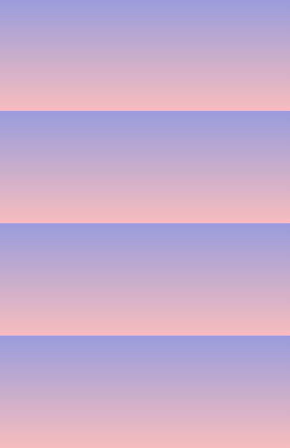
但我唯一得到的是在所有页面上重复渐变:
这是我正在使用的代码:
body {
  background: @body-color;
  background: -webkit-linear-gradient(#999cdb, #f6bdbd);
  background: -moz-linear-gradient(#999cdb, #f6bdbd);
  background: -o-linear-gradient(#999cdb, #f6bdbd);
  background: linear-gradient(#999cdb, #f6bdbd);
}
这可能是一件简单的事情,但我不知道我错过了什么。
3 个答案:
答案 0 :(得分:2)
您需要指定高度。使用vh,其仅仅意味着视口高度,该高度是用户的网页的可见区域的高度。这样,无论设备如何,它都会覆盖整个屏幕高度。
background-attachment属性设置背景是固定的还是与页面的其余部分一起滚动。


body {
  background: @body-color;

background: -webkit-linear-gradient(#999cdb, #f6bdbd);
  background: -moz-linear-gradient(#999cdb, #f6bdbd);
  background: -o-linear-gradient(#999cdb, #f6bdbd);
  background: linear-gradient(#999cdb, #f6bdbd);
  height: 100vh;
  background-attachment: fixed;
}
答案 1 :(得分:1)
这样的事情:
body {
	background: linear-gradient(to bottom,rgba(153,156,219,1) 0%,rgba(246,189,189,1) 60%);
    height:100%;
    background-repeat: no-repeat;
    background-attachment: fixed;
}
答案 2 :(得分:1)
所以你有:
body{
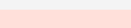
background: linear-gradient(to bottom, #F4F4F4 50%, #FFE0DA 50%);
background-repeat: no-repeat;
height: 200px;
}
工作原理:
-
to bottom指定渐变从上到下流动。 -
您应该以百分比形式指定
color-stop- 此处#F4F4F4停止在50%,然后在50%#FFE0DA开始。所以你得到一个没有任何渐变效果的双色div 。
要获得渐变效果,只需更改color-stop s:
body{
  background: linear-gradient(to bottom, #F4F4F4 10%, #FFE0DA 50%);
  background-repeat: no-repeat;
  height: 200px;
}
谢谢!
相关问题
最新问题
- 我写了这段代码,但我无法理解我的错误
- 我无法从一个代码实例的列表中删除 None 值,但我可以在另一个实例中。为什么它适用于一个细分市场而不适用于另一个细分市场?
- 是否有可能使 loadstring 不可能等于打印?卢阿
- java中的random.expovariate()
- Appscript 通过会议在 Google 日历中发送电子邮件和创建活动
- 为什么我的 Onclick 箭头功能在 React 中不起作用?
- 在此代码中是否有使用“this”的替代方法?
- 在 SQL Server 和 PostgreSQL 上查询,我如何从第一个表获得第二个表的可视化
- 每千个数字得到
- 更新了城市边界 KML 文件的来源?