HTML5 / CSS完整高度布局
好的,这是我的基本网站结构:
<body>
    <div id="wrapper">
        <header><a href="/"> </a></header>
        <nav>
            <ul>
                <li><a href="...">...</a></li>
                <li><a href="...">...</a></li>
                <li><a href="...">...</a></li>
            </ul>
        </nav>
        <div id="content"></div>
        <footer><a href="/"> </a></footer>
    </div>
</body>
这是我的CSS基础知识:
html
{
    font-size: 100%;
    height: 100%;
    line-height: 1.4;
    overflow-y: scroll;
}

body
{
    background: #EEE url("../images/background.png") repeat-y center center fixed;
    color: #333;
    height: 100%;
    font: 1em 'Lato-Regular';
    margin: 0;
    padding: 0;
}

#wrapper
{
    height: 100%;
    margin: 0 auto;
    width: 960px;
}

#content
{
    min-height: 460px;
    height: auto !important;
    height: 460px;
    margin: 20px 0;
}
这就是我想要实现的目标(不使用javascript hacks,最好):
- 页眉和页脚高度取决于其内容大小。
-
div#content的最小高度应为X像素,否则会扩展到想要包含页面内容的数量。 -
div#wrapper应伸展以填充整个视口高度,div#content是伸展的灵活部分。 - 我正在尝试尽可能多的浏览器,但我并没有真正完全跨浏览器兼容性。让旧的浏览器死掉。
我得到了一个奇怪的结果:
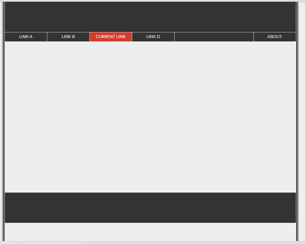
正如您所看到的,包装器没有伸展以填充浏览器视口,因此,页脚(底部的黑条)浮动在页面中间。 你能帮帮我吗?
2 个答案:
答案 0 :(得分:4)
display:flex;现在很容易(除了它看起来很像这个问题Fill remaining vertical space with CSS using display:flex)
html
{
    font-size: 100%;
    height: 100%;
    line-height: 1.4;
    overflow-y: scroll;
}

body
{
    background: #EEE url("../images/background.png") repeat-y center center fixed;
    color: #333;
    height: 100%;
    font: 1em 'Lato-Regular';
    margin: 0;
    padding: 0;
}

#wrapper
{
    height: 100%;
    margin: 0 auto;
    width: 960px;
  display:flex;
  flex-direction:column
}

#content
{
   flex:1;
    margin: 20px 0;
/* overflow:auto; add this and it will show a scrollbar when needed and won't push footer down */
}
footer,header {
  background:lightgray;
  /* no need to set any height, a min-height eventually */
<div id="wrapper">
<header><a href="/">header</a></header>
<nav>
<ul>
<li><a href="...">...</a></li>
<li><a href="...">...</a></li>
<li><a href="...">...</a></li>
</ul>
</nav>
<div id="content"></div>
<footer><a href="/">footer</a></footer>
</div>
答案 1 :(得分:0)
css3附带了一个高度和宽度的单位,许多人并没有真正使用或了解它。 vw和vh,代表视口宽度和视口高度。你应该使用它们。如果你想让你的一个div占据全高,那么设置高度:100vh如果它是一个图像并且你不希望它被垂直挤压放宽:auto。我真的很多用vw和vh。 vw最多,甚至是字体大小我将使用font-size:2vw或类似的东西,1.6或其他小数,这样无论设备的宽度如何,它总是2视口宽度(2vw)。玩它,你会发现正确的尺寸。设置页脚和导航设置为vh或vw,它们将与您所使用的任何设备保持成比例。
相关问题
最新问题
- 我写了这段代码,但我无法理解我的错误
- 我无法从一个代码实例的列表中删除 None 值,但我可以在另一个实例中。为什么它适用于一个细分市场而不适用于另一个细分市场?
- 是否有可能使 loadstring 不可能等于打印?卢阿
- java中的random.expovariate()
- Appscript 通过会议在 Google 日历中发送电子邮件和创建活动
- 为什么我的 Onclick 箭头功能在 React 中不起作用?
- 在此代码中是否有使用“this”的替代方法?
- 在 SQL Server 和 PostgreSQL 上查询,我如何从第一个表获得第二个表的可视化
- 每千个数字得到
- 更新了城市边界 KML 文件的来源?