CSS Flexbox:如何构建特定的布局
必须使用flexbox创建以下div,条件是其中3个应该是兄弟姐妹(不能为每列使用两个包装器)。
任何人都知道如何使用纯flex进行此操作?
我目前的审判:
HTML:
       <div class="meeting-room-wrap">
            <div class="observable-module">
            </div>
            <div class="observable-module">
            </div>
            <div class="active-module">
            </div>
        </div>
CSS:
.meeting-room-wrap
{
    display: flex;
    flex-direction: row
}
.observable-module
{
    flex-grow:1;
    height: 50%;
    min-width: 50%;
}
.observable-module:nth-child(1) /* div #1 */
{
        background: green;
        order : 1;

}
.observable-module:nth-child(2) /* div #3 */
{
        background: blue;
        order : 3;
}
.active-module  /* div #2 */
{
    flex-grow:1;
    height: 100%;
    min-width: 50%;
    background: red;
    order : 2;

}
3 个答案:
答案 0 :(得分:3)
包裹左栏选项
flex列中的左div是最明显的方法...... 缺少给定的约束。
.meeting-room-wrap {
  display: flex;
  height: 300px;
  background: #c0ffee;
  width: 80%;
  margin: 1em auto;
}
.observable {
  display: flex;
  flex-direction: column;
  flex: 1;
}
.observable-module {
  flex: 1;
  background: #bada55;
}
.observable-module:nth-child(2) {
  background: rebeccapurple;
}
.active-module {
  flex: 1;
  background: green;
}
<div class="meeting-room-wrap">
<div class="observable">
<div class="observable-module">
</div>
<div class="observable-module">
</div>
</div>
<div class="active-module">
</div>
</div>
Flex-column Option ...无需额外的包装。
* {
  margin: 0;
}
.wrap {
  display: flex;
  flex-direction: column;
  flex-wrap: wrap;
  height: 100vh;
  background: #c0ffee;
  width: 80%;
  margin: auto;
  color: red;
  Font-size: 36px;
}
.alpha,
.gamma {
  flex: 0 0 50%;
  width: 50%;
  background: #000;
}
.beta {
  background: #bada55;
  order: 2;
  flex: 0 0 100%;
  width: 50%;
}
.gamma {
  background: plum;
}
<div class="wrap">
<div class="alpha">ONE
</div>
<div class="beta">TWO
</div>
<div class="gamma">THREE
</div>
</div>
答案 1 :(得分:1)
鉴于它有一个固定的高度,为什么不使用定位?
&#13;
&#13;
&#13;
&#13;
.wrap {
  height: 300px;
  width: 600px;
  position: relative;
}
.wrap > div {
  position: absolute;
}
.one {
  background-color: red;
  top: 0;
  left: 0;
  right: 50%;
  bottom: 50%;
}
.two {
  background-color: green;
  top: 0;
  left: 50%;
  right: 0;
  bottom: 0;
}
.three {
  background-color: blue;
  top: 50%;
  left: 0;
  right: 50%;
  bottom: 0;
}
<div class="wrap">
<div class="small one">
1
</div>
<div class="two large">
2
</div>
<div class="three small">
3
</div>
</div>
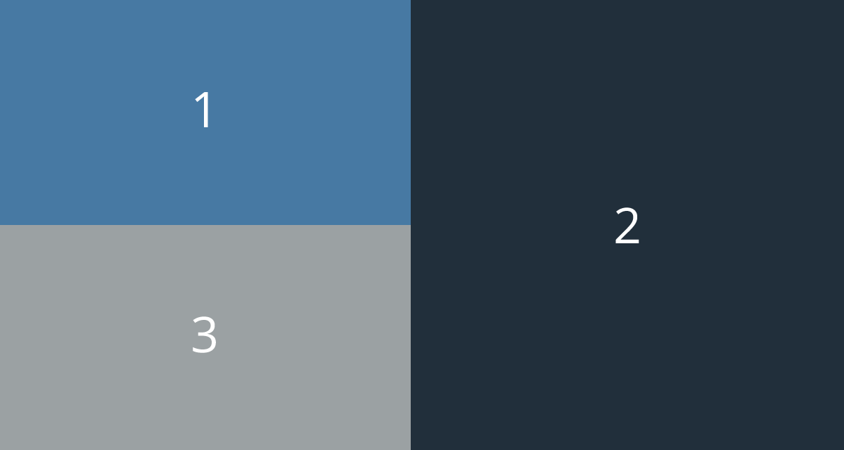
答案 2 :(得分:1)
根据要求,评论变成了答案。
玩得开心:)
UL.meeting-room-wrap {
width: 70%;
/* whatever */
margin: auto;
}
.meeting-room-wrap>div {
width: 50%;
text-align: center;
color:white;
font-size:4vw;
}
.meeting-room-wrap>div:before {
content: '';
padding-top: 40%;/* tune this to get ratio needed */
display:inline-block;/* contents of these 3 wrappers should be within an inline-block element */
vertical-align:middle;
}
.meeting-room-wrap>div.two:before {
padding-top: 80%;/* height's ratio x 2*/
}
.one {
background: #4779A3;
float: left;
}
.two {
background: #212F3B;
float: right;
}
.three {
background: #9BA1A3;
overflow: hidden;
}
相关问题
最新问题
- 我写了这段代码,但我无法理解我的错误
- 我无法从一个代码实例的列表中删除 None 值,但我可以在另一个实例中。为什么它适用于一个细分市场而不适用于另一个细分市场?
- 是否有可能使 loadstring 不可能等于打印?卢阿
- java中的random.expovariate()
- Appscript 通过会议在 Google 日历中发送电子邮件和创建活动
- 为什么我的 Onclick 箭头功能在 React 中不起作用?
- 在此代码中是否有使用“this”的替代方法?
- 在 SQL Server 和 PostgreSQL 上查询,我如何从第一个表获得第二个表的可视化
- 每千个数字得到
- 更新了城市边界 KML 文件的来源?