边界半径百分比(%)和像素(px)或em
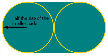
如果我对border-radius使用像素或em值,则边缘半径始终为圆弧或药丸形状如果该值大于元素的最大边。
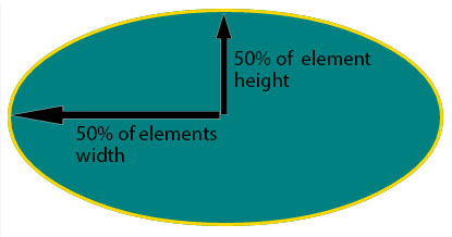
当我使用百分比时,边缘半径为椭圆形,从元素每边的中间开始,产生椭圆形或椭圆形:
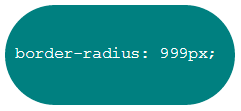
border-radius的像素值:
div {
   background: teal;
   border-radius: 999px;
   width: 230px;
   height: 100px;
   padding: 40px 10px;
   box-sizing: border-box;
   font-family: courier;
   color: #fff;
 }
<div>border-radius:999px;</div>
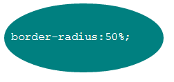
border-radius的百分比值:
div {
  background: teal;
  border-radius: 50%;
  width: 230px;
  height: 100px;
  padding:40px 10px;
  box-sizing:border-box;
  font-family:courier;
  color:#fff;
}
<div>border-radius:50%;</div>
为什么没有百分比的边界半径与使用像素值或em值设置的border-radius的方式相同?
3 个答案:
答案 0 :(得分:144)
边界半径:
首先,您需要了解border-radius属性需要2个值。这些值是定义拐角形状的四分之一椭圆的X / Y轴上的半径
如果仅设置了一个值,则第二个值等于第一个值。因此border-radius: x相当于border-radius:x/x;。
百分比值
参考W3C规范:CSS Backgrounds and Borders Module Level 3 border-radius property这是我们可以阅读的有关百分比值的内容:
百分比:请参阅边框的相应尺寸。
所以border-radius:50%;以这种方式定义椭圆的raddi:
- X轴上的半径是容器的50%宽度
- Y轴上的半径是容器的50%高度
像素和其他单位
使用一个值而不是边界半径百分比(em,in,视口相关单位,cm ...)将始终生成具有相同X / Y半径的椭圆。 换句话说,一个圆圈。
设置border-radius:999px;时,圆的半径应为999px。 但另一个rule is applied when the curves overlap将圆的半径减小到最小边的一半。所以在你的例子中,它等于元素高度的一半:50px。
对于此示例(使用固定大小的元素),您可以使用px和百分比获得相同的结果。由于元素为230px x 100px,border-radius: 50%;相当于border-radius:115px/50px;(双方的50%):
div {
  display: inline-block;
  background: teal;
  width: 230px;
  height: 100px;
  padding: 40px 10px;
  box-sizing: border-box;
  font-family: courier;
  font-size: 0.8em;
  color: #fff;
}
.percent {
  border-radius: 50%;
}
.pixels {
  border-radius: 115px/50px;
}
<div class="percent">border-radius:50%;</div>
<div class="pixels">border-radius:115px/50px;</div>
答案 1 :(得分:4)
只需将第一个值除以所需的百分比即可。如果您希望边界半径为50%,请输入:
border-radius: 25%/50%;
或另一个示例:
border-radius: 15%/30%;
您可以轻松地在js或SASS中进行数学运算。
答案 2 :(得分:0)
不是该问题的实际答案,而是针对可能偶然发现该问题的人员的可用性建议:
如果要使用相对单位但不希望%的椭圆行为,则可以始终使用em或rem。例如。 border-readius: 1em;
- 我写了这段代码,但我无法理解我的错误
- 我无法从一个代码实例的列表中删除 None 值,但我可以在另一个实例中。为什么它适用于一个细分市场而不适用于另一个细分市场?
- 是否有可能使 loadstring 不可能等于打印?卢阿
- java中的random.expovariate()
- Appscript 通过会议在 Google 日历中发送电子邮件和创建活动
- 为什么我的 Onclick 箭头功能在 React 中不起作用?
- 在此代码中是否有使用“this”的替代方法?
- 在 SQL Server 和 PostgreSQL 上查询,我如何从第一个表获得第二个表的可视化
- 每千个数字得到
- 更新了城市边界 KML 文件的来源?