我的联系表单上有跨浏览器前端显示问题
我正在尝试为自己建立一个投资组合,作为我正在学习的课程的一部分,我准备了联系表格的前端。
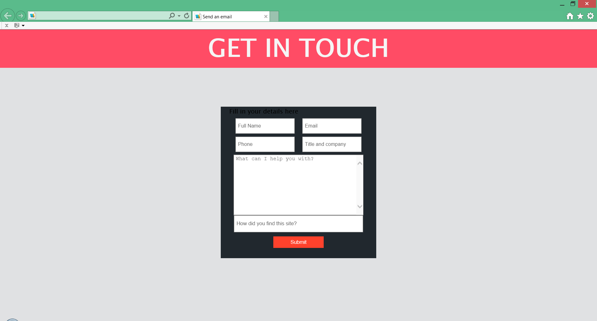
我开发它时考虑到了Google Chrome并使用1024x768px的屏幕分辨率作为基础,因此即使在我的1920x1080px屏幕上也能看起来很棒。
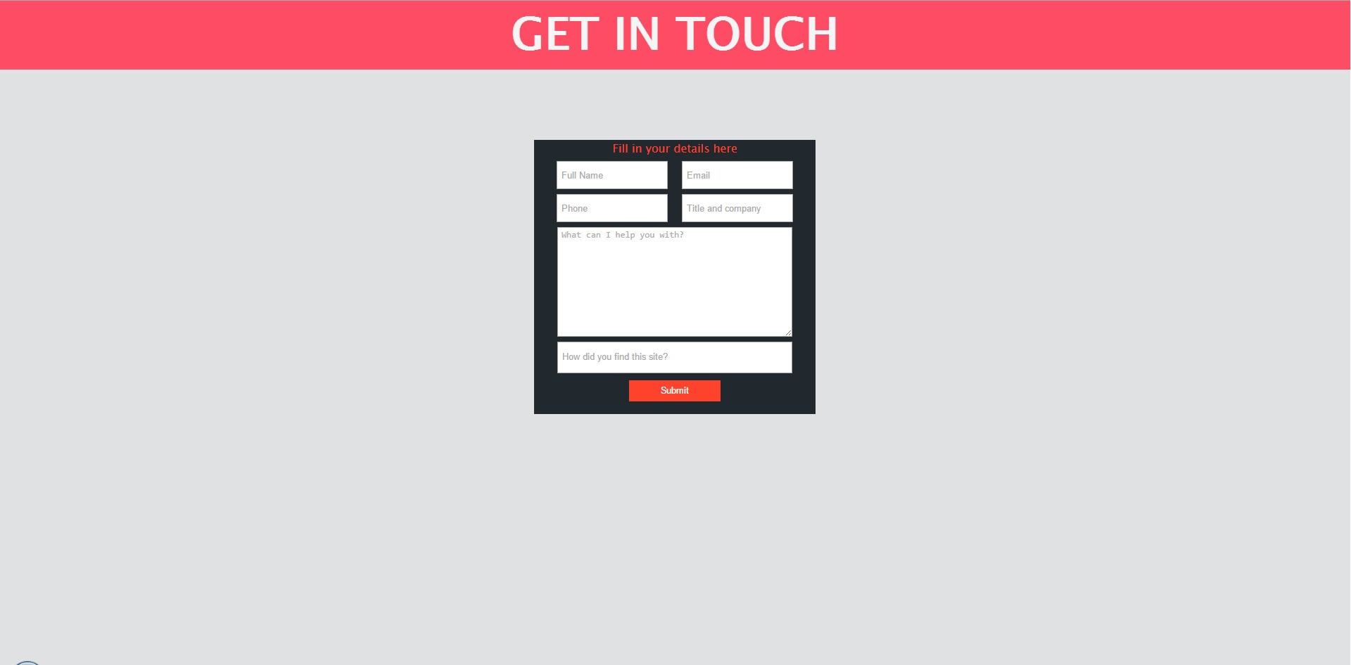
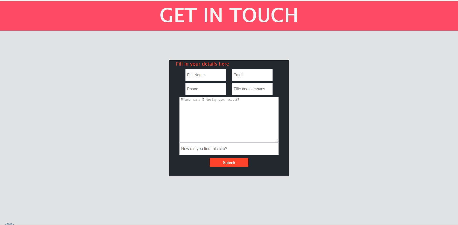
我在最新版本的IE和Firefox中遇到了跨浏览器兼容性问题。该网站在Google Chrome上看起来很不错。
在IE中:
- 评论框显示比其他表单元素 更宽
- “图例”标题的字体颜色为黑色而不是白色
在FireFox中:
- 评论框和“你是如何找到这个网站的?”文本框在宽度大小方面未与上述表单元素的其余部分对齐。
我并不是特别确定如何让它们在所有三种浏览器中看起来或多或少相等。据我所知,我使用的CSS应该是跨浏览器支持的。
这是我的代码:
        body {
          font-family: "Ludica Grande", "Lucida Sans Unicode", Verdana, Arial, Helvetica, sans-serif;
          background-color: #E0E1E3;
          margin: 0 auto;
          padding: 0;
        }
        h1 {
          color: #f5f5f5;
          font-size: 4em;
          padding: 0;
          margin: 0 auto;
        }
        .break {
          clear: both;
        }
        #header {
          margin: 0 auto;
          width: 100%;
          background-color: #FF4C65;
          text-align: center;
        }
        #wrapper {
          margin: 0 auto;
          padding: 0;
        }
        #loginContainer {
          position: relative;
          top: 100px;
          background-color: #21282E;
          color: #f5f5f5;
          margin: 0 auto;
          padding: 0;
          width: 400px;
          height: 390px;
        }
        fieldset {
          border: none;
          width: 90%;
          margin: 0 auto;
          padding: 0;
          text-align: center;
          height: 385px;
          color: #FF422C;
        }
        .spacer {
          display: inline-block;
          box-sizing: border-box;
          padding-left: 5px;
          height: 40px;
          line-height: normal;
          margin: 5px 7px 2px 7px;
          font-size: 0.81em;
        }
        textarea {
          margin-top: 5px;
          min-width: 325px;
          min-height: 150px;
          padding-left: 5px;
        }
        #survey {
          padding-top: 0;
          margin: 0;
          width: 325px;
          height: 40px;
          line-height: normal;
          padding-left: 5px;
        }
        #submitButton {
          margin-top: 10px;
          text-align: center;
          border: 0;
          width: 130px;
          height: 30px;
          background-color: #FF422C;
          cursor: pointer;
          color: white;
          transition: all 0.5s ease;
        }
        #submitButton:hover {
          background-color: grey;
        }
<div id="wrapper">
<div id="header">
<h1>GET IN TOUCH</h1>
</div>
<!-- Clear the floats -->
<div class="break"></div>
<div id="loginContainer">
<fieldset>
<legend>Fill in your details here</legend>
<form action="getintouch.php" type="get" id="getintouch">
<input type="text" name="name" placeholder="Full Name" class="spacer" required/>
<input type="email" name="email" class="spacer" placeholder="Email" required/>
<input type="tel" name="telephone" class="spacer" placeholder="Phone" required/>
<input type="text" name="titleAndCompany" class="spacer" placeholder="Title and company" />
<textarea name="comments" placeholder="What can I help you with?" required></textarea>
<input type="text" name="survey" id="survey" placeholder="How did you find this site?" required/>
<button type="submit" id="submitButton">Submit</button>
</form>
</fieldset>
</div>
</div>
这是jsfiddle的链接: http://jsfiddle.net/knadoor/bm2LbbL4/
建议赞赏!! : - )
PS:对于这里经验丰富的编码员,我很乐意看到我对代码布局的看法(我的背景不是网页开发)。
由于
修改 这是我完整代码片段的链接(我使用的是http://pastebin.com/gBJR1Nd3
第一张照片是Google Chrome,第二张是Firefox,第三张是IE。
1 个答案:
答案 0 :(得分:2)
当您通过浏览器浏览网站时,最好规范化甚至重置您的css代码。
您可以在此处了解有关规范化的更多信息:http://necolas.github.io/normalize.css/,它基本上会覆盖CSS的defualt浏览器设置,以便您可以更好地控制事物的外观。
此外,我可以看到您使用box-sizing - 确保您希望支持此功能的浏览器(添加-webkit,-moz,-o前缀不会伤害)。确保您的网页包含正确的文档类型。
除了你的代码看起来不错,不应该造成任何麻烦。很高兴看到有人使用正确的display属性。
相关问题
最新问题
- 我写了这段代码,但我无法理解我的错误
- 我无法从一个代码实例的列表中删除 None 值,但我可以在另一个实例中。为什么它适用于一个细分市场而不适用于另一个细分市场?
- 是否有可能使 loadstring 不可能等于打印?卢阿
- java中的random.expovariate()
- Appscript 通过会议在 Google 日历中发送电子邮件和创建活动
- 为什么我的 Onclick 箭头功能在 React 中不起作用?
- 在此代码中是否有使用“this”的替代方法?
- 在 SQL Server 和 PostgreSQL 上查询,我如何从第一个表获得第二个表的可视化
- 每千个数字得到
- 更新了城市边界 KML 文件的来源?