基于x高度的垂直对齐
尝试将内容集中在容器CSS-Tricks时有一个很好的指南。然而,当试图垂直居中一些比它的容器略小的文本时,我认为垂直居中文本的另一种方式可能更好。而不是使用字体的整个高度,我宁愿根据字体的x高度(基本上是小写x的高度)来居中它

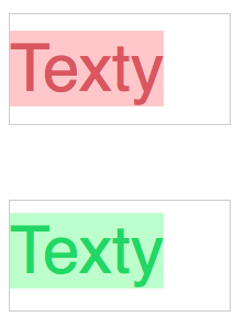
请参阅此示例,其中红色基于整个高度,绿色基于x高度
我能想到的唯一选择是在文本中添加一个与容器高度相同的伪元素,并使用vertical-align:middle。
.pseudo {
  white-space: nowrap;
}

.pseudo:before {
  content: '';
  display: inline-block;
  vertical-align: middle;
  height: 100px;
  width: 0;
}
这很有效,但遗憾的是只有一行。我想知道是否有其他人试图解决这个问题,是否有最好的做法可以遵循?我特别感兴趣的是使用尽可能少的魔法"尽可能使用数字,如果多线变量有一个很好的解决方案。
请参阅Codepen,了解我为什么要根据x高度和我的解决方案将其居中的示例。
6 个答案:
答案 0 :(得分:7)
文本中心位置和小写字母中心之间的差异等于(ascender height - x-height - descender height)/2(基本上我们需要以某种方式增加下降高度以使其等于ascender height - x-height以移动线的几何中心框到小写字母中心的位置)。从这3个未知数中,只有x-height可用于CSS(通过ex单位)。其他字体指标无法读取并保持“魔法数字”,因此只能为每种特定字体选择特定值。但是使用这个“特定于字体的幻数”,您可以将任意数量的行居中 - 通过给出内部元素display:inline-block并将magic value分配给其padding-bottom。
似乎无法从纯CSS中的字体指标中获取所需的值。 vertical-align / text-top这样的text-bottom值可以给出上升或下降的位置,但只有其中一个,像sub这样的奇异值似乎完全是任意的,我发现没有可能“衡量”一个元素的两个字体指标之间的差异。
我最成功的尝试是将线条(或线条)移动所需差异的一半,使“混合”居中(无论是大写字母还是小写字母都没有精确居中,但“光学”文字可能看起来更好居中)。这可以通过添加到最后一行的另一个伪元素来完成,该元素具有行框的高度,但它与小写字母的中心对齐:
.blue:after {
  content: ':'; /* must contain text to get the auto height of the line box */
  display: inline-block;
  vertical-align: middle;
  width: 0; /* making pseudo elenent invisible */
  overflow: hidden;
}
Edited CodePen example(我没有隐藏伪元素以进行可视化)。
为了使内联块本身居中,可以使用任何方法,我选择具有第二个辅助伪元素的方法,该元素始终具有容器的100%高度,因此不需要更多的幻数。
希望有所帮助:)
答案 1 :(得分:2)
抱歉无法发表评论。
这个怎么样:
.green {
  color: #6c6;
  background-color: #cfc;
  vertical-align: -16%;
  line-height: 60px;
}
http://jsfiddle.net/hcn25psh/3/
以及一些可能有用的信息:
答案 2 :(得分:2)
我认为获得所需结果的唯一方法是使用Dinamyc CSS(DCSS)。
首先,您需要在网站中创建一个能够检索文本高度的函数(小写)。
其次,你需要输出一个静态位置的css,这个位置实际上是动态的,因为它是由动态代码打印的。
这里有一个关于如何在PHP中检索文本高度的链接http://www.phpsnaps.com/snaps/view/get-text-height-width/粘贴的示例:
define("F_SIZE", 8);
define("F_FONT", "arial.ttf");


function get_bbox($text){
    return imagettfbbox(F_SIZE, 0, F_FONT, $text);
}

function text_height ($text) {
    $box = get_bbox($text);
    $height = $box[3] - $box[5];
    return $height;
}

function text_width ($text) {
    $box = get_bbox($text);
    $width = $box[4] - $box[6];
    return $width;
}
然后你会用CSS回复你的(x)HTML:
echo "<span style=\"YourStyleProperty=" . **Your line height / 2 + your text height / 2 (Hint: use the PHP or equivalent if other language)** . ";\"
有关imagettfbbox功能的更多信息:http://php.net/manual/fr/function.imagettfbbox.php
如果您在完成代码时遇到问题,请随时发帖,如果您付出一些努力,我将很乐意为您提供帮助:)。
有关DCSS的更多信息以及更好的想法/示例,请不要犹豫谷歌DCSS。
答案 3 :(得分:2)
使用此css
.outer {
    display: table;
    width: 200px;
    height: 200px;
    background-color:blue;
}
.inner {
    display: table-cell;
    vertical-align: middle;
    /*You can align center if you want as well*/
    /*text-align:center;*/
}
.box {
    position: relative;
    display: inline-block;
    background: orange;
    color: black;
    font-size: 60px;
    background-color: yellow;
}
并使用此标记。因此,“盒子”中的任何内容都将居中。 所以它只是添加一个外部作为表,内部作为单元格,所以你可以使用垂直对齐中间的多行。
<div class="outer">
    <div class="inner">
        <div class="box">
            Texty</br>
            Texty
        </div>
    </div>
</div>
这是一个codepen
答案 4 :(得分:1)
您可能需要其中一个jQuery插件:
- FlowType:最好的网络排版:基于元素宽度的字体大小和行高
- Squishy:用于将标题文字插入其容器的插件
- Responsive Text:根据“容器宽度” 响应性地设置字体大小
- TypeButter:允许您为网站上的任何字体设置光学字距调整
- FitText:FitText使字体大小变得灵活
- SlabText:一个jQuery插件,用于生成大胆,响亮的标题
- Auto Line-Height:用于灵活布局的jQuery插件
答案 5 :(得分:1)
我已将接受的答案推广到可重复使用的课程中,并在Chrome,Firefox和Edge上进行了测试。我还解决了它在文档流中的位置问题(容器会从::after元素中携带额外的宽度,并且看起来会低于兄弟元素)。您可以按如下方式轻松使用该类:
<any class="x-height">
  <span class="x-height">
    Centered text
  </span>
</any>
以下是Sass来源(Also check it out on Codepen):
%x-height {
  content: 'x';
  display: inline-block;
  vertical-align: middle;
  width: 0;
}

.x-height {
  vertical-align: bottom;

  &::after {
    @extend %x-height;

    content: '';
    height: 100%;
  }

  > .x-height {
    display: inline-block;
    vertical-align: baseline;
    margin-left: -1ch;
    margin-right: calc(-1ch / 2);
    white-space: nowrap;

    @at-root {
      @-moz-document url-prefix() {
        & {
          margin-left: auto;
          margin-right: auto;

          &::before { display: none; }
        }
      }
    }

    &::before, &::after {
      @extend %x-height;
      visibility: hidden;
    }

    &::after {
      width: 1ch;
      margin: 0 -1ch;
    }
  }
}
- 我写了这段代码,但我无法理解我的错误
- 我无法从一个代码实例的列表中删除 None 值,但我可以在另一个实例中。为什么它适用于一个细分市场而不适用于另一个细分市场?
- 是否有可能使 loadstring 不可能等于打印?卢阿
- java中的random.expovariate()
- Appscript 通过会议在 Google 日历中发送电子邮件和创建活动
- 为什么我的 Onclick 箭头功能在 React 中不起作用?
- 在此代码中是否有使用“this”的替代方法?
- 在 SQL Server 和 PostgreSQL 上查询,我如何从第一个表获得第二个表的可视化
- 每千个数字得到
- 更新了城市边界 KML 文件的来源?