响应水平页面滑动
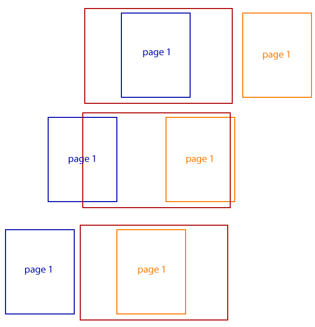
我想创建水平响应式页面导航,如下图所示:
这是我设法做到的:DEMO
$(document).ready(function () {
    var slideNum = $('.page').length,
        wrapperWidth = 100 * slideNum,
        slideWidth = 100/slideNum;
    $('.wrapper').width(wrapperWidth + '%');
    $('.page').width(slideWidth + '%');

    $('a.scrollitem').click(function(){
        $('a.scrollitem').removeClass('selected');
        $(this).addClass('selected');

        var slideNumber = $($(this).attr('href')).index('.page'),
            margin = slideNumber * -100 + '%';

        $('.wrapper').animate({marginLeft: margin},1000);
        return false;
    });
});
html, body {
height: 100%;
margin: 0;
overflow-x:hidden;
position:relative;
}
nav{
position:absolute;
top:0; left:0;
height:30px;
}
.wrapper {
height: 100%;
background: #263729;
}
.page {
float:left;
background: #992213;
min-height: 100%;
padding-top: 30px;
}
#page-1 {
background: #0C717A;
}
#page-2 {
background: #009900;
}
#page-3 {
background: #0000FF;
}
a {
color:#FFF;
}
a.selected{
color: red;
}
.simulate{
height:2000px;
}<script src="https://ajax.googleapis.com/ajax/libs/jquery/1.11.0/jquery.min.js"></script>
<div class="wrapper">
<nav>
<a href="#page-1" class="scrollitem selected">page 1</a>
<a href="#page-2" class="scrollitem">page 2</a>
<a href="#page-3" class="scrollitem">page 3</a>
</nav>
<div id="page-1" class="page">
<h3>page 1</h3>
<div class="simulate">Simulated content heigher than 100%</div>
</div>
<div id="page-2" class="page">
<h3>page 2</h3>
<div class="simulate">Simulated content heigher than 100%</div>
</div>
<div id="page-3" class="page">
<h3>page 3</h3>
<div class="simulate">Simulated content heigher than 100%</div>
</div>
</div>然而,我已经碰了几个砖墙,因为我的反应在一定程度上,正如你的规模,它需要坚持到它的页面,而不是透露其他。
此外,如果页面很长,它会显示一个完美的滚动条,但在最后一张幻灯片上有一个与滚动条一样宽的间隙。
我有以下要求:
- 需要回应
- 页面需要能够长(800px)并且仍然可以滚动,没有最后一页的间隙。
- 需要在最低ie9 上工作
2 个答案:
答案 0 :(得分:14)
水平页面滑动
左边距动画
这个jQuery片段:
- 计算幻灯片的数量并相应地设置包装的宽度。
- 根据点击的链接,在包装器上设置
left-margin动画,以显示平滑过渡的相应幻灯片 - 切换所点击链接的类以显示活动链接
- 仅使用一个菜单,以最大限度地减少标记并防止内容重复。
- 仅需要jQuery库
- 适用于动态幻灯片数
请注意此解决方案:
&#13;
&#13;
&#13;
&#13;
$(document).ready(function() {
  var slideNum = $('.page').length,
    wrapperWidth = 100 * slideNum,
    slideWidth = 100 / slideNum;
  $('.wrapper').width(wrapperWidth + '%');
  $('.page').width(slideWidth + '%');

  $('a.scrollitem').click(function() {
    $('a.scrollitem').removeClass('selected');
    $(this).addClass('selected');

    var slideNumber = $($(this).attr('href')).index('.page'),
      margin = slideNumber * -100 + '%';

    $('.wrapper').animate({
      marginLeft: margin
    }, 1000);
    return false;
  });
});
html,
body {
height: 100%;
margin: 0;
overflow-x: hidden;
position: relative;
}
nav {
position: absolute;
top: 0;
left: 0;
height: 30px;
}
.wrapper {
height: 100%;
background: #263729;
}
.page {
float: left;
background: #992213;
min-height: 100%;
padding-top: 30px;
}
#page-1 {
background: #0C717A;
}
#page-2 {
background: #009900;
}
#page-3 {
background: #0000FF;
}
a {
color: #FFF;
}
a.selected {
color: red;
}
.simulate {
height: 2000px;
}<script src="https://ajax.googleapis.com/ajax/libs/jquery/1.11.1/jquery.min.js"></script>
<div class="wrapper">
<nav>
<a href="#page-1" class="scrollitem selected">page 1</a>
<a href="#page-2" class="scrollitem">page 2</a>
<a href="#page-3" class="scrollitem">page 3</a>
</nav>
<div id="page-1" class="page">
<h3>page 1</h3>
<div class="simulate">Simulated content heigher than 100%</div>
</div>
<div id="page-2" class="page">
<h3>page 2</h3>
<div class="simulate">Simulated content heigher than 100%</div>
</div>
<div id="page-3" class="page">
<h3>page 3</h3>
<div class="simulate">Simulated content heigher than 100%</div>
</div>
</div>
答案 1 :(得分:2)
&#34;随着您的扩展,它需要坚持其所在页面并且不会透露其他页面&#34;
要实现这一点,请保持对当前页面元素的引用,然后在调整窗口大小时执行无延迟scrollTo此元素:
var currentPage; //here is where we will hold the reference
jQuery('a.scrollitem').click(function () {
    var targetPage = $(jQuery(this).attr('href'));
    jQuery('a.scrollitem').removeClass('selected');
    jQuery(this).addClass('selected');
    jQuery('.toggle').css({'display':'none'});
    jQuery('.wrapper').scrollTo(targetPage, 1200, function(){
        jQuery('.toggle').css({'display':'block'});
    });
    currentPage = targetPage; //here is where we set the reference
    return false;
});

//and here we do a no-delay scrollTo
$(window).resize(function(){
    if(!!currentPage){
        console.log('window resized.  scrolling to: ', currentPage.attr('id'));
        jQuery('.wrapper').scrollTo(currentPage);
    }
});
在我看来,这使得它非常敏感。
页面需要能够长(800px)并且仍然可以滚动,没有最后一页的差距。
为了摆脱这种差距,我只是让所有page s比他们需要的时间长一点。滚动不受此影响,因为页面左对齐left:0;。我怀疑其他页面有相同的差距,并且滚动条覆盖了这些页面上的间隙。
.page {
    width: 110%;
}
需要在最低ie9
上工作我担心在这方面我无能为力;我只安装了IE11。但是,嘿,它在IE11中效果很好。
相关问题
最新问题
- 我写了这段代码,但我无法理解我的错误
- 我无法从一个代码实例的列表中删除 None 值,但我可以在另一个实例中。为什么它适用于一个细分市场而不适用于另一个细分市场?
- 是否有可能使 loadstring 不可能等于打印?卢阿
- java中的random.expovariate()
- Appscript 通过会议在 Google 日历中发送电子邮件和创建活动
- 为什么我的 Onclick 箭头功能在 React 中不起作用?
- 在此代码中是否有使用“this”的替代方法?
- 在 SQL Server 和 PostgreSQL 上查询,我如何从第一个表获得第二个表的可视化
- 每千个数字得到
- 更新了城市边界 KML 文件的来源?