жҳҫзӨәDivеңЁ:: beforeе’Ң:: afterд№ӢеҗҺпјҹ
жҲ‘жӯЈеңЁжҲ‘зҡ„йЎөйқўдёӯе°қиҜ•е°ҶdivжҳҫзӨәеңЁ::beforeе’Ң::after CSSйҖүжӢ©еҷЁдёҠпјҢжүҖд»ҘжҲ‘жӯЈеңЁеҠӘеҠӣз»“жһңпјҡ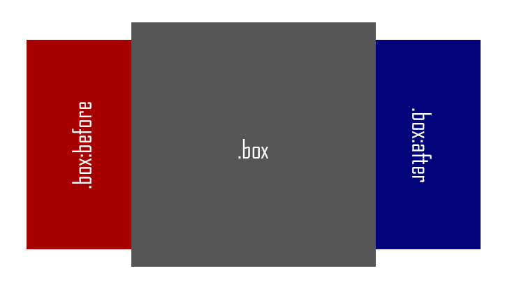
дҪҶжҳҜжҲ‘еҫ—еҲ°дәҶJSFIDDLE
иҝҷжҳҜжҲ‘зҡ„д»Јз Ғпјҡ
HTML
<div class="box"></div>
CSS
.box{
    width: 350px;
    height: 350px;
    background: #555;
    position: absolute;
    top: 50px;
    left: 200px;
    z-index: 10;
}
.box::before{
    content: "";
    background: #A60000;
    width: 300px;
    height: 300px;
    position: absolute;
    top: 25px;
    left: -150px;
    z-index: 1;
}
.box::after{
    content: "";
    background: #02047A;
    width: 300px;
    height: 300px;
    position: absolute;
    top: 25px;
    left: 200px;
    margin: auto;
    z-index: 1;
}
жҲ‘зҹҘйҒ“еңЁе…¶еҶ…е®№дёҠжҳҫзӨәdivдјјд№ҺжҳҜеӣ дёә Chrome еҗ‘жҲ‘жҳҫзӨә HTMLжәҗд»Јз ҒпјҢеҰӮдёӢжүҖзӨәпјҡ

дҪҶжҲ‘еёҢжңӣжңүеҠһжі•и§ЈеҶіиҝҷдёӘй—®йўҳ..
жҸҗеүҚиҮҙи°ў...
2 дёӘзӯ”жЎҲ:
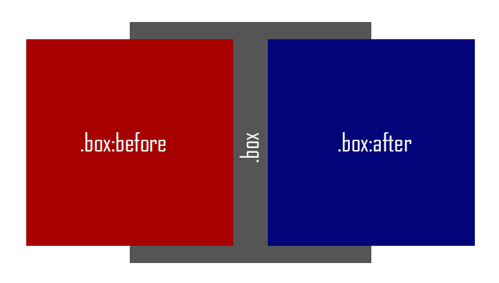
зӯ”жЎҲ 0 :(еҫ—еҲҶпјҡ8)
жӣҙж”№жӮЁзҡ„cssпјҡ
.box{
    width: 350px;
    height: 350px;
    background: #555;
    position: absolute;
    top: 50px;
    left: 200px;
}
.box::before{
    content: "";
    background: #A60000;
    width: 300px;
    height: 300px;
    position: absolute;
    top: 25px;
    left: -150px;
    z-index: -1;
}
.box::after{
    content: "";
    background: #02047A;
    width: 300px;
    height: 300px;
    position: absolute;
    top: 25px;
    left: 200px;
    margin: auto;
    z-index: -1;
}
жӮЁжүҖиҰҒеҒҡзҡ„е°ұжҳҜе°Ҷz-index :afterе’Ң:beforeи®ҫзҪ®дёә-1пјҢ然еҗҺд»Һ.box z-indexдёӯеҲ йҷӨгҖӮ
зӯ”жЎҲ 1 :(еҫ—еҲҶпјҡ2)
ж·»еҠ жҲ–жӣҝжҚўд»ҘдёӢеұһжҖ§пјҲдҪҝ:beforeе’Ң:afterе…ғзҙ жҳҫзӨәеңЁ.boxз”іиҜ·z-index:-1еҗҺйқўпјҢ并дҪҝз”Ёй»ҳи®Өz-indexд»Јжӣҝ.box }пјүпјҡ
.box{
    position: absolute;
}
.box::before{
    z-index: -1;
    -webkit-transform: rotate(-90deg);
    -moz-transform: rotate(-90deg);
    -o-transform: rotate(-90deg);
    -ms-transform: rotate(-90deg);
    transform: rotate(-90deg);
}
.box::after{
    z-index: -1;
    -webkit-transform: rotate(90deg);
    -moz-transform: rotate(90deg);
    -o-transform: rotate(90deg);
    -ms-transform: rotate(90deg);
    transform: rotate(90deg);
}

JSFiddle
зӣёе…ій—®йўҳ
жңҖж–°й—®йўҳ
- жҲ‘еҶҷдәҶиҝҷж®өд»Јз ҒпјҢдҪҶжҲ‘ж— жі•зҗҶи§ЈжҲ‘зҡ„й”ҷиҜҜ
- жҲ‘ж— жі•д»ҺдёҖдёӘд»Јз Ғе®һдҫӢзҡ„еҲ—иЎЁдёӯеҲ йҷӨ None еҖјпјҢдҪҶжҲ‘еҸҜд»ҘеңЁеҸҰдёҖдёӘе®һдҫӢдёӯгҖӮдёәд»Җд№Ҳе®ғйҖӮз”ЁдәҺдёҖдёӘз»ҶеҲҶеёӮеңәиҖҢдёҚйҖӮз”ЁдәҺеҸҰдёҖдёӘз»ҶеҲҶеёӮеңәпјҹ
- жҳҜеҗҰжңүеҸҜиғҪдҪҝ loadstring дёҚеҸҜиғҪзӯүдәҺжү“еҚ°пјҹеҚўйҳҝ
- javaдёӯзҡ„random.expovariate()
- Appscript йҖҡиҝҮдјҡи®®еңЁ Google ж—ҘеҺҶдёӯеҸ‘йҖҒз”өеӯҗйӮ®д»¶е’ҢеҲӣе»әжҙ»еҠЁ
- дёәд»Җд№ҲжҲ‘зҡ„ Onclick з®ӯеӨҙеҠҹиғҪеңЁ React дёӯдёҚиө·дҪңз”Ёпјҹ
- еңЁжӯӨд»Јз ҒдёӯжҳҜеҗҰжңүдҪҝз”ЁвҖңthisвҖқзҡ„жӣҝд»Јж–№жі•пјҹ
- еңЁ SQL Server е’Ң PostgreSQL дёҠжҹҘиҜўпјҢжҲ‘еҰӮдҪ•д»Һ第дёҖдёӘиЎЁиҺ·еҫ—第дәҢдёӘиЎЁзҡ„еҸҜи§ҶеҢ–
- жҜҸеҚғдёӘж•°еӯ—еҫ—еҲ°
- жӣҙж–°дәҶеҹҺеёӮиҫ№з•Ң KML ж–Ү件зҡ„жқҘжәҗпјҹ