css columns / flexbox,项目之间没有间隙
我需要摆脱列布局中元素之间的差距。我可以使用最新的css3,因为该网站针对现代浏览器/设备,但我需要避免使用javascript解决方案,以便从服务器提供的页面不需要根据的宽度重新呈现客户端。
使用flexbox,css列和其他技巧我需要哄一个类似于pinterest的布局。 (Pinterest使用javascript和绝对定位进行布局,它甚至不会在js关闭的情况下渲染。)该网站的盒子宽度已知但高度可变。列数需要根据浏览器宽度而变化。 (如果我知道要更改哪个css属性,我可以通过媒体查询执行此操作。)这里的内容如下:via
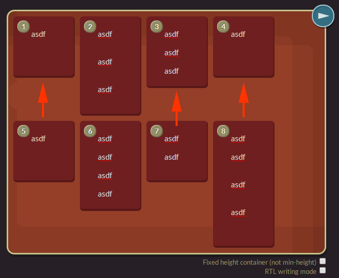
另请注意,我不能仅仅增加容器的高度来填充空白区域。我想把它下面的项目带上去,而不是让所有的高度匹配。 (因此,上图中的第1,3和4项不是我想要的。)
我尝试的事情:
-
CSS 3列。这看起来很棒,但是项目的顺序错误,第二项在第一项之下。如果这可以改为不同的顺序,使它们从左到右,那就太好了!
-
Flexbox各种flexbox配置,我尝试了几乎所有我能够改变的设置。
-
的Javascript。是的,我知道我可以手动创建列并在调整大小时重新渲染它们。我希望避免昂贵的重新渲染操作,这需要手动平衡列和显示。对于那些不支持css3解决方案的旧浏览器,我可以使用它。我也想避免手动定位所有项目。毛。
我已经给JSFiddle发了评论链接,因为我不能把它放在这里,因为"链接到jsfiddle需要代码"。
5 个答案:
答案 0 :(得分:2)
查看此演示。这是纯粹的css3砌体效果。 http://w3bits.com/labs/css-masonry/
来自链接的spinet
body {
    font: 1em/1.67 'Open Sans', Arial, Sans-serif;
    margin: 0;
    background: #e9e9e9;
}

.wrapper {
    width: 95%;
    margin: 3em auto;
}

.masonry {
    margin: 1.5em 0;
    padding: 0;
    -moz-column-gap: 1.5em;
    -webkit-column-gap: 1.5em;
    column-gap: 1.5em;
    font-size: .85em;
}

.item {
    display: inline-block;
    background: #fff;
    padding: 1em;
    margin: 0 0 1.5em;
    width: 100%;
    height: 150px;
    box-sizing: border-box;
    -moz-box-sizing: border-box;
    -webkit-box-sizing: border-box;
    box-shadow: 2px 2px 4px 0 #ccc;
}
.item.black{
background-color: #000; height:200px;}
.item.blue{
background-color:blue; height:250px;}
.item.green{
background-color:green; height:300px;}

@media only screen and (min-width: 400px) {
    .masonry {
        -moz-column-count: 2;
        -webkit-column-count: 2;
        column-count: 2;
    }
}

@media only screen and (min-width: 700px) {
    .masonry {
        -moz-column-count: 3;
        -webkit-column-count: 3;
        column-count: 3;
    }
}

@media only screen and (min-width: 900px) {
    .masonry {
        -moz-column-count: 4;
        -webkit-column-count: 4;
        column-count: 4;
    }
}

@media only screen and (min-width: 1100px) {
    .masonry {
        -moz-column-count: 5;
        -webkit-column-count: 5;
        column-count: 5;
    }
}

@media only screen and (min-width: 1280px) {
    .wrapper {
        width: 1260px;
    }
}
<div class="masonry">
<div class="item">Lorem ipsum dolor sit amet, consectetur adipisicing elit.</div>
<div class="item black">...</div>
<div class="item blue">...</div>
<div class="item green">...</div>
<div class="item black">...</div>
<div class="item blue">...</div>
<div class="item green">...</div>
<div class="item black">...</div>
<div class="item blue">...</div>
<div class="item green">...</div>
</div>
希望这对你有所帮助。
答案 1 :(得分:1)
CSS3:将包含所有8个下拉面板的主ul li设置为margin:0 auto;
mainList li {
   margin: 0 auto; /*0 giving no margins on the top and bottom of the panels, and auto making the panels use all of the space within the parent, mainList. I hope this helps.*/
}
答案 2 :(得分:0)
你可以通过flexbox实现它:
HTML:
<div class="container">
  <div class="item">1</div>
  <div class="item">2</div>
  <div class="item">3</div>
  <div class="item">4</div>
  <div class="item">5</div>
  <div class="item">6</div>
</div>
CSS:
.container {
  max-width: 900px;
  height: 470px;
  display: flex;
  flex-flow: column wrap;
  align-items: flex-start;
}

.item {
  height: 150px;
}
答案 3 :(得分:0)
嗯,有点晚了,可能这可能是一个解决方案。
我正在使用flex,因为它是唯一可以根据需要更改订单的系统。
这种方法的drawbakcs是我需要使用一些人造元素作为分隔符,我需要在容器上设置一个预定的高度
.container {
  border: 1px solid black;
  width: 90%;
  height: 700px;
  display: flex;
  flex-flow: column wrap;
  align-items: flex-start;
}
.item {
  height: 150px;
  width: 24%;
  margin: 2px;
}
.item:nth-child(3n + 1) {
  height: 200px;
}
.item:nth-child(3n + 2) {
  height: 250px;
}
.item:nth-child(4n) {
  background-color: orange;
  order: 40;
}
.item:nth-child(4n + 1) {
  background-color: green;
  order: 10;
}
.item:nth-child(4n + 2) {
  background-color: lightblue;
  order: 20;
}
.item:nth-child(4n + 3) {
  background-color: yellow;
  order: 30;
}
.divider {
  width: 1px;
  background-color: red;
  height: 100%;
}
.divider:nth-last-child(3) {
  order: 15;
}
.divider:nth-last-child(2) {
  order: 25;
}
.divider:nth-last-child(1) {
  order: 35;
}
<div class="container">
<div class="item">1</div>
<div class="item">2</div>
<div class="item">3</div>
<div class="item">4</div>
<div class="item">5</div>
<div class="item">6</div>
<div class="item">7</div>
<div class="item">8</div>
<div class="item">9</div>
<div class="divider"></div>
<div class="divider"></div>
<div class="divider"></div>
</div>
答案 4 :(得分:-1)
使用http://desandro.github.io/masonry/砌体将有助于解决您的问题,这是Pinterest使用的。我公司目前正在使用它开发一个程序,它非常简单,用户友好。
- 我写了这段代码,但我无法理解我的错误
- 我无法从一个代码实例的列表中删除 None 值,但我可以在另一个实例中。为什么它适用于一个细分市场而不适用于另一个细分市场?
- 是否有可能使 loadstring 不可能等于打印?卢阿
- java中的random.expovariate()
- Appscript 通过会议在 Google 日历中发送电子邮件和创建活动
- 为什么我的 Onclick 箭头功能在 React 中不起作用?
- 在此代码中是否有使用“this”的替代方法?
- 在 SQL Server 和 PostgreSQL 上查询,我如何从第一个表获得第二个表的可视化
- 每千个数字得到
- 更新了城市边界 KML 文件的来源?