Bootstrap将焦点和验证状态添加到input-group-addon,而不仅仅是输入
在Bootstrap中,当你:专注于输入时,它会添加一个蓝色边框和方框阴影来指示焦点。
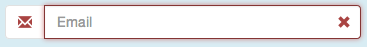
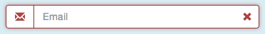
对于验证状态(错误,警告,成功),它分别为输入添加红色,黄色和绿色边框。
但是,如果您在输入字段中放置了输入组插件,则插件不会聚焦。创造一些有点奇怪的效果:
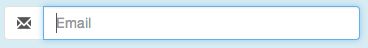
如何将焦点添加到插件?
4 个答案:
答案 0 :(得分:4)
不幸的是,如果没有javascript,我无法找到一种方法。但这是一个解决方案。
添加此CSS:
.input-group-focus {
  border-radius:4px;
  -webkit-transition: box-shadow ease-in-out .15s;
          transition: box-shadow ease-in-out .15s;
}
.input-group-addon {
  -webkit-transition: border-color ease-in-out .15s;
          transition: border-color ease-in-out .15s;
}
.input-group.input-group-focus {
  -webkit-box-shadow: inset 0 1px 1px rgba(0,0,0,.075), 0 0 8px rgba(102, 175, 233, .6) !important;
          box-shadow: inset 0 1px 1px rgba(0,0,0,.075), 0 0 8px rgba(102, 175, 233, .6) !important;
}
.has-error.input-group.input-group-focus,
.has-error .input-group.input-group-focus {
  -webkit-box-shadow: inset 0 1px 1px rgba(0, 0, 0, .075), 0 0 6px #ce8483 !important;
          box-shadow: inset 0 1px 1px rgba(0, 0, 0, .075), 0 0 6px #ce8483 !important;
}
.has-warning.input-group.input-group-focus,
.has-warning .input-group.input-group-focus {
  -webkit-box-shadow: inset 0 1px 1px rgba(0, 0, 0, .075), 0 0 6px #67b168 !important;
          box-shadow: inset 0 1px 1px rgba(0, 0, 0, .075), 0 0 6px #67b168 !important;
}
.has-success .input-group.input-group-focus,
.has-success .input-group.input-group-focus {
  -webkit-box-shadow: inset 0 1px 1px rgba(0, 0, 0, .075), 0 0 6px #c0a16b !important;
          box-shadow: inset 0 1px 1px rgba(0, 0, 0, .075), 0 0 6px #c0a16b !important;
}
.input-group-focus input:focus {
  -webkit-box-shadow: none !important;
          box-shadow: none !important;
}
.input-group-focus .input-group-addon {
  border-color: #66afe9 !important;
}
.has-error .input-group-addon {
  border-color: #843534 !important;
}
.has-success .input-group-addon {
  border-color: #2b542c !important;
}
.has-warning .input-group-addon {
  border-color: #66512c !important;
}
!important对您的实施可能是必要的,也可能不是,所以我决定将它们留在那里。我不认为有些事情比你的焦点状态更重要,所以它应该没问题。
JS(使用jQuery):
$(document).ready(function() {
    $(".input-group > input").focus(function(e){
        $(this).parent().addClass("input-group-focus");
    }).blur(function(e){
        $(this).parent().removeClass("input-group-focus");
    });
});
无论是向.input-group父级还是.form-group父级添加验证状态,这都会有效。
结果:

答案 1 :(得分:3)
这是我仅通过CSS就能做到的方式
.input-group:focus-within .input-group-prepend .input-group-text,
.form-control:focus ~ .input-group-append .input-group-text {
  border-color: #06f;
}
答案 2 :(得分:0)
我最近并不喜欢在最好的时候使用JQuery,并且发现javascript解决方案可能会变得很难支持(很高兴得到纠正:)
根据我们对CSS的了解,+运算符会将规则应用于下一个子选择器,或者我们可以使用~来定位任何子选择器。 (令人讨厌的是没有父选择器)
考虑到这一点,我的解决方案(仅针对Chrome进行测试,而不是使用.has-success上的.has-errors,.form-group等状态进行测试)是覆盖{{1}的修改后的副本阻止,嵌套在其中。
基本块类似于:
.input-group修改/复制块(在上面的代码中的输入字段之后添加/插入):
<div class="form-group">
    <label class="control-label">Input with addons</label>
        <div class="input-group">
            <div class="input-group-addon">$</div>
            <input type="text" class="form-control" placeholder="placeholder text">
            <div class="input-group-addon">.00</div>
        </div>
    <span class="help-block">Help block</span>
</div>
完整版块现在看起来像:
<div class="input-group-overlay">
    <div class="input-group-addon">$</div>
    <span class="form-control"></span>
    <div class="input-group-addon">.00</div>
</div>
如果有附加元素,则块需要在最后一个input-group-addon之前移动,否则将不应用顶部和右下半径角。我还在下面的CSS中使用<div class="form-group">
<label class="control-label">Input with addons</label>
<div class="input-group">
<div class="input-group-addon">$</div>
<input type="text" class="form-control" placeholder="placeholder text">
<div class="input-group-overlay">
<div class="input-group-addon">$</div>
<span class="form-control"></span>
<div class="input-group-addon">.00</div>
</div>
<div class="input-group-addon">.00</div>
</div>
<span class="help-block">Help block</span>
</div>
作为运算符,它希望它是下一个元素。
现在的CSS:
+这会将边框应用于父元素上的子输入插件。
如上所述,这仅在Chrome中进行了测试,span .form-group的z-index可能需要在其他浏览器中进行一些调整。
添加了反弹功能,您还可以删除输入的左右边框,并更改插件的背景颜色,使其看起来像输入的一部分。
input:focus + .input-group-overlay .input-group-addon {
  border-color: #66afe9;
}

.input-group-overlay {
  position: absolute;
  display: inherit;
  z-index: 1;
  top: 0;
  left: 0;
}
答案 3 :(得分:0)
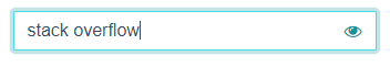
如上所述,我的解决方案(使用Bootstrap 4)是将input-group-addon与input重叠,并使用绝对定位和z-index。我在input上添加了一些右填充,以便为插件腾出空间。这是我的SCSS和标记:
.input-group.input-group-seamless-append {
    > input {
        width: 100%;
        padding-right: 52px;
    }
    > .input-group-append {
        position: absolute;
        right: 1px;
        top: 1px;
        bottom: 1px;
        z-index: 4;
    }
}
<div class="input-group input-group-seamless-append">
<input autocomplete="off" class="form-control rounded"
aria-describedby="button-addon"
[attr.type]="showPassword ? 'text' : 'password'">
<div class="input-group-append">
<button type="button" id="button-addon"
class="btn btn-light shadow-none border-0 bg-transparent text-primary">
<i class="fa fa-eye" *ngIf="showPassword"
(click)="showPassword = !showPassword"></i>
<i class="fa fa-eye-slash" *ngIf="!showPassword"
(click)="showPassword = !showPassword"></i>
</button>
</div>
</div>
您可以看到,通过将类input-group-seamless-append添加到我的input-group中可以激活此特殊UX,因此我可以控制其应用的特定位置。
如果您不使用Angular,则需要删除(click),*ngIf和[attr]绑定,这些绑定特定于显示/隐藏密码功能。
这是最终的样子:
不专心:
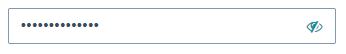
重点:
- 我写了这段代码,但我无法理解我的错误
- 我无法从一个代码实例的列表中删除 None 值,但我可以在另一个实例中。为什么它适用于一个细分市场而不适用于另一个细分市场?
- 是否有可能使 loadstring 不可能等于打印?卢阿
- java中的random.expovariate()
- Appscript 通过会议在 Google 日历中发送电子邮件和创建活动
- 为什么我的 Onclick 箭头功能在 React 中不起作用?
- 在此代码中是否有使用“this”的替代方法?
- 在 SQL Server 和 PostgreSQL 上查询,我如何从第一个表获得第二个表的可视化
- 每千个数字得到
- 更新了城市边界 KML 文件的来源?