使用自定义项模板在ComboBox中显示所选项
我使用此页面中的代码来设置我的组合框样式:How to style ComboBox Background on Mouse Hover?
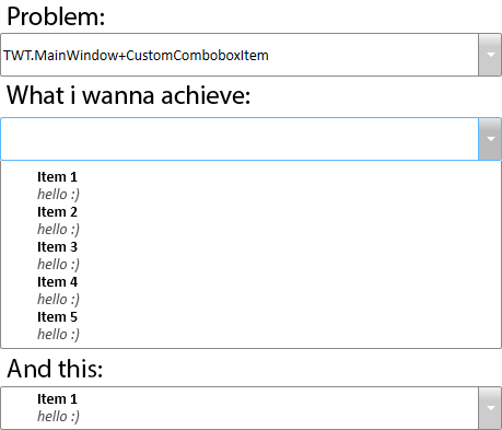
我已更改默认项目模板,但现在它们不会出现在所选值区域中。在下图中,您可以看到问题以及我想要实现的目标。
这是我在App.xaml中的XAML:
<LinearGradientBrush x:Key="ButtonBackgroundBrush" StartPoint="0,0" EndPoint="0,1">
    <GradientStop Offset="0" Color="#FFF3F3F3"/>
    <GradientStop Offset="0.3" Color="#FFCCCCCC"/>
</LinearGradientBrush>

<LinearGradientBrush x:Key="ButtonBackgroundBrush" StartPoint="0,0" EndPoint="0,1">
    <GradientStop Offset="0" Color="#FFF3F3F3"/>
    <GradientStop Offset="0.3" Color="#FFCCCCCC"/>
</LinearGradientBrush>

<LinearGradientBrush x:Key="ButtonBackgroundHoverBrush" StartPoint="0,0" EndPoint="0,1">
    <GradientStop Offset="0" Color="#FFE4E4E4"/>
    <GradientStop Offset="0.3" Color="#FFBBBBBB"/>
</LinearGradientBrush>

<LinearGradientBrush x:Key="ButtonBackgroundDisabledBrush" StartPoint="0,0" EndPoint="0,1">
    <GradientStop Offset="0" Color="#FF636363"/>
    <GradientStop Offset="0.3" Color="#FF4E4D4D"/>
</LinearGradientBrush>

<SolidColorBrush x:Key="GlyphBrush" Color="#FFF" />

<SolidColorBrush x:Key="DisabledForegroundBrush" Color="#888" />

<SolidColorBrush x:Key="WindowBackgroundBrush" Color="#FFF" />

<ControlTemplate x:Key="ComboBoxToggleButton" TargetType="ToggleButton">
    <Grid>
        <Grid.ColumnDefinitions>
            <ColumnDefinition />
            <ColumnDefinition Width="20" />
        </Grid.ColumnDefinitions>

        <Border x:Name="Border" Grid.ColumnSpan="2" CornerRadius="2" Background="{StaticResource ButtonBackgroundBrush}" BorderBrush="#FF898989" BorderThickness="1" />
        <Border x:Name="Border2" Grid.Column="0" CornerRadius="2,0,0,2" Margin="1" Background="White" BorderBrush="#FF898989" BorderThickness="0,0,1,0" />

        <Path x:Name="Arrow" Grid.Column="1" Fill="{StaticResource GlyphBrush}" HorizontalAlignment="Center" VerticalAlignment="Center" Data="M 0 0 L 4 4 L 8 0 Z"/>
    </Grid>
    <ControlTemplate.Triggers>
        <Trigger Property="ToggleButton.IsMouseOver" Value="True">
            <Setter TargetName="Border" Property="Background" Value="{StaticResource ButtonBackgroundHoverBrush}" />
            <Setter TargetName="Border" Property="BorderBrush" Value="#FF59B7FF" />
            <Setter TargetName="Border2" Property="BorderBrush" Value="#FF59B7FF" />
        </Trigger>
        <Trigger Property="ToggleButton.IsChecked" Value="True">
            <Setter TargetName="Border" Property="Background" Value="{StaticResource ButtonBackgroundHoverBrush}" />
            <Setter TargetName="Border" Property="BorderBrush" Value="#FF59B7FF" />
            <Setter TargetName="Border2" Property="BorderBrush" Value="#FF59B7FF" />
        </Trigger>
        <Trigger Property="IsEnabled" Value="False">
            <Setter TargetName="Border" Property="Background" Value="{StaticResource ButtonBackgroundDisabledBrush}" />
            <Setter TargetName="Arrow" Property="Fill" Value="{StaticResource DisabledForegroundBrush}" />
        </Trigger>
    </ControlTemplate.Triggers>
</ControlTemplate>

<ControlTemplate x:Key="ComboBoxTextBox" TargetType="TextBox">
    <Border x:Name="PART_ContentHost" Focusable="False" Background="{TemplateBinding Background}" />
</ControlTemplate>

<Style x:Key="{x:Type ComboBox}" TargetType="ComboBox">
    <Setter Property="SnapsToDevicePixels" Value="True"/>
    <Setter Property="OverridesDefaultStyle" Value="True"/>
    <Setter Property="ScrollViewer.HorizontalScrollBarVisibility" Value="Auto"/>
    <Setter Property="ScrollViewer.VerticalScrollBarVisibility" Value="Auto"/>
    <Setter Property="ScrollViewer.CanContentScroll" Value="True"/>
    <Setter Property="MinWidth" Value="120"/>
    <Setter Property="MinHeight" Value="20"/>
    <Setter Property="Template">
        <Setter.Value>
            <ControlTemplate TargetType="ComboBox">
                <Grid>
                    <ToggleButton Name="ToggleButton" Template="{StaticResource ComboBoxToggleButton}" Grid.Column="2" Focusable="False" IsChecked="{Binding Path=IsDropDownOpen,Mode=TwoWay,RelativeSource={RelativeSource TemplatedParent}}" ClickMode="Press" />
                    <ContentPresenter Name="ContentSite" IsHitTestVisible="False" Content="{TemplateBinding SelectionBoxItem}" ContentTemplate="{TemplateBinding SelectionBoxItemTemplate}" ContentTemplateSelector="{TemplateBinding ItemTemplateSelector}" Margin="3,3,23,3" VerticalAlignment="Center" HorizontalAlignment="Left" />
                    <TextBox x:Name="PART_EditableTextBox" Style="{x:Null}" Template="{StaticResource ComboBoxTextBox}" HorizontalAlignment="Left" VerticalAlignment="Center" Margin="3,3,23,3" Focusable="True" Background="Transparent" Visibility="Hidden" IsReadOnly="{TemplateBinding IsReadOnly}" />
                    <Popup Name="Popup" Placement="Bottom" IsOpen="{TemplateBinding IsDropDownOpen}" AllowsTransparency="True" Focusable="False" PopupAnimation="Slide">
                        <Grid Name="DropDown" SnapsToDevicePixels="True" MinWidth="{TemplateBinding ActualWidth}" MaxHeight="{TemplateBinding MaxDropDownHeight}">
                            <Border x:Name="DropDownBorder" Background="White" BorderThickness="1" BorderBrush="#FF898989" />
                            <ScrollViewer Margin="4,6,4,6" SnapsToDevicePixels="True">
                                <StackPanel IsItemsHost="True" KeyboardNavigation.DirectionalNavigation="Contained" />
                            </ScrollViewer>
                        </Grid>
                    </Popup>
                </Grid>
                <ControlTemplate.Triggers>
                    <Trigger Property="HasItems" Value="False">
                        <Setter TargetName="DropDownBorder" Property="MinHeight" Value="95"/>
                    </Trigger>
                    <Trigger Property="IsEnabled" Value="False">
                        <Setter Property="Foreground" Value="{StaticResource DisabledForegroundBrush}"/>
                    </Trigger>
                    <Trigger Property="IsGrouping" Value="True">
                        <Setter Property="ScrollViewer.CanContentScroll" Value="False"/>
                    </Trigger>
                    <Trigger SourceName="Popup" Property="Popup.AllowsTransparency" Value="True">
                        <Setter TargetName="DropDownBorder" Property="CornerRadius" Value="0,0,2,2"/>
                        <Setter TargetName="DropDownBorder" Property="Margin" Value="0,-1,0,0"/>
                    </Trigger>
                    <Trigger Property="IsEditable" Value="True">
                        <Setter Property="IsTabStop" Value="False"/>
                        <Setter TargetName="PART_EditableTextBox" Property="Visibility" Value="Visible"/>
                        <Setter TargetName="ContentSite" Property="Visibility" Value="Hidden"/>
                    </Trigger>
                </ControlTemplate.Triggers>
            </ControlTemplate>
        </Setter.Value>
    </Setter>
</Style>

<Style x:Name="CustomComboboxItem" TargetType="ComboBoxItem">
    <Setter Property="Template">
        <Setter.Value>
            <ControlTemplate TargetType="ComboBoxItem">
                <Grid>
                    <Grid.ColumnDefinitions>
                        <ColumnDefinition Width="30"/>
                        <ColumnDefinition Width="*"/>
                    </Grid.ColumnDefinitions>
                    <Grid Grid.Column="1">
                        <Grid.RowDefinitions>
                            <RowDefinition Height="16" MinHeight="16" MaxHeight="16" />
                            <RowDefinition Height="16" MinHeight="16" MaxHeight="16" />
                        </Grid.RowDefinitions>
                        <TextBlock Text="{Binding NewItemName}" Grid.Row="0" FontWeight="Bold" />
                        <TextBlock Text="{Binding NewItemComment}" Grid.Row="1" FontStyle="Italic" Foreground="#FF555454" />
                    </Grid>
                </Grid>

                <ControlTemplate.Triggers>
                    <Trigger Property="IsMouseOver" Value="True">
                        <Setter Property="Background" Value="LightGray"/>
                    </Trigger>
                </ControlTemplate.Triggers>
            </ControlTemplate>
        </Setter.Value>
    </Setter>
</Style>
MainWindow.xaml:
<ComboBox Height="40" HorizontalAlignment="Left" Margin="102,64,0,0" Name="comboBox1" VerticalAlignment="Top" Width="459" />
代码隐藏:
public MainWindow()
{
    InitializeComponent();

    comboBox1.Items.Add(new CustomComboboxItem { NewItemName = "Item 1", NewItemComment = "hello :)" });
    comboBox1.Items.Add(new CustomComboboxItem { NewItemName = "Item 2", NewItemComment = "hello :)" });
    comboBox1.Items.Add(new CustomComboboxItem { NewItemName = "Item 3", NewItemComment = "hello :)" });
    comboBox1.Items.Add(new CustomComboboxItem { NewItemName = "Item 4", NewItemComment = "hello :)" });
    comboBox1.Items.Add(new CustomComboboxItem { NewItemName = "Item 5", NewItemComment = "hello :)" });
}

public class CustomComboboxItem
{
    public string NewItemName { get; set; }
    public string NewItemComment { get; set; }
}
有人能告诉我我做错了吗?
3 个答案:
答案 0 :(得分:6)
您可以为ComboBox定义ItemTemplate而不是ComboBoxItem的ControlTemplate来实现它。如您所见,ControlTemplate for ComboBoxItem在ItemTemplate执行时不会影响选定的项目外观。以下是您在ComboBox样式中合并的CustomComboboxItem样式的内容:
<Style x:Key="{x:Type ComboBox}" TargetType="ComboBox">
        ........
        <Setter Property="HorizontalContentAlignment" Value="Stretch"/>
        <Setter Property="ItemTemplate">
            <Setter.Value>
                <DataTemplate>
                    <Grid>
                        <Grid.Style>
                            <Style TargetType="Grid">
                                <Style.Triggers>
                                    <Trigger Property="IsMouseOver" Value="True">
                                        <Setter Property="Background" Value="LightGray"/>
                                    </Trigger>
                                </Style.Triggers>
                            </Style>
                        </Grid.Style>
                        <Grid.ColumnDefinitions>
                            <ColumnDefinition Width="30"/>
                            <ColumnDefinition Width="*"/>
                        </Grid.ColumnDefinitions>
                        <Grid Grid.Column="1">
                            <Grid.RowDefinitions>
                                <RowDefinition Height="16" MinHeight="16" MaxHeight="16" />
                                <RowDefinition Height="16" MinHeight="16" MaxHeight="16" />
                            </Grid.RowDefinitions>
                            <TextBlock Text="{Binding NewItemName}" Grid.Row="0" FontWeight="Bold" />
                            <TextBlock Text="{Binding NewItemComment}" Grid.Row="1" FontStyle="Italic" Foreground="#FF555454" />
                        </Grid>
                    </Grid>
                </DataTemplate>
            </Setter.Value>
        </Setter>
        ........
    </Style>
答案 1 :(得分:0)
<Style x:Name="CustomComboboxItem" TargetType="ComboBoxItem">
用
替换上面的代码<Style x:Key="{x:Type ComboBoxItem}" TargetType="ComboBoxItem">
删除x:Name ..
    public MainWindow()
    {
        InitializeComponent();
        var itemSource = new System.Collections.ObjectModel.ObservableCollection<CustomComboboxItem>();

        itemSource.Add(new CustomComboboxItem {NewItemName = "Item 1", NewItemComment = "hello :)"});
        itemSource.Add(new CustomComboboxItem {NewItemName = "Item 2", NewItemComment = "hello :)"});
        itemSource.Add(new CustomComboboxItem {NewItemName = "Item 3", NewItemComment = "hello :)"});
        itemSource.Add(new CustomComboboxItem {NewItemName = "Item 4", NewItemComment = "hello :)"});
        itemSource.Add(new CustomComboboxItem {NewItemName = "Item 5", NewItemComment = "hello :)"});

        comboBox1.ItemSource = itemSource;

    }
答案 2 :(得分:0)
您应该覆盖toString()类的CustomComboboxItem方法。
相关问题
最新问题
- 我写了这段代码,但我无法理解我的错误
- 我无法从一个代码实例的列表中删除 None 值,但我可以在另一个实例中。为什么它适用于一个细分市场而不适用于另一个细分市场?
- 是否有可能使 loadstring 不可能等于打印?卢阿
- java中的random.expovariate()
- Appscript 通过会议在 Google 日历中发送电子邮件和创建活动
- 为什么我的 Onclick 箭头功能在 React 中不起作用?
- 在此代码中是否有使用“this”的替代方法?
- 在 SQL Server 和 PostgreSQL 上查询,我如何从第一个表获得第二个表的可视化
- 每千个数字得到
- 更新了城市边界 KML 文件的来源?