cssдёӨиЎҢ1еҲ—жЎҶеёғеұҖ
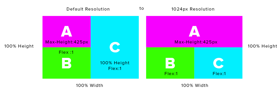
жҲ‘дёҖзӣҙеңЁдҪҝз”ЁflexboxиҝӣиЎҢдёӨиЎҢе’ҢдёҖеҲ—еёғеұҖпјҢжҲ‘дҪҝз”Ёзҡ„жҳҜflexboxпјҢеӣ дёәжҲ‘дёҚи®Өдёәcss2.1еҸҜд»ҘеЎ«е……box-Bзҡ„еү©дҪҷз©әй—ҙгҖӮеңЁжҲ‘зҡ„jsFiddleзҡ„дҫӢеӯҗдёӯпјҢжҲ‘дёҚиғҪи®©box-Cеҗ‘еҸіз§»еҠЁпјҢиҖҢдё”жҲ‘д№ҹдёҚиғҪи®©box-BеһӮзӣҙејҜжӣІе№¶еЎ«е……еҶ…е®№пјҢжңүдәәеҸҜд»Ҙеё®еҠ©жҲ‘иҝҷдёӘеёғеұҖ

#container {
    background-color:red;
    width:100%; height:100%
}

#three-box-layout {
    display:flex;
    display:-ms-flex;
    display:-webkit-flexbox;
    display:-moz-flex;
    height:100%;
    -ms-flex-direction:column;
    -webkit-flex-direction:column
}

.shuffle-box {

}
#box-a {
    background-color:#f601ff; -ms-flex-order:1; -webkit-flex-order:1;
    margin-right:30%;
}
#box-b {
    -ms-flex:3;
    -webkit-flex:3;
    -moz-flex:3;
    flex:3;

    background-color:#37fe02;
    margin-right:30%;
}
#three-box-layout #box-c {
    -ms-flex:3;
    -webkit-flex:3;
    -moz-flex:3;
    flex:3;

    background-color:#02effe;

    margin-left:70%; float:right;

}


<div id="container">
    <div id="three-box-layout">
        <div id="box-a" class="shuffle-box">
            <div style="height:425px; background-color:pink">A</div>
        </div>
        <div id="box-b">B</div>
        <div id="box-c">C</div>
    </div>
</div>
1 дёӘзӯ”жЎҲ:
зӯ”жЎҲ 0 :(еҫ—еҲҶпјҡ1)
жӮЁеҸҜд»ҘдҪҝз”ЁCSSиЎЁж јпјҲдёҚйңҖиҰҒFlexboxпјү
и°ғж•ҙжөҸи§ҲеҷЁеӨ§е°Ҹд»ҘжҹҘзңӢжӯЈеңЁиҝҗиЎҢзҡ„еӘ’дҪ“жҹҘиҜўпјҒ
FIDDLE1пјҲеҶ…е®№еҫҲе°‘пјү/ FIDDLE2пјҲеҫҲеӨҡеҶ…е®№пјү
ж Үи®°
<div class="container">
    <div class="row1">
        <div>A</div>
        <div></div> /* give this div table cell 50% width on wide screens */
    </div>
    <div class="row2">
        <div>B</div>
        <div>C</div>
    </div>
</div>

CSS
--

.container {
    width: 800px;
    height: 500px;
    display:table;
    text-align: center;
    position: relative;
}
.row1 {
    display:table-row;
    max-height: 425px;
    background: pink;
}
.row1 div {
    display:table-cell;
    width:50%;
}
.row2 {
    display:table-row;
    height: 100%;
}
.row2 div {
    width: 100%;
    height: 100%;
    float:left;
    background: green;
}
.row2 div + div {
    background: aqua;
    width: 50%;
    height: 100%;
    position: absolute;
    top:0;
    right:0;
}
@media (max-width: 1024px) {
    .row1 {
        width: 100%;
    }
    .row1 div + div {
        display: none;
    }
    .row2 div {
        width: 50%;
    }
    .row2 div + div {
        position: static;
    }
}
зӣёе…ій—®йўҳ
- еёҰжңү<ul> </ul>зҡ„еҸҢеҲ—еёғеұҖ
- еҸҢйқўжЎҶйҳҙеҪұйЎ¶йғЁжңү3дёӘж–№жЎҶйҳҙеҪұ
- е“Қеә”дёӨеҲ—йЎөи„ҡ
- cssдёӨиЎҢ1еҲ—жЎҶеёғеұҖ
- зҪ‘йЎөMetroUI CSSеңЁеҲ—дёҠи·Ёи¶ҠдёӨиЎҢ
- дёӨж Ҹdivй—®йўҳ
- еҰӮдҪ•еңЁжҜҸеҲ—дёӯж Үи®°1еҲ—пјҲдёҚеҢ…еҗ«иЎҢпјүе’Ң2еҲ—пјҢжҜҸиЎҢ3иЎҢ
- Bootstrap 2иЎҢпјҢ1еҲ—
- е°ҶdivжӢҶеҲҶдёәдёӨиЎҢпјҢеҰӮеӨҡеҲ—CSSеұһжҖ§
- иҮіе°‘дёӨиЎҢдҪҝз”ЁеёҰжңүиЎҢеҶ…еқ—зҡ„еҲ—е®Ҫ
жңҖж–°й—®йўҳ
- жҲ‘еҶҷдәҶиҝҷж®өд»Јз ҒпјҢдҪҶжҲ‘ж— жі•зҗҶи§ЈжҲ‘зҡ„й”ҷиҜҜ
- жҲ‘ж— жі•д»ҺдёҖдёӘд»Јз Ғе®һдҫӢзҡ„еҲ—иЎЁдёӯеҲ йҷӨ None еҖјпјҢдҪҶжҲ‘еҸҜд»ҘеңЁеҸҰдёҖдёӘе®һдҫӢдёӯгҖӮдёәд»Җд№Ҳе®ғйҖӮз”ЁдәҺдёҖдёӘз»ҶеҲҶеёӮеңәиҖҢдёҚйҖӮз”ЁдәҺеҸҰдёҖдёӘз»ҶеҲҶеёӮеңәпјҹ
- жҳҜеҗҰжңүеҸҜиғҪдҪҝ loadstring дёҚеҸҜиғҪзӯүдәҺжү“еҚ°пјҹеҚўйҳҝ
- javaдёӯзҡ„random.expovariate()
- Appscript йҖҡиҝҮдјҡи®®еңЁ Google ж—ҘеҺҶдёӯеҸ‘йҖҒз”өеӯҗйӮ®д»¶е’ҢеҲӣе»әжҙ»еҠЁ
- дёәд»Җд№ҲжҲ‘зҡ„ Onclick з®ӯеӨҙеҠҹиғҪеңЁ React дёӯдёҚиө·дҪңз”Ёпјҹ
- еңЁжӯӨд»Јз ҒдёӯжҳҜеҗҰжңүдҪҝз”ЁвҖңthisвҖқзҡ„жӣҝд»Јж–№жі•пјҹ
- еңЁ SQL Server е’Ң PostgreSQL дёҠжҹҘиҜўпјҢжҲ‘еҰӮдҪ•д»Һ第дёҖдёӘиЎЁиҺ·еҫ—第дәҢдёӘиЎЁзҡ„еҸҜи§ҶеҢ–
- жҜҸеҚғдёӘж•°еӯ—еҫ—еҲ°
- жӣҙж–°дәҶеҹҺеёӮиҫ№з•Ң KML ж–Ү件зҡ„жқҘжәҗпјҹ