iOS 7圆形框架按钮
iOS App Store有一个蓝色圆形框架按钮,用于购买/下载应用程序。
在我的应用程序中,您可以下载其他内容,我想要一个类似的按钮,只是因为它看起来很熟悉用户。
如果您不知道,我的意思是:这些按钮,如“$ 3.99”
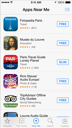
这怎么可能?
8 个答案:
答案 0 :(得分:199)
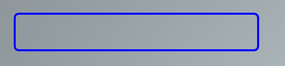
您可以轻松操作按钮的CALayer来完成此操作。
// assuming you have a UIButton or more generally a UIView called buyButton

buyButton.layer.cornerRadius = 2;
buyButton.layer.borderWidth = 1;
buyButton.layer.borderColor = [UIColor blueColor].CGColor;
// (note - may prefer to use the tintColor of the control)
你可以调整每一个以获得你想要的颜色和边框效果。
您还必须在要使用CALayers的任何文件中添加导入
#import <QuartzCore/QuartzCore.h>
答案 1 :(得分:90)
如果您非常喜欢使用故事板进行iOS设计的UI设计..您可以设置角半径(以及dima的answer中提到的任何其他参数 - 虽然不幸的是不是颜色,因为它是CGColor和Apple目前在故事板中identity inspector - &gt; user defined runtime attributes的弹出窗口中没有该选项,如下所示:
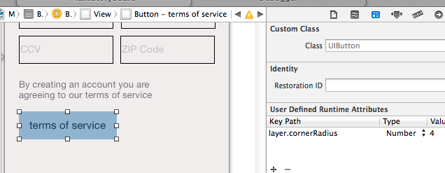
<强>奖金:
您使用UIButton占位符文字颜色的运行时属性(请参阅here)并更改UILabel,UITextField和UIButton的字体(请参阅{{3 }})
答案 2 :(得分:17)
对于UIButton,UILabel等标准iOS控制元素,
您应该使用UIView tintColor属性:
buyButton.layer.borderColor = buyButton.tintColor.CGColor;
答案 3 :(得分:8)
对于您所描述的简单边框,请使用来自Dima的答案,使用CALAyer。
如果你想要更多,例如带渐变的圆角矩形,那么使用这种方法作为基础:
创建一个自定义视图,绘制一个圆角矩形并将其放在按钮上。 使用此处的搜索功能搜索绘制圆角矩形。 绘图通过绘制具有定义半径(角)和4条直线的4个弧来实现。
FTR,按照亚历克斯和布莱恩的说法,你可以使用正确的iOS7圆角制作UIView。
我很确定CGPathCreateWithRoundedRect 不会为您提供“新”圆角。你必须使用bezierPathWithRoundedRect作为“新”角。
#import "UIViewWithIOS7RoundedCorners.h"
@implementation UIViewWithIOS7RoundedCorners
-(void)drawRect:(CGRect)rect
    {
    // for a filled shape...

    UIBezierPath* path =
        [UIBezierPath bezierPathWithRoundedRect:self.bounds cornerRadius:4];
    [[UIColor blueColor] setFill];
    [path fill];

    // for just a border...

    int thickness=2;
    UIBezierPath* path =
        [UIBezierPath bezierPathWithRoundedRect:
            CGRectInset(self.bounds, thickness/2, thickness/2)
            cornerRadius: 4];
    path.lineWidth = thickness;
    [[UIColor blueColor] setStroke];
    [path stroke];
    }

@end
// ps don't forget to set .backgroundColor=[UIColor clearColor]
// perhaps in initWithCoder/initWithFrame
希望它有助于某人
答案 4 :(得分:2)
答案 5 :(得分:2)
为了扩展@abbood的优秀答案,实际上可以从IB设置视图层的边框颜色和背景颜色,但这需要做一些准备工作。< / p>
我在NSView,CALayer + setUIColor.h上创建了一个自定义类别。
设置边框颜色只有一个方法setBorderUIColor。它将UIColor作为输入,获取UIColor的底层NSColor,并将该颜色应用于视图层。
然后,在IB中,您只需添加一个用户定义的运行时属性,如下所示:
的keyPath layer.borderUIColor 类型 颜色 值 所需的颜色。
在运行时,系统会调用您的方法,传入IB中定义的UIColor。该类别从UIColor获取CGColor并将其应用于图层。
你可以在我的github项目中的一个名为
的工作项目中看到这个我也为设置图层的背景颜色属性做了同样的事情,但在上面的项目中却没有。
答案 6 :(得分:0)
对于快速版本的邓肯C&s延长了abbood的答案:
extension CALayer {
    var borderUIColor: UIColor? {
        get {
            if let borderColor = borderColor {
                return UIColor(CGColor: borderColor)
            }
            return nil
        }
        set {
            borderColor = newValue?.CGColor ?? nil
        }
    }
}
答案 7 :(得分:0)
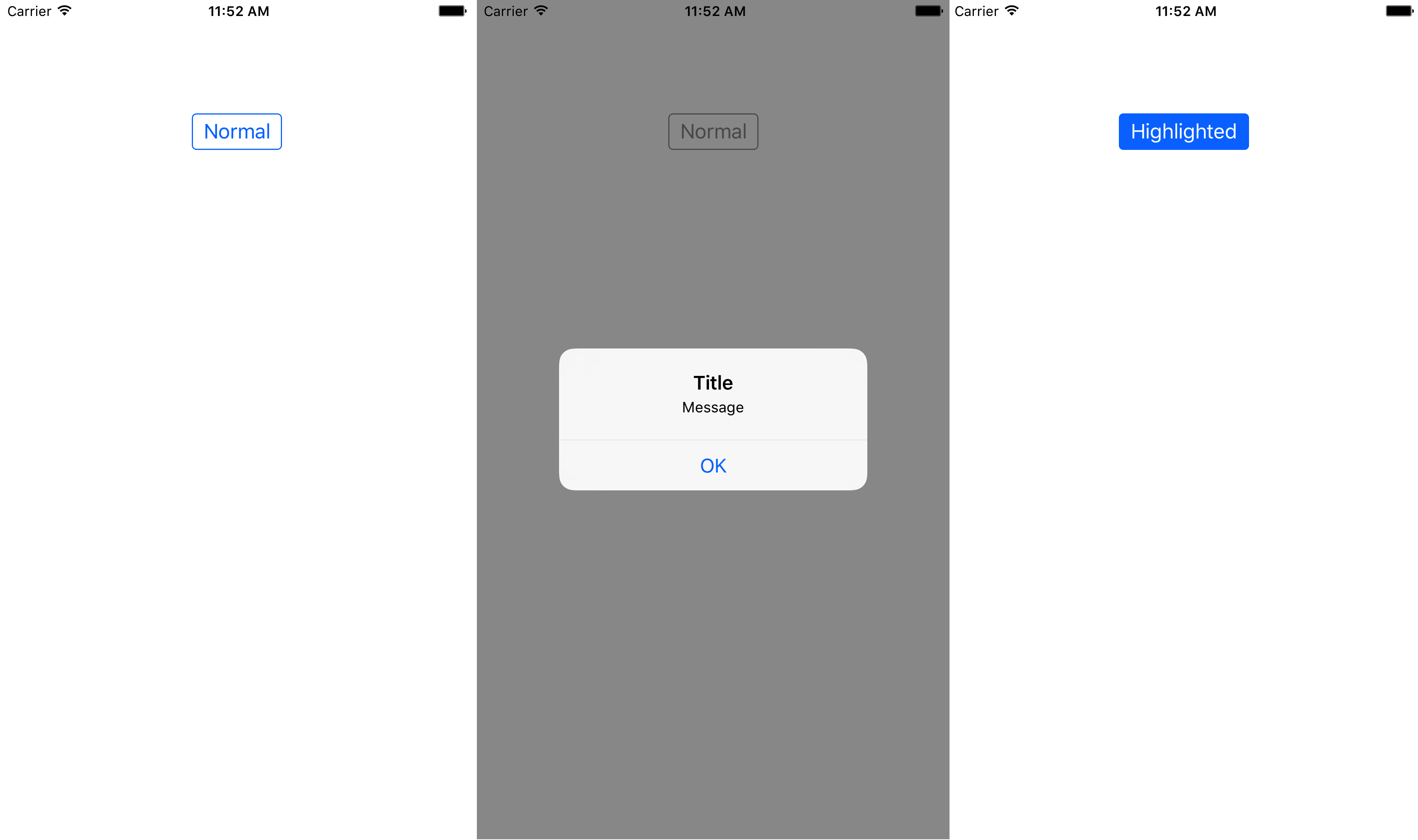
使用Swift 3 / iOS 10,您可以创建UIButton的子类,以便拥有一个自定义按钮,该按钮看起来像iOS AppStore应用程序中的蓝色圆角边框按钮。
以下代码显示了如何正确管理色调颜色(当按钮出现在UIAlertController的灰色视图后面时),标题的颜色,突出显示的背景颜色,边框的样式,边框的颜色以及内容插入。
CustomButton.swift:
import UIKit
class CustomButton: UIButton {
override init(frame: CGRect) {
super.init(frame: frame)
setProperties()
}
required init?(coder aDecoder: NSCoder) {
super.init(coder: aDecoder)
// Make sure to set CustomButton as the class of the UIButton in Identity inspector of storyboard
// Make sure to set Custom as the type of the UIButton in Attributes inspector of storyboard
setProperties()
}
func setProperties() {
// Set tintColor (only if you want to replace the system default tintColor)
// tintColor = .red
// Set the border's color
layer.borderColor = tintColor?.cgColor
// Set colors for title's states
setTitleColor(tintColor, for: .normal)
setTitleColor(.white, for: .highlighted)
// Add some margins between the title (content) and the border
contentEdgeInsets = UIEdgeInsets(top: 5, left: 10, bottom: 5, right: 10)
}
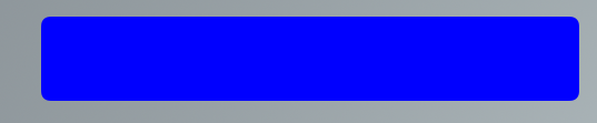
override var isHighlighted: Bool {
didSet {
// Toggle the background color according to button's highlighted state
backgroundColor = super.isHighlighted ? tintColor : nil
}
}
override func tintColorDidChange() {
super.tintColorDidChange()
// When the tint color is changed by the system (eg when the button appears below the dimmed view of a UIAlertController), we have to manually update border color and title's text color
layer.borderColor = tintColor?.cgColor
titleLabel?.textColor = tintColor
}
override func draw(_ rect: CGRect) {
// Draw the border
layer.borderWidth = 1
layer.cornerRadius = 4
layer.masksToBounds = true
}
}
ViewController.swift(以编程方式创建自定义按钮):
import UIKit

class ViewController: UIViewController {

    override func viewDidLoad() {
        super.viewDidLoad()

        let button = CustomButton()
        button.setTitle("Normal", for: .normal)
        button.setTitle("Highlighted", for: .highlighted)
        button.addTarget(self, action: #selector(presentAlert(_:)), for: .touchUpInside)
        view.addSubview(button)

        // auto layout
        button.translatesAutoresizingMaskIntoConstraints = false
        button.centerXAnchor.constraint(equalTo: view.centerXAnchor).isActive = true
        button.topAnchor.constraint(equalTo: view.topAnchor, constant: 100).isActive = true
    }

    /// Present alert when button is tapped
    func presentAlert(_ sender: UIButton) {
        let alertController = UIAlertController(title: "Title", message: "Message", preferredStyle: .alert)
        let alertAction = UIAlertAction(title: "OK", style: .default)
        alertController.addAction(alertAction)
        present(alertController, animated: true, completion: nil)
    }

}
ViewController.swift(在故事板中创建自定义按钮的替代方法):
import UIKit

class ViewController: UIViewController {

    @IBOutlet weak var button: CustomButton!

    override func viewDidLoad() {
        super.viewDidLoad()

        button.setTitle("Normal", for: .normal)
        button.setTitle("Highlighted", for: .highlighted)
    }

    /// Present alert when button is tapped
    @IBAction func presentAlert(_ sender: UIButton) {
        let alertController = UIAlertController(title: "Title", message: "Message", preferredStyle: .alert)
        let alertAction = UIAlertAction(title: "OK", style: .default)
        alertController.addAction(alertAction)
        present(alertController, animated: true, completion: nil)
    }

}
下图显示了当系统tinColor发生变化(在UIAlertController的灰暗视图后面)和highlighted状态时,自定义按钮在正常状态下的显示方式。< / p>
- 我写了这段代码,但我无法理解我的错误
- 我无法从一个代码实例的列表中删除 None 值,但我可以在另一个实例中。为什么它适用于一个细分市场而不适用于另一个细分市场?
- 是否有可能使 loadstring 不可能等于打印?卢阿
- java中的random.expovariate()
- Appscript 通过会议在 Google 日历中发送电子邮件和创建活动
- 为什么我的 Onclick 箭头功能在 React 中不起作用?
- 在此代码中是否有使用“this”的替代方法?
- 在 SQL Server 和 PostgreSQL 上查询,我如何从第一个表获得第二个表的可视化
- 每千个数字得到
- 更新了城市边界 KML 文件的来源?