位于页面底部的页脚有固定页眉
我想将页脚放在页面底部,该页面还有一个固定的标题...
-
不在
position: fixed- 我不希望它留在屏幕上,它应该只是在页面的末尾,在滚动时表现正常 -
不在可见屏幕的底部 - 在页面底部,即;在所有其他内容之后。
这是一个更好解释的图表:
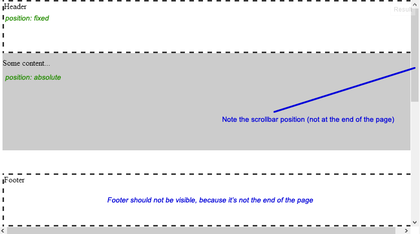
以下代码:
- 我准备了一个演示: JSFiddle
- 或者见下文
<div id="header">Header</div>
<div id="content">
    <p>Some content...</p>
</div>
<div id="footer">Footer</div>
body{
    /* Just to enable scrolling in JSFiddle */
    height: 1000px;
}

#header{
    width: 100%;
    height: 100px;
    position: fixed;
    top: 0px;
    z-index: 1;
}

#content{
    width: 100%;
    position: absolute;
    top: 100px; /*Height of header*/
    z-index: 0;
}

#footer{
    width: 100%;
    height: 100px;
    position: absolute;
    bottom: 0px;
}

/*For demo only*/
#header, #footer{
    border: 3px dashed #333333;
    background: #FFFFFF;
}

#content{
    background: #CCCCCC;
    height: 200px;
}
6 个答案:
答案 0 :(得分:34)
正如您所提到的,position: fixed会将页脚放在视口而不是页面本身。因此,我们必须将元素保持在正常流程中,并以某种方式将其放置在页面底部。
有几种方法可以实现这一点,在此期间已经在野外讨论了 。 例如:
- A List Apart的文章Exploring Footers - Bobby Van Der Sluis ,2004
- footerStickAlt - Craig Erskine ,2005
- Sticky Footer - Shelly Cole ,2006
- How to keep footers at the bottom of the page - Matthew James Taylor ,2007
- Make the Footer Stick to the Bottom of a Page - Ryan Fait ,2007
- Refined version of Ryan Fait's Sticky Footer - Chris Coyier ,2009
- Sticky CSS footers: The flexible way (使用CSS Tables) - Torben Haase ,2011
- Responsive Sticky Footer (Torben&#39;方法的精炼版) - Joshua Cook ,2013
- Solved by Flexbox&#39; Sticky Footer - Philip Walton ,2013
粘性页脚
在这个答案中,我选择Ryan Fait's method,因为它简单易懂,也符合您的需求(页眉和页脚都有固定高度的情况)
考虑以下结构:
<div id="content"> <!-- content goes here. It may (not) include the header --> </div>
<div id="footer">Footer</div>
需要执行以下步骤:
-
将
height和<html>元素的<body>设置为100%,这是下一步 1 所必需的。 -
我们需要做的最重要的事情是确保
#content足够高,以便将#footer推向页面。因此,我们为#contentmin-height100%提供#content。 -
So far,
100%取了#content视口的高度,因此我们应该将页脚向上拉以将其放置在页面底部。为此,我们可以为margin-bottom提供与页脚height相同的否定position。另外,为了确保页脚显示在内容的顶部,我们应该relative页脚#content。的 Demo Here -
可以看出,当
#content按内容增长时,部分内容会在页脚后面。我们可以通过在padding-bottom末尾附加一个spacer元素来使用<div id="content"> <!-- content goes here --> <div class="spacer"></div> </div> <div id="footer">Footer</div>和box-sizing: border-box2 的组合来避免这种情况,它应该是{{} 3}}以及。 -
如果标题在正常流程中保持,您只需将其添加到
<div id="content">
    <div id="header">Header</div>
    ...
,如下所示:
(的 Updated Example )#content -
但如果它应该绝对定位 3 ,我们需要按Example Here顺序推送
#content元素的内容
4.1添加间隔符
<强> supported on IE8
.spacer, #footer { height: 100px; }
padding-bottom 4.2 box-sizing和#content {
min-height: 100%;
margin-bottom: -100px; /* Equivalent to footer's height */
padding-bottom: 100px; /* Equivalent to footer's height */
box-sizing: border-box;
}
的组合
<强> Example Here
#content(请注意,由于简洁,省略了供应商前缀)
添加标题
因此,我们可以在<div id="header">Header</div>
<div id="content">
<div class="header-spacer"></div>
<!-- content goes here -->
<div class="footer-spacer"></div>
</div>
<div id="footer">Footer</div>
( to prevent overlapping 的开头添加间隔符:
padding-top或使用box-sizing和<div id="header">Header</div>
<div id="content"> <!-- content goes here. --> </div>
<div id="footer">Footer</div>
的组合,如下所示:
#content {
    min-height: 100%;
    margin-bottom: -100px; /* Equivalent to footer's height */

    padding-top   : 50px;  /* Equivalent to header's height */
    padding-bottom: 100px; /* Equivalent to footer's height */

    box-sizing: border-box;
}
#contentExample Here (请注意,由于简洁,省略了供应商前缀)
最后但并非最不重要!
如今,所有主要的现代网络浏览器都支持Updated Example声明(包括IE8)。但是,如果您正在寻找具有更广泛浏览器支持的传统方式,请坚持使用spacer元素。
1。需要这样才能使box-sizing: border-box对height元素起作用(因为百分比值是相对于<body>的包含块的<html>而由{height: 100%建立的1}})。另外,<body>应明确min-height: 100%以使width能够使用height。
2。 height使UA计算框的position / absolute,包括填充和边框。
3。 box-sizing: border-box,绝对定位的元素是fixed {{1}}或{{1}}的元素。
答案 1 :(得分:3)
你几乎得到了它。你需要的是一个容器。
这是我的修改位: JSFiddle Update
添加容器div:
<div id="container">
    <div id="header"></div>
    <div id="page"></div>
    <div id="footer"></div>
</div>
然后使位置相对,高度为100%:
#container {
    height: 100%;
    position: relative;
}
并确保该位置对于页脚是绝对的。
答案 2 :(得分:3)
或者对于那些通过谷歌搜索找到这篇文章的人,想要一个更短的答案,没有包装(因为你不需要它们):
html { height: 100%; }
body { min-height: 100%; position: relative; padding-bottom: 3em; }
.footer { height: 3em; position: absolute; bottom: 0; }
完成后,页面现在至少有100%的屏幕高度,页脚位于页面底部,而不是“屏幕”的底部。如果页面比屏幕长,它仍然位于底部,我们没有人为的“包装元素”或类似内容:body元素已经是我们需要的包装器=)
唯一需要注意的是,身体边距需要与页脚高度相同,但接着是负值,因为“bottom:0”规则会使页脚在底部开始 而不是基线锚定。然后再次,作为CSS,.less或.styl,这很容易确保。
答案 3 :(得分:0)
要做到这一点:
#header {
    position: fixed;
    width:100%;
    height:100px;
    top:0px;
    z-index:2;
}
#content, #footer {
    position: relative; /* or leave it static as by default */
    z-index:1;
}
body,div {
    margin:0; padding:0; /* http://jsfiddle.net/css/normalize.css */
}
#content {
    margin-top: 100px; /* the same value as header's height */
}
答案 4 :(得分:0)
But if you want the footer to take full size of the screen while #wrapper is 1000px and centered you would do:


<body>
<div id="wrapper">
<div id="wrapper-inner">
<div id="header"></div>
<div id="content"></div>
<div id="footer"></div>
</div>
</div>
</body>

html,
body {
margin:0;
padding:0;
height:100%;
}
#wrapper {
min-height:100%;
position:relative;
}
#wrapper-inner {
margin: 0 auto;
width: 1000px;
}
#content {
padding:10px;
padding-bottom:80px; /* Height of the footer element */
}
#footer {
width:100%;
height:80px;
position:absolute;
bottom:0;
left:0;
}
答案 5 :(得分:0)
我在Web开发领域还很陌生,我知道这已经得到了答案,但这是我找到的最简单的解决方法,我认为这有所不同。我想要一些灵活的东西,因为我的页脚在Web应用程序的不同部分可以具有不同的高度。我最终使用了FlexBox和一个垫片。
- 首先设置HTML和正文的高度
git checkout feature
git merge -s ours master
git checkout master
git merge feature在您需要添加标题,英雄或垂直对齐的任何内容的情况下,我假设我们的应用程序具有html, body {
height: 100%;
display: flex;
flex-direction: column;
margin: 0px;
}
行为。
- 创建spacer类
column- 所以以后在HTML上可能是
.spacer {
    flex: 1;
}
- 我写了这段代码,但我无法理解我的错误
- 我无法从一个代码实例的列表中删除 None 值,但我可以在另一个实例中。为什么它适用于一个细分市场而不适用于另一个细分市场?
- 是否有可能使 loadstring 不可能等于打印?卢阿
- java中的random.expovariate()
- Appscript 通过会议在 Google 日历中发送电子邮件和创建活动
- 为什么我的 Onclick 箭头功能在 React 中不起作用?
- 在此代码中是否有使用“this”的替代方法?
- 在 SQL Server 和 PostgreSQL 上查询,我如何从第一个表获得第二个表的可视化
- 每千个数字得到
- 更新了城市边界 KML 文件的来源?