CSS挑战,我可以不引入更多HTML吗?
想象一下,我有任何带有文本的块或内联块。像段落或李或其他什么。如果该标记具有“separator”类,我希望它显示如下:
所有内容都居中(text-align:center;就足够了)。 这是一个棘手的部分:在居中内容的两侧,出现一条(垂直居中的)线。
下图说明了我的想法:

如果我需要引入更多HTML,那就算了吧 - 不感兴趣。
我是一个很长时间的CSS用户,但我无法想出这个...其他人有个主意吗?尽管我喜欢它,但最好没有CSS3(因为工作......因为兼容性而无法使用新东西)..
示例问题:<p class="separator">CENTRE ME</p>
7 个答案:
答案 0 :(得分:18)
这适用于Firefox:
.separator {
    text-align: center;
    height: 0.5em;
    border-bottom: 2px solid black;
    margin-bottom: 0.5em;
}
.separator:first-line {
    background-color: white;
}
答案 1 :(得分:3)
我开发了一个不依赖于background: white的解决方案,也就是说,您可以看到分隔符文本背后的内容。只需运行示例,您将看到:
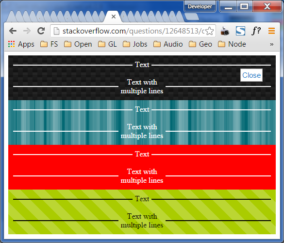
忽略此插图中所有那些杂乱的标签......这是一个CSS样本,而不是组织样本。
.separator>*{
  display: inline-block;
  vertical-align: middle;
}
.separator {
    text-align: center;
    border: 0;
    white-space: nowrap;
    display: block;
    overflow: hidden;
    padding: 0;
    margin: 0;
}
.separator:before, .separator:after {
    content: "";
    height: 2px;
    width: 50%;
    background-color: gray;
    margin: 0 5px 0 5px;
    display: inline-block;
    vertical-align: middle;
}
.separator:before {
    margin-left: -100%;
}
.separator:after {
    margin-right: -100%;
}
<div class="texture texture1 dark-theme">
<p class="separator">Text</p>
<br/>
<p class="separator"><span>Text with<br/>multiple lines</span></p>
</div>
<div class="texture texture2 dark-theme">
<p class="separator">Text</p>
<br/>
<p class="separator"><span>Text with<br/>multiple lines</span></p>
</div>
<div class="texture texture3 dark-theme">
<p class="separator">Text</p>
<br/>
<p class="separator"><span>Text with<br/>multiple lines</span></p>
</div>
<div class="texture texture4 light-theme">
<p class="separator">Text</p>
<br/>
<p class="separator"><span>Text with<br/>multiple lines</span></p>
</div>
<style>
/**
STYLES TO MAKE THE BACKGROUND HAVE PATTERNS WHICH ARE NOT SOLID WHITE,
SO THAT YOU CAN SEE THAT IT IS VISIBLE BEHIND THE SEPARATOR.
**/
.light-theme .separator:before, .light-theme .separator:after {
background-color: black;
}
.light-theme .separator, .light-theme .separator {
color: black;
}
.dark-theme .separator:before, .dark-theme .separator:after {
background-color: white;
}
.dark-theme .separator, .dark-theme .separator {
color: white;
}
.texture {
padding: 10px;
}
.texture3 {
background-color: red;
color: white;
}
.texture1 {
//-webkit-box-sizing: content-box;
//-moz-box-sizing: content-box;
//box-sizing: content-box;
//width: 320px;
//height: 320px;
//border: none;
//font: normal 100%/normal Arial, Helvetica, sans-serif;
//color: rgb(255, 255, 255);
//-o-text-overflow: clip;
//text-overflow: clip;
background: -webkit-linear-gradient(63deg, rgb(21,21,21) 5px, rgba(0,0,0,0) 5px), -webkit-linear-gradient(-117deg, rgb(21,21,21) 5px, rgba(0,0,0,0) 5px), -webkit-linear-gradient(63deg, rgb(34,34,34) 5px, rgba(0,0,0,0) 5px), -webkit-linear-gradient(-117deg, rgb(34,34,34) 5px, rgba(0,0,0,0) 5px), -webkit-linear-gradient(0deg, rgb(27,27,27) 10px, rgba(0,0,0,0) 10px), -webkit-linear-gradient(-90deg, rgb(29,29,29) 25%, rgb(26,26,26) 25%, rgb(26,26,26) 50%, rgba(0,0,0,0) 50%, rgba(0,0,0,0) 75%, rgb(36,36,36) 75%, rgb(36,36,36) 100%), rgb(19, 19, 19);
background: -moz-linear-gradient(27deg, rgb(21,21,21) 5px, rgba(0,0,0,0) 5px), -moz-linear-gradient(207deg, rgb(21,21,21) 5px, rgba(0,0,0,0) 5px), -moz-linear-gradient(27deg, rgb(34,34,34) 5px, rgba(0,0,0,0) 5px), -moz-linear-gradient(207deg, rgb(34,34,34) 5px, rgba(0,0,0,0) 5px), -moz-linear-gradient(90deg, rgb(27,27,27) 10px, rgba(0,0,0,0) 10px), -moz-linear-gradient(180deg, rgb(29,29,29) 25%, rgb(26,26,26) 25%, rgb(26,26,26) 50%, rgba(0,0,0,0) 50%, rgba(0,0,0,0) 75%, rgb(36,36,36) 75%, rgb(36,36,36) 100%), rgb(19, 19, 19);
background: linear-gradient(27deg, rgb(21,21,21) 5px, rgba(0,0,0,0) 5px), linear-gradient(207deg, rgb(21,21,21) 5px, rgba(0,0,0,0) 5px), linear-gradient(27deg, rgb(34,34,34) 5px, rgba(0,0,0,0) 5px), linear-gradient(207deg, rgb(34,34,34) 5px, rgba(0,0,0,0) 5px), linear-gradient(90deg, rgb(27,27,27) 10px, rgba(0,0,0,0) 10px), linear-gradient(180deg, rgb(29,29,29) 25%, rgb(26,26,26) 25%, rgb(26,26,26) 50%, rgba(0,0,0,0) 50%, rgba(0,0,0,0) 75%, rgb(36,36,36) 75%, rgb(36,36,36) 100%), rgb(19, 19, 19);
background-position: 0 5px, 10px 0, 0 10px, 10px 5px, 0 0, 0 0;
-webkit-background-origin: padding-box;
background-origin: padding-box;
-webkit-background-clip: border-box;
background-clip: border-box;
-webkit-background-size: 20px 20px;
background-size: 20px 20px;
}
.texture2 {
//-webkit-box-sizing: content-box;
//-moz-box-sizing: content-box;
//box-sizing: content-box;
//width: 320px;
//height: 320px;
//border: none;
//font: normal 100%/normal Arial, Helvetica, sans-serif;
//color: rgb(255, 255, 255);
//-o-text-overflow: clip;
//text-overflow: clip;
background: -webkit-linear-gradient(0deg, rgba(255,255,255,0.0666667) 50%, rgba(0,0,0,0) 50%), -webkit-linear-gradient(0deg, rgba(255,255,255,0.129412) 50%, rgba(0,0,0,0) 50%), -webkit-linear-gradient(0deg, rgba(0,0,0,0) 50%, rgba(255,255,255,0.168627) 50%), -webkit-linear-gradient(0deg, rgba(0,0,0,0) 50%, rgba(255,255,255,0.188235) 50%), rgb(2, 104, 115);
background: -moz-linear-gradient(90deg, rgba(255,255,255,0.0666667) 50%, rgba(0,0,0,0) 50%), -moz-linear-gradient(90deg, rgba(255,255,255,0.129412) 50%, rgba(0,0,0,0) 50%), -moz-linear-gradient(90deg, rgba(0,0,0,0) 50%, rgba(255,255,255,0.168627) 50%), -moz-linear-gradient(90deg, rgba(0,0,0,0) 50%, rgba(255,255,255,0.188235) 50%), rgb(2, 104, 115);
background: linear-gradient(90deg, rgba(255,255,255,0.0666667) 50%, rgba(0,0,0,0) 50%), linear-gradient(90deg, rgba(255,255,255,0.129412) 50%, rgba(0,0,0,0) 50%), linear-gradient(90deg, rgba(0,0,0,0) 50%, rgba(255,255,255,0.168627) 50%), linear-gradient(90deg, rgba(0,0,0,0) 50%, rgba(255,255,255,0.188235) 50%), rgb(2, 104, 115);
-webkit-background-origin: padding-box;
background-origin: padding-box;
-webkit-background-clip: border-box;
background-clip: border-box;
-webkit-background-size: 13px 13px, 29px 29px, 37px 37px, 53px 53px;
background-size: 13px 13px, 29px 29px, 37px 37px, 53px 53px;
}
.texture4 {
//-webkit-box-sizing: content-box;
//-moz-box-sizing: content-box;
//box-sizing: content-box;
//width: 320px;
//height: 320px;
//border: none;
//font: normal 100%/normal Arial, Helvetica, sans-serif;
//color: rgba(255,255,255,1);
//-o-text-overflow: clip;
//text-overflow: clip;
background: -webkit-linear-gradient(45deg, rgba(255,255,255,0.2) 25%, rgba(0,0,0,0) 25%, rgba(0,0,0,0) 50%, rgba(255,255,255,0.2) 50%, rgba(255,255,255,0.2) 75%, rgba(0,0,0,0) 75%, rgba(0,0,0,0) 0), rgb(170, 204, 0);
background: -moz-linear-gradient(45deg, rgba(255,255,255,0.2) 25%, rgba(0,0,0,0) 25%, rgba(0,0,0,0) 50%, rgba(255,255,255,0.2) 50%, rgba(255,255,255,0.2) 75%, rgba(0,0,0,0) 75%, rgba(0,0,0,0) 0), rgb(170, 204, 0);
background: linear-gradient(45deg, rgba(255,255,255,0.2) 25%, rgba(0,0,0,0) 25%, rgba(0,0,0,0) 50%, rgba(255,255,255,0.2) 50%, rgba(255,255,255,0.2) 75%, rgba(0,0,0,0) 75%, rgba(0,0,0,0) 0), rgb(170, 204, 0);
background-position: auto auto;
-webkit-background-origin: padding-box;
background-origin: padding-box;
-webkit-background-clip: border-box;
background-clip: border-box;
-webkit-background-size: 50px 50px;
background-size: 50px 50px;
}
</style>
P.S。:我使用的背景示例不是我的创作。我在enjoycss.com得到了它们。红色的背景,嗯,它也不是我的创造,也不是他们......没有人的创造,也许。谁创建了red ...我不知道。如果您这样做了,而且我没有给予信任,请在评论中留言。
答案 2 :(得分:1)
很抱歉打破它,但如果没有引入至少一个额外的标记,就无法在HTML / CSS中执行此操作。
唯一可以近似它的是,使用:before和:之后的伪类,但它无法插入html内容,更不用说具有可变宽度的内容,具体取决于内容。
答案 3 :(得分:1)
你去了:
<p class="separator"></p>

p.separator {
    line-height:1em;
    border-bottom:1px solid red;
}
p.separator:before {
    content:"TEXT";
    position:relative;
    left:50%;
    margin-left:-2.5em; /* half the number of chars */
    padding:0 0.3em;
    top:0.5em;
    background:white;
}
答案 4 :(得分:1)
您可以使用背景图像作为线条,然后为文本提供一系列黑色文字阴影,以模拟2-3px笔划,覆盖文本周围和文本之间的背景。
IE中。 CSS Font Border?
http://jsfiddle.net/4mPkU/ - 示例
向后兼容性将是基于文本阴影支持的问题。 (有一个IE过滤器可能有助于兼容性。)
答案 5 :(得分:1)
.center-separator {
    display: flex;
  line-height: 1em;
  color: gray;
}

.center-separator::before, .center-separator::after {
    content: '';
    display: inline-block;
    flex-grow: 1;
    margin-top: 0.5em;
    background: gray;
    height: 1px;
    margin-right: 10px;
    margin-left: 10px;
  }
答案 6 :(得分:0)
要制作动态的东西,你可以做类似的事情:
<ul>
    <li>
        <div class='lineLeft'></div>
        <div class='inlineText'></div>
        <div class=lineRight'></div>
    </li>
</ul>
基本上你可以将'inlineText'div设置为居中(不必是div,现在,只是一个想法),然后'lineLeft'和'lineRight'都将被称为float left /因此,将高度设置为父列表项标记的高度的一半。然后给每个边div在css中给出一个底边。
这是我能想到的最有活力的解决方案。这是一个更多的HTML,但它会正确地实现你的目标,假设你可以正确地调整大小。
告诉我们。祝你好运。
- 我写了这段代码,但我无法理解我的错误
- 我无法从一个代码实例的列表中删除 None 值,但我可以在另一个实例中。为什么它适用于一个细分市场而不适用于另一个细分市场?
- 是否有可能使 loadstring 不可能等于打印?卢阿
- java中的random.expovariate()
- Appscript 通过会议在 Google 日历中发送电子邮件和创建活动
- 为什么我的 Onclick 箭头功能在 React 中不起作用?
- 在此代码中是否有使用“this”的替代方法?
- 在 SQL Server 和 PostgreSQL 上查询,我如何从第一个表获得第二个表的可视化
- 每千个数字得到
- 更新了城市边界 KML 文件的来源?