如何在XAML中构建控件网格?
我正在尝试在WPF中构建一个规范的UI。 UI用于编辑项目集合。每个项目都有一个可编辑的字符串属性,以及UI需要显示的可变数量的只读字符串。它可能看起来像这样:
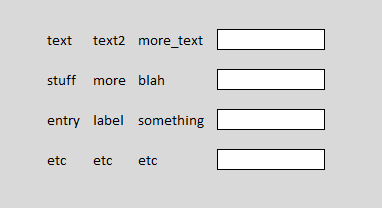
或者,根据数据,可能具有不同数量的文本标签列:

文本列的数量是完全可变的,可以从1到“批次”不等。规范要求调整列的大小以适应最长的条目(它们总是非常短),整个事情应该看起来像一个网格。此网格将包含在窗口中,水平拉伸文本框以适合窗口。
重要的是,文本框可以包含多行文本,并会自动增长以适合文本。如果发生这种情况,下面的行需要被推开。
问题:在WPF中这样做的好方法是什么?
来自WinForms背景,我想的是TableLayoutPanel,它会被我编写的代码直接填充。但是,我需要在WPF中执行此操作。虽然我仍然可以让自己成为Grid并在代码中填充它,但我真的更喜欢一种更符合WPF中的工作方式的方式:即定义ViewModel,填充它,然后描述视图完全在XAML中。但是,我想不出在XAML中描述这种视图的方法。
我使用MVVM和XAML最接近这个是使用ItemsControl每行一个项目,并使用数据模板,而该数据模板又使用另一个ItemsControl(水平堆叠)时间)为可变数量的标签,后跟文本框。不幸的是,这不能像规范要求那样在网格图案中垂直对齐。
6 个答案:
答案 0 :(得分:1)
这并不能很好地映射,你可以使用DataGrid和retemplate看起来像这样。在其他方法中,您可能需要强制添加列等以使布局正确完成。
(您可以挂钩AutoGeneratingColumn将一个可写列的宽度设置为*)
答案 1 :(得分:1)
您可以创建自己的Panel,然后决定您希望布局逻辑如何适用于放置在其中的子项。
看看这个灵感:
您可以拥有“ColumnCount”属性,然后在MeassureOverride和ArrangeOverride中使用该属性来决定何时包装孩子。
或者你可以修改这段代码(我知道它是Silverlight代码,但在WPF中它应该接近相同)。
您可以添加一个List / Collection属性来记录您想要的不同列宽,然后在AutoGrid_LayoutUpdated中,而不是为所有列设置相同的宽度(默认为1星“*”)。使用这些宽度来生成ColumnDefinition值。
答案 2 :(得分:1)
您已经问了很多,下面的代码展示了如何使用您想要的控件构建网格,并设置绑定:
    public void BuildListTemplate(IEnumerable<Class1> myData, int numLabelCols)
    {
        var myGrid = new Grid();

        for (int i = 0; i < myData.Count(); i++)
        {
            myGrid.RowDefinitions.Add(new RowDefinition() { Height= new GridLength(0, GridUnitType.Auto)});
        }
        for (int i = 0; i < numLabelCols; i++)
        {
            myGrid.ColumnDefinitions.Add(new ColumnDefinition() { Width = new GridLength(0, GridUnitType.Auto) });
        }
        myGrid.ColumnDefinitions.Add(new ColumnDefinition() { Width = new GridLength(1, GridUnitType.Star) });
        for (int i = 0; i < myData.Count(); i++)
        {
            for (int j = 0; j < numLabelCols; j++)
            {
                var tb = new TextBlock();
                tb.SetBinding(TextBlock.TextProperty, new Binding("[" + i + "].labels[" + j + "]"));
                tb.SetValue(Grid.RowProperty, i);
                tb.SetValue(Grid.ColumnProperty, j);
                tb.Margin = new Thickness(0, 0, 20, 0);
                myGrid.Children.Add(tb);
            }
            var edit = new TextBox();
            edit.SetBinding(TextBox.TextProperty, new Binding("[" + i + "].MyEditString"));
            edit.SetValue(Grid.RowProperty, i);
            edit.SetValue(Grid.ColumnProperty, numLabelCols);
            edit.AcceptsReturn = true;
            edit.TextWrapping = TextWrapping.Wrap;
            edit.Margin = new Thickness(0, 0, 20, 6);
            myGrid.Children.Add(edit);
        }
       contentPresenter1.Content = myGrid;
    }
以上的快速解释它所做的只是创建网格,定义网格的行;和一系列网格列,用于内容的自动调整大小。
然后它只是为每个数据点生成控件,设置绑定路径,并分配各种其他显示属性,同时为控件设置正确的行/列。
最后,它将网格放在已在窗口xaml中定义的contentPresenter中,以便显示它。
现在您需要做的就是创建一个具有以下属性的类,并将contentPresenter1的数据上下文设置为该对象的列表:
public class Class1
{
    public string[] labels { get; set; }
    public string MyEditString { get; set; }
}
为了完整性,这里是窗口xaml和构造函数来显示所有内容:
<Window x:Class="WpfApplication1.MainWindow"
    xmlns="http://schemas.microsoft.com/winfx/2006/xaml/presentation"
    xmlns:x="http://schemas.microsoft.com/winfx/2006/xaml"
    Title="MainWindow" Height="350" Width="525">
<ContentPresenter Name="contentPresenter1"></ContentPresenter>
</Window>

    public MainWindow()
    {
        InitializeComponent();

        var data = new List<Class1>();

        data.Add(new Class1() { labels = new string[] {"the first", "the second", "the third"}, MyEditString = "starting text"});
        data.Add(new Class1() { labels = new string[] { "col a", "col b" }, MyEditString = "<Nothing>" });

        BuildListTemplate(data, 3);
        DataContext = data;
    }
你当然可以使用其他方法,例如listview,并为它构建一个gridview(如果你有大量的行,我会这样做),或者其他一些这样的控件,但考虑到你的特定布局要求,你可能是希望这个方法与网格。
编辑:刚发现你正在寻找一种在xaml中做的方式 - 所有我能说的是我不认为你想要它的功能是太可行了。如果你不需要在单独的行上保持与动态大小的内容保持一致,那么它将更可行...但我也会说,不要害怕代码背后,它在创建ui时有它的位置。
答案 3 :(得分:1)
在代码隐藏中执行它实际上不是WPFish(wpf方式)。 在这里,我为您提供了我的解决方案,看起来很不错。
0)在开始之前,您需要GridHelpers。这些确保您可以动态更改行/列。你可以通过一点谷歌找到它:
How can I dynamically add a RowDefinition to a Grid in an ItemsPanelTemplate?
在实际实现某些内容之前,您需要稍微重构一下您的程序。您需要新的结构“CustomCollection”,它将具有:
- RowCount - 有多少行(使用INotifyPropertyChanged实现)
- ColumnCount - 有多少列(使用INotifyPropertyChanged实现)
- ActualItems - 您自己的“rows / items”集合(ObservableCollection)
1)首先创建一个包含Grid的ItemsControl。确保Grid RowDefinitions / ColumnDefinitions是动态的。应用ItemContainerStyle。
    <ItemsControl
      ItemsSource="{Binding Collection.ActualItems,
        Converter={StaticResource presentationConverter}">
      <ItemsControl.ItemsPanel>
        <ItemsPanelTemplate>
          <Grid
             local:GridHelpers.RowCount="{Binding Collection.RowCount}"
             local:GridHelpers.StarColumns="{Binding Collection.ColumnCount,
               Converter={StaticResource subtractOneConverter}"
             local:GridHelpers.ColumnCount="{Binding Collection.ColumnCount}" />
        </ItemsPanelTemplate>
      </ItemsControl.ItemsPanel>
      <ItemsControl.ItemContainerStyle>
         <Style TargetType="{x:Type FrameworkElement}">
           <Setter Property="Grid.Row" Value="{Binding RowIndex}"/>
           <Setter Property="Grid.Column" Value="{Binding ColumnIndex}"/>
         </Style>
     </ItemsControl.ItemContainerStyle>
    </ItemsControl>
唯一要做的事情是:实现presentationConverter,它将您的Viewmodel演示文稿转换为View演示文稿。 (阅读:http://wpftutorial.net/ValueConverters.html)
转换器应该返回一个项目集合,其中每个“标签”或“文本框”是一个单独的实体。每个实体都应该有RowIndex和ColumnIndex。
这是实体类:
public class SingleEntity
{
   ..RowIndex property..
   ..ColumnIndex property..
   ..ContentProperty..  <-- This will either hold label string or TextBox binded property.
   ..ContentType..
}
请注意,ContentType是一个枚举,您将在ItemsTemplate中绑定它以决定是否应创建TextBox或Label。
这似乎是一个非常冗长的解决方案,但它实际上很好,原因很少:
- ViewModel不知道发生了什么。这纯粹是View问题。
- 一切都充满活力。一旦你在ViewModel中添加/删除一些东西(假设一切都正确实现),你的ItemsControl将重新触发转换器并再次绑定。如果不是这种情况,您可以设置ActualItems = null然后返回。
如果您有任何疑问,请与我们联系。
答案 4 :(得分:0)
嗯,简单但不是非常先进的方法是在代码隐藏中动态填充UI。这似乎是最简单的解决方案,它或多或少与您的winforms体验相匹配。
如果您想以MVVM方式执行此操作,则应使用ItemsControl,将项集合设置为ItemsSource,并为集合项类型定义DataTemplate
我希望DataTemplate有类似的东西:
<Window x:Class="SharedSG.MainWindow"
        xmlns="http://schemas.microsoft.com/winfx/2006/xaml/presentation"
        xmlns:x="http://schemas.microsoft.com/winfx/2006/xaml"
        xmlns:app="clr-namespace:SharedSG"
        Title="MainWindow" Height="350" Width="525">
    <Window.Resources>
        <DataTemplate DataType="{x:Type app:LabelVM}">
            <Grid>
                <Grid.ColumnDefinitions>
                    <ColumnDefinition SharedSizeGroup="G1"/>
                    <ColumnDefinition SharedSizeGroup="G2"/>
                    <ColumnDefinition MinWidth="40" Width="*"/>
                </Grid.ColumnDefinitions>
                <Label Content="{Binding L1}" Grid.Column="0"/>
                <Label Content="{Binding L2}" Grid.Column="1"/>
                <TextBox Grid.Column="2"/>
            </Grid>
        </DataTemplate>
    </Window.Resources>
    <Grid Grid.IsSharedSizeScope="True">
        <ItemsControl ItemsSource="{Binding}"/>
    </Grid>
</Window>
答案 5 :(得分:0)
你可能已经解决了这个问题,但最近我遇到了类似的问题,并且我在xaml中工作得非常好,所以我想我会分享我的解决方案。
主要的缺点是你必须愿意对标签的“批量”意味着上限。如果批次可能意味着100,这将无效。如果批次肯定少于你愿意输入Ctrl + V的次数,那么你或许可以让它工作。您还必须愿意将所有标签放入视图模型中的单个ObservableCollection属性中。在你的问题中,我听到你已经尝试过了。但是,无论如何。
我利用AlternationIndex获取标签的索引并将其分配给列。想想我是从here那里学到的。如果项目具有&lt; x标签额外的列不会妨碍。如果某个商品有&gt; x标签,标签将开始堆叠在彼此之上。
<!-- Increase AlternationCount and RowDefinitions if this template breaks -->
<ItemsControl ItemsSource="{Binding Labels}" IsTabStop="False" AlternationCount="5">
        <ItemsControl.ItemTemplate>
            <DataTemplate>
                 <TextBlock Text="{Binding}"/>
            </DataTemplate>
        </ItemsControl.ItemTemplate>
        <ItemsControl.ItemContainerStyle>
            <Style TargetType="{x:Type ContentPresenter}">
                <Setter Property="Grid.Column"
                        Value="{Binding RelativeSource={RelativeSource Self},
                                        Path=(ItemsControl.AlternationIndex)}"/>
            </Style>
        </ItemsControl.ItemContainerStyle>
        <ItemsControl.ItemsPanel>
            <ItemsPanelTemplate>
                <Grid IsItemsHost="True">
                    <Grid.ColumnDefinitions>
                        <ColumnDefinition SharedSizeGroup="A"/>
                        <ColumnDefinition SharedSizeGroup="B"/>
                        <ColumnDefinition SharedSizeGroup="C"/>
                        <ColumnDefinition SharedSizeGroup="D"/>
                        <ColumnDefinition SharedSizeGroup="E"/>
                    </Grid.ColumnDefinitions>
                </Grid>
            </ItemsPanelTemplate>
        </ItemsControl.ItemsPanel>
    </ItemsControl>
- 我写了这段代码,但我无法理解我的错误
- 我无法从一个代码实例的列表中删除 None 值,但我可以在另一个实例中。为什么它适用于一个细分市场而不适用于另一个细分市场?
- 是否有可能使 loadstring 不可能等于打印?卢阿
- java中的random.expovariate()
- Appscript 通过会议在 Google 日历中发送电子邮件和创建活动
- 为什么我的 Onclick 箭头功能在 React 中不起作用?
- 在此代码中是否有使用“this”的替代方法?
- 在 SQL Server 和 PostgreSQL 上查询,我如何从第一个表获得第二个表的可视化
- 每千个数字得到
- 更新了城市边界 KML 文件的来源?