刷新页脚到页面底部,twitter bootstrap
我通常熟悉使用css刷新页脚的技巧。
但是我在使用这种方法为Twitter引导工作时遇到了一些麻烦,很可能是因为Twitter引导本质上是响应式的。使用Twitter bootstrap我无法使用上述博客文章中描述的方法让页脚刷新到页面底部。
35 个答案:
答案 0 :(得分:434)
这现在包含在Bootstrap 2.2.1中。
Bootstrap 3.x
使用导航栏组件并添加.navbar-fixed-bottom类:
<div class="navbar navbar-fixed-bottom"></div>
Bootstrap 4.x
<div class="navbar fixed-bottom"></div>
不要忘记添加body { padding-bottom: 70px; }或以其他方式覆盖页面内容。
答案 1 :(得分:304)
发现片段here非常适用于bootstrap
HTML:
<div id="wrap">
  <div id="main" class="container clear-top">
    <p>Your content here</p>
  </div>
</div>
<footer class="footer"></footer>
CSS:
html, body {
  height: 100%;
}

#wrap {
  min-height: 100%;
}

#main {
  overflow:auto;
  padding-bottom:150px; /* this needs to be bigger than footer height*/
}

.footer {
  position: relative;
  margin-top: -150px; /* negative value of footer height */
  height: 150px;
  clear:both;
  padding-top:20px;
}
答案 2 :(得分:72)
Twitter bootstrap的一个工作示例 NOT STICKY FOOTER
<script>
$(document).ready(function() {

    var docHeight = $(window).height();
    var footerHeight = $('#footer').height();
    var footerTop = $('#footer').position().top + footerHeight;

    if (footerTop < docHeight)
        $('#footer').css('margin-top', 10+ (docHeight - footerTop) + 'px');
});
</script>
在用户打开devtools或调整窗口大小的情况下始终更新的版本。
<script>
    $(document).ready(function() {
        setInterval(function() {
            var docHeight = $(window).height();
            var footerHeight = $('#footer').height();
            var footerTop = $('#footer').position().top + footerHeight;
            var marginTop = (docHeight - footerTop + 10);

            if (footerTop < docHeight)
                $('#footer').css('margin-top', marginTop + 'px'); // padding of 30 on footer
            else
                $('#footer').css('margin-top', '0px');
            // console.log("docheight: " + docHeight + "\n" + "footerheight: " + footerHeight + "\n" + "footertop: " + footerTop + "\n" + "new docheight: " + $(window).height() + "\n" + "margintop: " + marginTop);
        }, 250);
    });
</script>
您至少需要一个#footer
的元素
如果内容适合屏幕,如果不想要滚动条,只需将值10更改为0 如果内容不适合屏幕,滚动条将显示。
答案 3 :(得分:33)
以下是如何从官方页面实现这一点:
http://getbootstrap.com/2.3.2/examples/sticky-footer.html
我现在刚刚测试过,效果很好! :)
<强> HTML
<body>

    <!-- Part 1: Wrap all page content here -->
    <div id="wrap">

      <!-- Begin page content -->
      <div class="container">
        <div class="page-header">
          <h1>Sticky footer</h1>
        </div>
        <p class="lead">Pin a fixed-height footer to the bottom of the viewport in desktop browsers with this custom HTML and CSS.</p>
      </div>

      <div id="push"></div>
    </div>

    <div id="footer">
      <div class="container">
        <p class="muted credit">Example courtesy <a href="http://martinbean.co.uk">Martin Bean</a> and <a href="http://ryanfait.com/sticky-footer/">Ryan Fait</a>.</p>
      </div>
    </div>
</body>
相关的CSS代码是:
/* Sticky footer styles
-------------------------------------------------- */
html,
body {
    height: 100%;
    /* The html and body elements cannot have any padding or margin. */
}

/* Wrapper for page content to push down footer */
#wrap {
    min-height: 100%;
    height: auto !important;
    height: 100%;
    /* Negative indent footer by it's height */
    margin: 0 auto -30px;
}

/* Set the fixed height of the footer here */
#push,
#footer {
    height: 30px;
}

#footer {
    background-color: #f5f5f5;
}

/* Lastly, apply responsive CSS fixes as necessary */
@media (max-width: 767px) {
    #footer {
        margin-left: -20px;
        margin-right: -20px;
        padding-left: 20px;
        padding-right: 20px;
    }
}
答案 4 :(得分:32)
对于Sticky Footer,我们在HTML中使用两个DIV's来获得基本的粘性页脚效果。写得像这样:
<强> HTML
<div class="container"></div>

<div class="footer"></div>
<强> CSS
body,html {
    height:100%;
}
.container {
    min-height:100%;
}
.footer {
    height:40px;
    margin-top:-40px;
}
答案 5 :(得分:28)
更简单的官方示例:http://getbootstrap.com/examples/sticky-footer-navbar/
html {
  position: relative;
  min-height: 100%;
}
body {
  margin-bottom: 60px;
}
.footer {
  position: absolute;
  bottom: 0;
  width: 100%;
  height: 60px;
  background-color: #f5f5f5;
}
答案 6 :(得分:18)
我发现navbar-inner和navbar-fixed-bottom
<div id="footer">
 <div class="navbar navbar-inner  navbar-fixed-bottom">
    <p class="muted credit"><center>ver 1.0.1</center></p>
 </div>
</div>
这似乎很好,对我有用
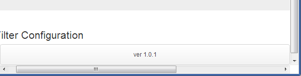
参见 Fiddle
中的示例答案 7 :(得分:11)
这对我很有帮助。
将此类navbar-fixed-bottom添加到页脚。
<div class="footer navbar-fixed-bottom">
我这样用过:
<div class="container-fluid footer navbar-fixed-bottom">
<!-- start footer -->
</div>
它设置在整个宽度的底部。
编辑:这会将页脚设置为始终可见,这是您需要考虑的事项。
答案 8 :(得分:10)
您需要打包.container-fluid div以使粘性页脚起作用,您还缺少.wrapper类的某些属性。试试这个:
从padding-top:70px标记中移除body,然后将其添加到.container-fluid中,如下所示:
.wrapper > .container-fluid {
    padding-top: 70px;
}
我们必须这样做,因为向下推动body以容纳导航栏会最终将页脚推进(远超70px)通过视口,因此我们得到一个滚动条。我们在推动.container-fluid div时得到了更好的结果。
接下来,我们必须删除.wrapper div之外的.container-fluid类,并将#main div包装在其中,如下所示:
<div class="wrapper">
    <div id="main" class="container-fluid">
        <div class="row-fluid">...</div>
        <div class="push"></div>
    </div>
</div>
你的页脚当然必须超出.wrapper div,所以将它从`.wrapper div中删除并将其放在外面,如下所示:
<div class="wrapper">
    ....
</div>
<footer class="container-fluid">
    ....
</footer><!--END .row-fluid-->
完成所有操作后,使用负边距正确地将您的页脚推向.wrapper课程,如下所示:
.wrapper {
    min-height: 100%;
    height: auto !important; /* ie7 fix */
    height: 100%;
    margin: 0 auto -43px;
}
这应该可行,尽管你可能需要修改一些其他的东西,以便在调整屏幕大小时使其工作,比如重置.wrapper类的高度,如下所示:
@media (max-width:480px) {
   .wrapper {
      height:auto;
   }
}
答案 9 :(得分:10)
HenryW's answer很好,但我需要做一些调整才能让它按照我想要的方式运行。特别是以下内容也处理:
- 首先标记不可见并在javascript中设置可见,避免页面加载时出现“跳跃”
- 处理浏览器优雅地调整大小
- 如果浏览器变小且页脚变得比页面大,则将页脚设置回页面
- 高度函数调整
这些调整对我有用:
<强> HTML:
<div id="footer" class="invisible">My sweet footer</div>
<强> CSS:
#footer {
    padding-bottom: 30px;
}
<强> JavaScript的:
function setFooterStyle() {
    var docHeight = $(window).height();
    var footerHeight = $('#footer').outerHeight();
    var footerTop = $('#footer').position().top + footerHeight;
    if (footerTop < docHeight) {
        $('#footer').css('margin-top', (docHeight - footerTop) + 'px');
    } else {
        $('#footer').css('margin-top', '');
    }
    $('#footer').removeClass('invisible');
}
$(document).ready(function() {
    setFooterStyle();
    window.onresize = setFooterStyle;
});
答案 10 :(得分:9)
使用Twitter Bootstrap和新的navbar-fixed-bottom类这是正确的方法:(你不知道我花了多长时间寻找这个)
CSS:
html {
  position: relative;
  min-height: 100%;
}
#content {
  padding-bottom: 50px;
}
#footer .navbar{
  position: absolute;
}
HTML:
<html>
  <body>
    <div id="content">...</div>
    <div id="footer">
      <div class="navbar navbar-fixed-bottom">
        <div class="navbar-inner">
          <div class="container">
            <ul class="nav">
              <li><a href="#">Menu 1</a></li>
              <li><a href="#">Menu 2</a></li>
            </ul>
          </div>
        </div>
      </div>
    </div>
  </div>
</body>
</html>
答案 11 :(得分:9)
在bootstrap 4.3的latest version中,可以使用.fixed-bottom类完成此操作。
<div class="fixed-bottom"></div>
以下是我如何使用页脚:
<footer class="footer fixed-bottom container">
<hr>
<p>© 2017 Company, Inc.</p>
</footer>
您可以在位置文档here中找到更多信息。
答案 12 :(得分:4)
使用导航栏组件并添加.navbar-fixed-bottom class:
<div class="navbar navbar-fixed-bottom"></div>
添加身体
{ padding-bottom: 70px; }
答案 13 :(得分:3)
处理宽度约束布局使用以下内容,这样就不会出现圆角,并且导航条将与应用程序的两侧齐平
<div class="navbar navbar-fixed-bottom">
    <div class="navbar-inner">
        <div class="width-constraint clearfix">
            <p class="pull-left muted credit">YourApp v1.0.0</p>

            <p class="pull-right muted credit">©2013 • CONFIDENTIAL ALL RIGHTS RESERVED</p>
        </div>
    </div>
</div>
然后您可以使用css覆盖引导类来调整高度,字体和颜色
    .navbar-fixed-bottom {
      font-size: 12px;
      line-height: 18px;
    }
    .navbar-fixed-bottom .navbar-inner {
        min-height: 22px;
    }
    .navbar-fixed-bottom .p {
        margin: 2px 0 2px;
    }
答案 14 :(得分:3)
您可以使用jQuery来处理:
$(function() {
    /**
     * Read the size of the window and reposition the footer at the bottom.
     */
    var stickyFooter = function(){
        var pageHeight = $('html').height();
        var windowHeight = $(window).height();
        var footerHeight = $('footer').outerHeight();

        // A footer with 'fixed-bottom' has the CSS attribute "position: absolute",
        // and thus is outside of its container and counted in $('html').height().
        var totalHeight = $('footer').hasClass('fixed-bottom') ?
            pageHeight + footerHeight : pageHeight;

        // If the window is larger than the content, fix the footer at the bottom.
        if (windowHeight >= totalHeight) {
            return $('footer').addClass('fixed-bottom');
        } else {
            // If the page content is larger than the window, the footer must move.
            return $('footer').removeClass('fixed-bottom');
        }
    };

    // Call when this script is first loaded.
    window.onload = stickyFooter;

    // Call again when the window is resized.
    $(window).resize(function() {
        stickyFooter();
    });
});
答案 15 :(得分:2)
使用Bootstrap 3.6.6进行测试。
<强> HTML
<div class="container footer navbar-fixed-bottom">
  <footer>
    <!-- your footer content here -->
  </footer>
</div>
<强> CSS
.footer {
  bottom: 0;
  position: absolute;
}
答案 16 :(得分:2)
最简单的技术可能是使用Bootstrap navbar-static-bottom并将主容器div设置为height: 100vh(新的CSS3 view port percentage)。这会将页脚冲到底部。
<main class="container" style="height: 100vh;">
some content
</main>
<footer class="navbar navbar-default navbar-static-bottom">
<div class="container">
<p class="navbar-text navbar-left">© Footer4U</p>
</div>
</footer>
答案 17 :(得分:1)
唯一一个适合我的人!:
html {
  position: relative;
  min-height: 100%;
  padding-bottom:90px;
}
body {
  margin-bottom: 90px;
}
footer {
  position: absolute;
  bottom: 0;
  width: 100%;
  height: 90px;
}
答案 18 :(得分:1)
在引导程序中使用这段代码是可行的
<div class="navbar fixed-bottom">
<div class="container">
 <p class="muted credit">Footer <a href="http://google.com">Link</a> and <a
href="http://google.com/">link</a>.</p>
 </div>
 </div>
答案 19 :(得分:1)
Bootstrap v4 +解决方案
这里的解决方案不需要重新考虑HTML结构或涉及填充的任何其他CSS技巧:
<html style="height:100%;">
  ...
  <body class="d-flex flex-column h-100">
    ...
    <main class="flex-grow-1">...</main>
    <footer>...</footer>
  </body>
  ...
</html>
请注意,此解决方案允许页脚具有灵活的高度,当设计用于多种屏幕尺寸的页面并缩小内容时,这特别方便。
为什么行得通
-
style="height:100%;"使<html>标签占据文档的整个空间。 - 类
d-flex将display:flex设置为我们的<body>标签。 - 类
flex-column将flex-direction:column设置为我们的<body>标签。它的子级(<header>,<main>,<footer>和其他直接子级)现在垂直对齐。 - 类
h-100将height:100%设置为我们的<body>标签,这意味着它将垂直覆盖整个屏幕。 - 类
flex-grow-1将flex-grow:1设置到我们的<main>,有效地指示它填充任何剩余的垂直空间,因此等于我们之前在{{1}上设置的100%垂直高度}标签。
在这里工作的演示:https://codepen.io/maxencemaire/pen/VwvyRQB
有关弹性框的更多信息,请参见https://css-tricks.com/snippets/css/a-guide-to-flexbox/。
答案 20 :(得分:1)
#wrap {
min-height: 100%;
height: auto !important;
height: 100%;
width: 100%;
/*Negative indent footer by its height*/
margin: 0 auto -60px;
position: fixed;
left: 0;
top: 0;
}
页脚高度与包装元素底部缩进的大小相匹配。
.footer {
position: fixed;
bottom: 0;
left: 0;
right: 0;
height: 60px;
}
答案 21 :(得分:0)
这就是bootstrap的用法:
http://getbootstrap.com/2.3.2/examples/sticky-footer.html
只需使用页面源,您应该能够看到。唐&#39;忘记<div id="wrap">顶部。
答案 22 :(得分:0)
另一种可能的解决方案,仅使用媒体查询
@media screen and (min-width:1px) and (max-width:767px) {
    .footer {
    }
}
/* no style for smaller or else it goes weird.*/
@media screen and (min-width:768px) and (max-width:991px) {
    .footer{
        bottom: 0;
        width: 100%;
        position: absolute;
    }
}
@media screen and (min-width:992px) and (max-width:1199px) {
    .footer{
        bottom: 0;
        width: 100%;
        position: absolute;
    }
}
@media screen and (min-width:1120px){
    .footer{
        bottom: 0;
        width: 100%;
        position: absolute;
    }
}
答案 23 :(得分:0)
以下是使用css3的示例:
<强> CSS:
html, body {
    height: 100%;
    margin: 0;
}
#wrap {
    padding: 10px;
    min-height: -webkit-calc(100% - 100px);     /* Chrome */
    min-height: -moz-calc(100% - 100px);     /* Firefox */
    min-height: calc(100% - 100px);     /* native */
}
.footer {
    position: relative;
    clear:both;
}
<强> HTML:
<div id="wrap">
    <div class="container clear-top">
       body content....
    </div>
</div>
<footer class="footer">
    footer content....
</footer>
答案 24 :(得分:0)
保持简单。
footer {
  bottom: 0;
  position: absolute;
}
您可能还需要通过向margin-bottom添加与页脚高度等效的body来偏移页脚的高度。
答案 25 :(得分:0)
使用以下类将其推送到页面的最后一行,并将其置于页面的中心位置。
如果您在rails HAML页面上使用ruby,则可以使用以下代码。
%footer.card.text-center
请不要忘记使用twitter bootstrapp
答案 26 :(得分:0)
这是使用Flexbox的最新版本Bootstrap(在撰写本文时为4.3)的解决方案。
HTML:
<div class="wrapper">
  <div class="content">
    <p>Content goes here</p>
  </div>
</div>
<footer class="footer"></footer>
CSS:
html, body {
  height: 100%;
}

body {
  display: flex;
  flex-direction: column;
}

.wrapper {
  flex-grow: 1;
}
还有一个代码笔示例:https://codepen.io/tillytoby/pen/QPdomR
答案 27 :(得分:0)
使用Bootstrap 4内置的flex实用程序! 这是我主要使用Bootstrap 4实用程序想到的。
<div class="d-flex flex-column" style="min-height: 100vh">
  <header></header>
  <div class="container flex-grow-1">
    <div>Some Content</div>
  </div>
  <footer></footer>
</div>
-
.d-flex将主div设置为flex容器
在主div上 -
.flex-column将您的弹性项目排列在列中 -
min-height: 100vh到主div(具有style属性或在CSS中),以垂直填充视口 -
.flex-grow-1在容器元素上,以使主要内容容器占用保留在视口高度中的所有空间。
答案 28 :(得分:0)
根据Bootstrap 4.3 example,如果您像我一样失去理智,这实际上是这样的:
- 页脚div的所有父母都必须拥有
height: 100%(h-100课程) - 页脚的直接父级必须具有
display: flex(d-flex类) - 页脚需要具有
margin-top: auto(mt-auto类)
问题在于,在现代的前端框架中,我们经常在这些元素周围添加其他包装器。
例如,在我的案例中,使用Angular,我从单独的应用程序根目录,主应用程序组件和页脚组件组成了视图,所有这些都将其自定义元素添加到DOM中。
因此,要使其正常工作,我必须向这些包装器元素添加类:附加的h-100,将d-flex向下移动一级,并将mt-auto向上移动一级从页脚开始(因此实际上不再在页脚类上,而是在我的<app-footer>自定义元素上)。
答案 29 :(得分:0)
HTML
<div id="wrapper">

  <div id="content">
    <!-- navbar and containers here -->
  </div>

  <div id="footer">
   <!-- your footer here -->
  </div>

</div>
CSS
html, body {
  height: 100%;
}

#wrapper {
  min-height: 100%;
  position: relative;
}

#content {
  padding-bottom: 100px; /* Height of the footer element */
}

#footer {
  width: 100%;
  height: 100px; /* Adjust to the footer needs */
  position: absolute;
  bottom: 0;
  left: 0;
}
答案 30 :(得分:0)
这是最好的!
html {
  position: relative;
  min-height: 100%;
  padding-bottom:90px;
}
body {
  margin-bottom: 90px;
}
footer {
  position: absolute;
  bottom: 0;
  width: 100%;
  height: 90px;
}
答案 31 :(得分:0)
这很好
html
<footer></footer>
css
html {
  position: relative;
  min-height: 100%;
  padding-bottom:90px;
}
body {
  margin-bottom: 90px;
}
footer {
  position: absolute;
  bottom: 0;
  width: 100%;
  height: 90px;
}
答案 32 :(得分:0)
在这里,您可以在页面底部的页首和页脚的导航栏中找到HAML(http://haml.info)中的方法:
%body
  #main{:role => "main"}
    %header.navbar.navbar-fixed-top
      %nav.navbar-inner
        .container
          /HEADER
      .container
        /BODY
    %footer.navbar.navbar-fixed-bottom
      .container
        .row
          /FOOTER
答案 33 :(得分:0)
看起来height:100%'链'在div#main被破坏了。尝试向其添加height:100%,这可能会让您更接近目标。
答案 34 :(得分:-1)
这种方式最适合我
<meta name="viewport" content="width=device-width, initial-scale=1">
- 我写了这段代码,但我无法理解我的错误
- 我无法从一个代码实例的列表中删除 None 值,但我可以在另一个实例中。为什么它适用于一个细分市场而不适用于另一个细分市场?
- 是否有可能使 loadstring 不可能等于打印?卢阿
- java中的random.expovariate()
- Appscript 通过会议在 Google 日历中发送电子邮件和创建活动
- 为什么我的 Onclick 箭头功能在 React 中不起作用?
- 在此代码中是否有使用“this”的替代方法?
- 在 SQL Server 和 PostgreSQL 上查询,我如何从第一个表获得第二个表的可视化
- 每千个数字得到
- 更新了城市边界 KML 文件的来源?