具有7个以上数据集的Pyplot直方图
Pyplot允许您创建多个数据集的堆叠直方图(如this one)。
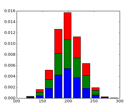
但是,如果直方图中有超过7个数据集,则会重复颜色。

有没有办法区分7种不同的颜色?
我尝试使用可选的填充参数(documented here),但它只需要一个填充样式用于所有条形,而不是每个条形图的一个填充样式。
# This applies one hatch-style to all bars
plt.hist(data, label=label, normed=True, stacked=True, hatch='/')

# This doesn't apply different hatch styles to different bars.
# It throws an error
plt.hist(data, label=label, normed=True, stacked=True, hatch=
         ['/', '\\', '|', '-', '+', 'x', 'o', 'O', '.', '*', 'oo', 'xx'])
1 个答案:
答案 0 :(得分:4)
Matplotlib使用具有预定义颜色的颜色循环。您可以根据自己的喜好修改此颜色循环,但如果直接指定hist调用中的颜色,则会更清晰。手动指定颜色很繁琐,因此您可以使用matplotlibs颜色图之一来生成它们。在下面的示例中,我还使用了colorbrewer的色彩映射,因为它们也非常好。
import matplotlib.pyplot as plt
import numpy as np
import brewer2mpl

colors_brewer = brewer2mpl.get_map('Paired', 'Qualitative', 12).mpl_colors
colors_jet = plt.cm.jet(np.linspace(0,1,12))

# random data
data = np.random.rand(100,12)

# plot it
fig, ax = plt.subplots(1,2)
ax[0].hist(data, bins=10, stacked=True, color=colors_brewer)
ax[1].hist(data, bins=10, stacked=True, color=colors_jet)
plt.show()
结果:

相关问题
最新问题
- 我写了这段代码,但我无法理解我的错误
- 我无法从一个代码实例的列表中删除 None 值,但我可以在另一个实例中。为什么它适用于一个细分市场而不适用于另一个细分市场?
- 是否有可能使 loadstring 不可能等于打印?卢阿
- java中的random.expovariate()
- Appscript 通过会议在 Google 日历中发送电子邮件和创建活动
- 为什么我的 Onclick 箭头功能在 React 中不起作用?
- 在此代码中是否有使用“this”的替代方法?
- 在 SQL Server 和 PostgreSQL 上查询,我如何从第一个表获得第二个表的可视化
- 每千个数字得到
- 更新了城市边界 KML 文件的来源?